Authors Sara Wachter-Boettcher and Eric Meyer share a short excerpt from Chapter 2 of their new book, Design for Real Life, and then answer our questions about one of the book’s major topics.
RECONSIDER “SIMPLE”
We often assume something will be “simple” for a user: “This form field will take two seconds,” we might think. “We’ll just make it required.” But what our limited knowledge tells us is simple might be anything but for someone else. The more we identify our biases and stretch our thinking beyond them, the better our designs will work for everyone.
Take gender. We ask for it all the time: when we’re onboarding new users, signing them up for a newsletter, requesting their mailing address. Often, those interfaces offer only a binary choice between male and female (FIG 2.1)
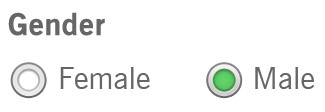
FIG 2.1: A binary gender selector leaves people out—and often isn’t even needed (https://bkaprt.com/dfrl/02-01/).
But gender isn’t so simple. There are people who were born one gender but now identify as another. People who are in the process of transitioning between genders. People who are not—or prefer not to identify as—any specific gender. People who do identify with a gender, but prefer not to share that information. These are real people.
If we want to make space for everyone’s lives and needs, we need to account for a broader range of experiences—and a whole host of complicated feelings and emotional responses that can come along with using our interfaces.
Here’s how one transgender man, who is not yet out to everyone and is just beginning to transition, explained his experience to us:
Every time a website asks: “Male or Female?” and offers no opt-out, no “It’s complicated,” I pause. I have to think about what I want to answer and why. Do I check “female” to match the name I still give and the socialization I received? Or do I check “male” and risk someone noticing the discrepancy, because this reflects myself?
Sit with that for a moment: every time he’s asked this question, he pauses to think. Is an honest answer going to make him unsafe? Will he risk being outed to people he’s not ready to tell yet? Will it raise red flags? Will it result in further questions?
Every check of a box forces him to choose between his safety and his sense of self. Suddenly, the question doesn’t seem quite so simple.
And how often does his answer matter to the product or service he’s using? Be honest: probably not very often. Unless you’re talking about healthcare or official government services that, at least for now, require gender information, most digital experiences ask for gender simply because the company wants to know.
It might not be easy to convince your company to stop asking for unnecessary information, but as interface makers, we have a responsibility: to question the decisions and desires that cause harm to our users. We might not change our organizations’ minds every time, but we can start the conversation.
Q&A with UX Magazine
What can UX designers do better to account for personal identification options that aren’t simply binary?
The very first thing we should all be asking is, “Do we need to capture this information in the first place?” This would solve a huge percentage of our problems—because, quite often, we don’t actually need a user’s gender or race to set up their account or process their order. We are asking for it because we want more data to push marketing messages a user might not want, or just because we’ve never stopped and thought about it.
That said, there are plenty of times when asking for identity information is important for users—for example, on social or dating sites, many users will want to share information about their identities. It’s part of who people are and how they relate to others. And then there are the times when gathering that information is legally required, like in government services and financial systems.
When you do need to gather information about a user’s personal identity, you can better account for the real, diverse people who need to use your service by:
- Allowing users to define themselves: Where possible, let people use their own words to define themselves, rather than selecting from limited options. Clean databases and taxonomies don’t always matter.
- Supporting complexity: Be careful with fields that require an either/or response. For example, lots of menus only allow a user to select one race or ethnicity option. These menus sometimes include an option for “multiracial,” sometimes not. This forces users to flatten themselves—to either accept the generic “multiracial,” or to pick one piece of their identity over another. That’s alienating, and it doesn’t reflect how race and ethnicity work in real life.
- Avoiding false categories: In the book, we talk about the period-tracking app Glow. Glow forces users to select one of three categories at onboarding: Avoiding pregnancy, Trying to conceive, or Fertility treatments. You can’t use the app without selecting one, and for a huge number of people—say, women who aren’t sexually active, or whose partners are other women—none of them fit, and the entire experience breaks.
- Categorizing by needs, not identity: Often, we ask users to express who they are, when what we actually need to know is what they want to do. For example, unlike Glow, period-tracker Clue onboards new users by asking what they want to track—period reminders, birth control, etc.—with a simple yes or no for each. These questions don’t force a user to define themselves, and they don’t leave anyone out.
With respect to gender, do you recommend that companies start offering a third option to self-identify as transgender, or would that have a negative effect on UX?
Well, like we said above, we’d generally ask an organization to start by considering whether they need this data in the first place. For example, the Information Architecture Institute currently requires users to enter their gender in order to become a member, as Barry Briggs tweeted the other day:
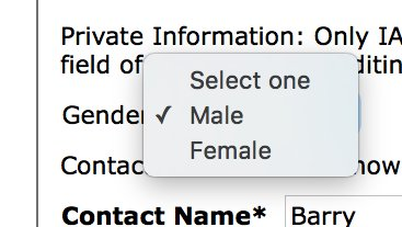
Lots of UX Mag readers are probably IAI members, and their board is full of thoughtful people who aren’t interested in mining members’ personal data. So why does that field exist at all? Our guess is that the membership management software they use includes that field by default, and that whoever was involved in the initial setup of the form didn’t think to question it. But now that people are questioning it, they’re realizing it doesn’t need to be there—in fact, Abby Covert, the IAI president, has noted that they’re in the process of implementing a new form that resolves this problem.
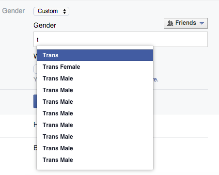
But when you do need to ask for gender, we can’t really imagine a scenario where allowing non-binary responses could be bad for UX. For example, Facebook recently overhauled its settings to allow users to identify as Male, Female or a Custom gender setting. If you select Custom and start typing, a list of terms others have used comes up, so you can either select one of those or keep entering your own. It’s simple, and no one gets left out.
Where should companies draw the line with personal identification questions before it starts to affect UX? Is there a line, or does it depend on the company/what they’re using the information for?
Every personal identification question affects UX. When you ask people for information, you’re asking them to reveal and define themselves. That always has ramifications. It doesn’t mean you shouldn’t do it, though. It just means you need to be intentional: you need to have thought through each question you ask, and how you allow users to submit their answers.
A great tool for doing this is a question protocol, which we learned about from Caroline Jarrett. It’s a simple tool to evaluate whether you need to ask for information, and how you should do it. It lists:
- Every question you ask
- Who within your organization uses the answers to each question
- What they use them for
- Whether an answer is required or optional
- If an answer is required, what happens if a user enters any old thing just to get through the form
By going through every single field with these questions in mind, you’ll weed out any information that’s not being used, or that’s of marginal importance to your business. Then you can think through the rest of the fields from a user’s perspective, and ask, “Who might be excluded here? How could this break or cause harm? Is there a way to ask the question or gather answers that will avoid this?” Together, these exercises will ensure you’re designing experiences that are as inclusive and useful as possible.