Save

For me, my design process has become a creative Lego set, a collection of building blocks that I use to construct solutions. In this article, I’ll be sharing the details of how my design process has evolved over the past four years. I hope this article will provide you with valuable and practical knowledge for your creative endeavors.
My design process includes two main stages: Discovery and Visual Design, each comprising various subcategories. The activities can be shuffled and adapted as the project progresses. I treat my building blocks as valuable resources. I assess what I have and the available options, adding or removing blocks as needed. There’s no rigid order, allowing for flexibility and rapid pivoting if needed.
Discovery: the foundation for making informed decisions. Only understanding “the why” will result in meaningful design.
The outcome of the UX discovery process is to gather sufficient and valid information that serves as a foundation for the subsequent phases of the design process.
In my world, the Discovery box includes the following blocks:
- Desk research
- Opportunity solution tree
- User interviews
- Willingness to pay test
- Usability testing
- Product analytics and user feedback platforms
Desk Research can be as exciting as it is horrifying. You need to go broad and narrow. Make random notes all over the place. The most important thing I’ve learned about early research is to timebox it. I am a strong believer in 90-minute focus time. I set a timer on my FigJam, turn the Acoustic ambient on, and fall into a rabbit hole. But this is a 90 min trip. I can have multiple of those sessions, but each one is followed by a self-review or sometimes a team brain session of what I’ve learned and where to go next.
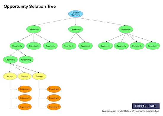
The Opportunity solution tree is one of my latest and most powerful blocks in product discovery. It helps identify and explore potential solutions to address customer problems and achieve desired outcomes. The most valuable thing I’ve witnessed with this form of visualization is that it is clear and welcomed by all the teams, from management to engineers. It magically visualizes the rationale behind the solution in a simple and clear way. Everyone understands “why” they do what they are assigned to do. Everyone on the team can see how their piece of work adds value to user outcomes (the top of the tree) and where they can go next with the mapped-out opportunities (branches). This makes the product cycle whole and meaningful.

Example of the Opportunity Solution Tree from Product talk
I will refer to the article by Teresa Torres. I’ve read it multiple times and was using it as a manual when creating my first opportunity solution tree. The article uncovers a piece of the brilliant book Continuous Discovery Habits by Teresa Torres, which, as you can guess, has become one of my favourite books lately.
User interviews are my favourites. They are useful during most activities within your design process and beyond. This is where you get the most precious asset for making meaningful decisions — insights and feedback! I schedule a user interview when:
- I’ve done previous research and identified the gaps in knowledge. I interview users as field experts to fill in the gaps in the data.
- I’ve come up with an initial concept and created a prototype informative enough to articulate the user outcome I’m chasing. The goal is to validate the concept.
- Users have confirmed that the concept is addressing the user’s pain and I need to know if they would adopt the concept and will be willing to pay for it. I will refer to another great article by Teresa Torres from which I’ve learned about this.
Usability testing, which can also take the form of user interviews, can be conducted during various stages of the design process. I’ve learned a ton about ongoing usability testing methods and best practices in the Usability Testing course from Nielsen Norman Group. This is a great way to collect user behaviour observations to identify:
- Problems in the design
- Discover opportunities for design improvement
- Learn about your product users
Product analytics and user feedback platforms (like Pendo) are powerful tools for enhancing your design process. They are great for gathering user feedback, tracking feature adoption, and facilitating communication with customers. By utilizing in-app surveys and feedback widgets, you can continuously collect feedback directly from your users within the context of your product.
Furthermore, it is a great way to “catch” the right customers for discovery. It’s important to identify customers who are genuinely interested in the concept you’re sharing. During customer interviews, it may become clear that some people are not excited about what you’re demoing simply because the concept doesn’t address their specific problem. Chances are high that these users will not have the necessary knowledge to provide meaningful feedback. To engage with the right customers, you can create a survey or a short video and share it through a platform to grab the attention of interested individuals. By targeting these customers, you are more likely to receive valuable knowledge and insights during the discovery process, ultimately making it more efficient.
The Visual Design: Constructing the User Experience
Once you validate your concept and have supporting data, you can commit to the next stage: visual design. It’s time to make ideas real and move on to the fun part. If during discovery you came to the conclusion that the idea was terrible, we shouldn’t be doing this — that’s great. You haven’t committed yourself and other teams to the next phases. Whether negative or positive, it’s a unit of progress.
The outcome of this stage is a visual functional specification and a single source of truth for product managers to create stories and engineers to have visual support for the story.
My Visual Design box includes:
- Conceptualizing: information architecture, initial sketches, wireframes
- Rapid prototyping
- High-fidelity design
Conceptualizing starts with crafting the information architecture, which defines the structure. Next, create initial sketches and wireframes to list the functionality and outline the layout on the screen. Now you know the “what” (included on the screen) and the “how” (how the content is laid out). Jot down notes for the visuals, including the purpose of the screen and the affordable actions. Do the same for each section/critical UI element on the screen. This helps articulate the rationale behind your screens.
Rapid prototyping has been the most powerful tool in my toolbox since my first project. I’ve listed only several benefits below:
- Eliminating the vagueness of the requirements
- Helping engineers identify what is feasible and estimate the efforts/time
- Keeping the whole team aligned
The use cases for rapid prototyping are enormous: user testing, iteration and refinement, stakeholder communication, design documentation and more. Sometimes I would create prototypes using my 1st version frames (literally boxes and lines with headers) just to share the flow internally and make sure that it makes sense.
For the flows which have been through several iterations, I would never show up for a meeting without a prototype. The main reason is I can bring the team to the same page in minutes just by clicking through the interactive flow vs navigating through static screens and explaining what was changed in the behaviour, etc.
High-fidelity design brings the product to life. It’s a “final” (remember design is never finished) This is a visual functional specification and a single source of truth for every person who needs to work with your design. I honestly have a hard time labeling my design as high fidelity and final, as there’s always room for improvement. But once it is signed off and handed over to development, it is “final” unless you get feedback and this brings you all the way back to discovery and understanding “the why”.
My rules of thumb applicable at every stage of your design process:
- Assumptions should be validated
- Make your thinking visual
- Share your idea early and often, and seek feedback
This is how my design process looks today, which has evolved from very basic blocks to a more refined and adaptable approach. Each project is unique, even within a product company, and I need to tweak how I use the blocks accordingly. But the order is constant: you need to understand the “why” before diving into the “what” and “how.” The beauty of keeping each block separate allows for flexibility and enables you to do more faster.
Building something of high quality requires having high-quality tools, and in the design world, those tools are your skills, all of which are present in your design process.
This article was originally published on Medium.
Yuliia Galytska
Product designer. Career switcher. Tackling complex problems and building products from scratch, driven by data-backed decisions.
- This article explores the author’s evolved design process. It features:
- a collection of building blocks for continuous discovery;
- tools such as opportunity solution trees and rapid prototyping;
- the method of understanding the “why” before diving into the “what” and “how” of design.


