Written and illustrated by Jonathan Keyek-Franssen, Product Designer at Workday.
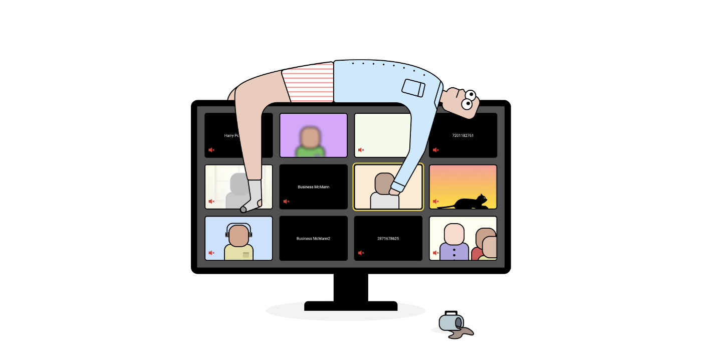
Most information has no perfect channel to be passed through–social media posts are good for advertising, but so are TV spots. Podcasts are good for storytelling, but so are novels. And, as it turns out, repetitive, expensive, and synchronous meetings are good for getting slack messages like this:

Effective design communication that creates actionable insights is built from one-part engagement and one-part perceived value. If you have information I need, but don’t present it in a way that makes me want to listen, I won’t care. If you have a great presentation but the information you relay isn’t valuable, I won’t learn anything useful.
Valuable + Non-Engaging = I don’t care
Not-Valuable + Engaging = I learn nothing useful
While looking at how our design meetings were working for us, our Communications Technology Design team at Workday saw that designers have a special aptitude for operating in the information-dissemination space: we have the creative skills to make things enticing, and an innate ability to understand emotions and turn them into insights.
This partnership of traits makes us especially valuable in communicating ideas in an effort to make things better (I mean, that’s how we got hired, right?).
Valuable + Engaging = I gain something I can actually utilize
Where We Were
Based on that examination of our ceremonies, we realized that the way we were attempting to communicate our design activities to the org at large was costing unnecessary time and money.
Our primary communication method was a bi-weekly cross-functional meeting consisting of about 2 dozen participants, ranging from Sr. Director to Jr. Individual Contributor. Turnout was always high and the conversations were usually engaging, so from the surface all seemed well.
Then, the cracks started to appear.
A few months in, we noticed people started coming into the meeting late, deep questions stopped being asked, laptops stayed open, and eyes became more glazed. Confusingly, we were getting feedback that the information we were covering was valuable and our presentations were always well prepared.
So, why the lack of engagement?
Well, if we break apart our formula from earlier, we can theorize that “engagement” is built from relevancy and convenience, and it was clear we did not have the latter dialed in. The value of the information we were passing was being counteracted by the context switching required to engage with the content.
To this point, we had not fully utilized the value of communication in Design and had stumbled backwards into a muddy triad of crap meetings:
“This could have been an email.”
Right people, but wrong forum
“Oh I missed that, can I retroactively add my thoughts?”
Right forum but wrong people
“This info isn’t pertinent to me.”
Wrong forum? Wrong people? Wrong info?
With opportunity staring us in the face, we regrouped to explore our options.
What We Did
To start, we held a feedback session with some Sr. org leaders to work out what could be done. To start, we defined what it was that we were trying to accomplish:
“Reimagine the way the org and Design communicate by disseminating information about Design activities, offering inclusion in the design process, and showcasing the connection of Design efforts to larger business objectives.”
Along with that definition, we also determined that the best manifestation of this idea would be scalable (no more “really, another meeting?”), asynchronous (no more “oh, I missed that”), and engaging (no more “I can’t keep my eyes open”). In short, we needed to level-up our communication skills.
We first looked to others in the industry to find out more about effective design communication and found example after example — like Neilson Norman’s Storytelling to Present UX Work and Jared Spool’s Combining Our UX Metrics With Compelling, Emotional Stories — about storytelling and its inherent ability to entice and engage.
Our team then spitballed ideas about how we could realize our goal through storytelling and determined that a video newsletter would:
- Let our viewers digest the information asynchronously.
- Allow us the space to create worthwhile content at scale.
- Enable us to effectively use our creative energy to create engaging content.
With the details of producing (I conveniently have a background in video production), cataloging (Google Drive), and presenting our content (Slack) figured out, we set up some calendar time and hit record.

Clearly David didn’t know we meant “Lisa Frank” when we told him this was a “Frank”-themed episode
After our boisterous first recording session, I edited down the footage, interspersed a few memes to add some lightness, and wrote a text breakdown of the video to post along with the actual recording. We posted the video on the primary slack channel for our org and we (well, maybe just me) watched our Slack notifications nervously to see what, if anything, peoples’ reactions would be.

Much to the chagrin of my inner critic, people were very into it.

Within a few hours, our post resulted in more engagement, more fresh ideas, and more questions about our Design happenings than we had ever received from our original meetings.
These are a few of my favorite reactions from that original post:

We also had multiple Sr. stakeholders reach out to show their support for the new method, we had design leaders from other orgs ping us to see how they could learn more about our process, and our management pushed us to cross-post the videos into other channels to promote the value of our org at large.
This level of enthusiasm validated that what we were trying out really was effective design communication.
What We’re Planning
In the 5 or so videos since our initial pass, we have learned how to:
- Properly budget our time by being more intentional with our pre-planning.
- How to level-up our content with engaging editing and videography.
- How to make the most of our time in front of people by including guest stars from outside the Design discipline.
With that, if you asked me if we have successfully “reimagined the way the org and Design communicate,” I would have to say, “not yet.”
While we may have a steady increase in viewers and much more engagement than before, we are still figuring out how we can most effectively leverage that audience to reach our goal.
For now, we must continue asking questions like, “how can we evolve the series? What is the secret sauce to engagement? How do we scale this beyond just our org and discipline?” and trust that through diligence and enthusiasm, we can create something great.
Through building this idea from the ground up, we have not only seen the power of Design as an open and inclusive domain, but we have seen that creativity plays a massive and oftentimes undervalued role in effective design communication.
The video newsletter is not the only way that our Design team is trying to get more creative and asynchronous with our communications. Below are a handful of ideas that are free and easy to implement:
- Have a long-form thought you want to pass off to others? Try Loom (yes Loom, but Zoom would also work!) to record yourself walking through your idea. We’ve used this to walk our direct teams through design iterations, unpack research findings, and more.
- Have a research readout that you want a large group of people to see? Try iMovieto splice together your findings, recordings from your sessions, and your next steps. We’ve done this frequently to enable people from all levels of our org to digest the findings on their own time.
- Working on a lot of designs at the same time? Try design cover pages like this Figma thumbnail kitfrom Joey Banks to help others keep track of your progress. We utilize our own version of this to help identify finalized items for PM and development and keep in-progress work out of the production stream.
I’ll end with a plea. To anyone reading this, if you’re even tangentially contributing to a meeting that has some of the negative side effects we experienced, change it! Push your team to explore more scalable, asynchronous, and engaging ideas to improve your meetings (your calendars can thank us later).