Save

Search is a fairly complex feature and this article does not cover everything there is to know about it. In this story, I will be discussing how to pick between the two most popular ways of using search on your application, search bar on the landing screen or search tab on the navigation bar.
Search for mobile apps
So many applications that we use on a daily basis have the Search feature. The way these applications implement search can be very different. But why is there a need for different implementations of the same feature? Is one better than the other? Let’s find out.
1. Search bar on landing screen
Search tab on the navigation bar
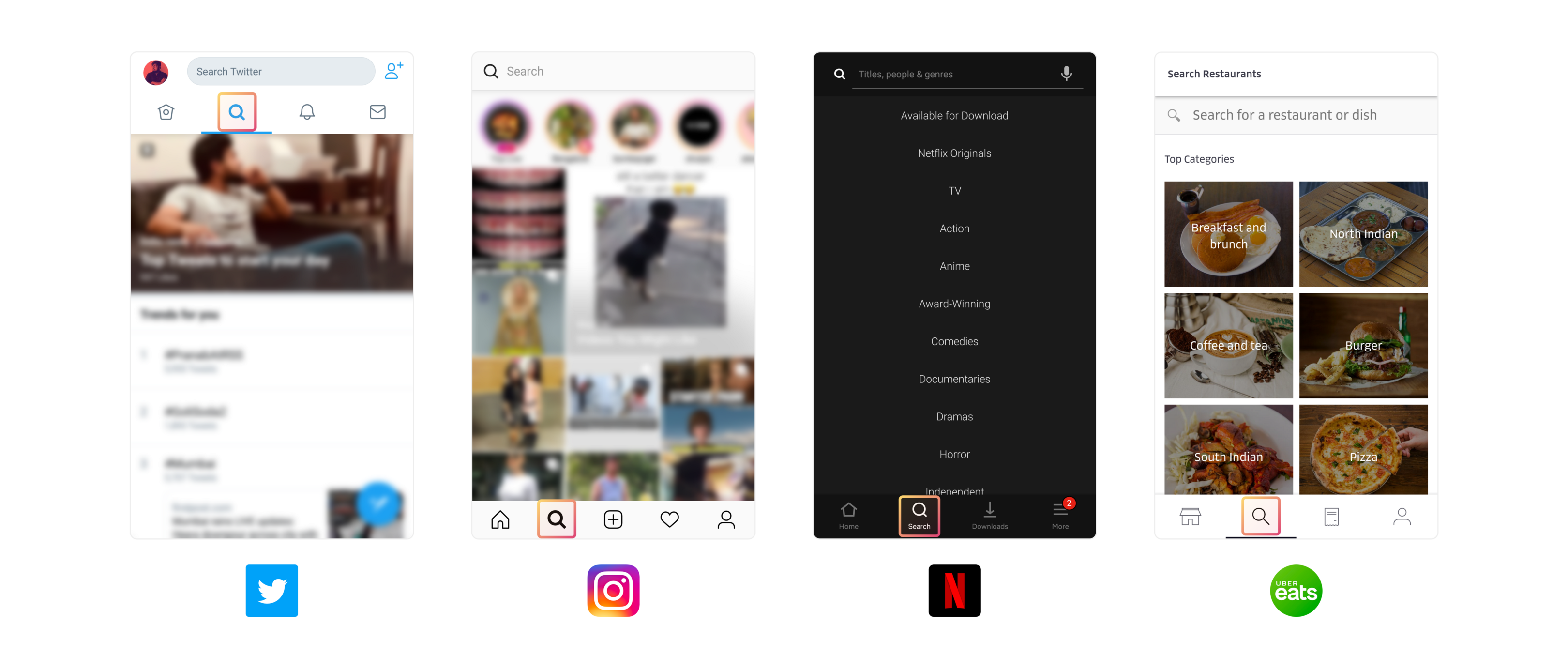
And here are screenshots of some apps that use search as a tab on the navigation bar. This Search isn’t as discoverable as the Search bar on the landing screen, but it is easily accessible considering that the users can easily reach it with their thumbs.
In this case, Search gets an entire screen for itself. This screen has a search bar on the top and the rest of the screen is populated with data that would either aid the user’s search or would help the user explore the content on the platform. This facilitates an exploratory search for the user who does not have a clear intention yet.
Bar or Tab?
Both the searches aid different intentions of the user. And that’s not all, both the searches also depend on the type of platform and the kind of content the platform offers.
Use a search bar on the landing screen when
- The user’s primary intention behind opening the app could be searching for something. For reference, have a look at Google Maps, Uber or Zomato. Most of the times people open these apps precisely to perform a search for a location, a restaurant or a dish.
- The user has a clear intention behind performing the search, as in the case of Facebook where users generally look for other users or pages. Most of the times they know what the name of the user or page might be, even if they’re not completely certain of how it’s spelled. For such platforms, it’s a rare possibility that the user only has vague information about the thing they’re looking for. And even if this possibility arises, there’s not much that the platform can do to help the user.
Use search as a tab on the navigation bar when
- You want to enhance user engagement by allowing the user to explore and discover new content on the platform. For reference, have a look at Instagram and Twitter. These platforms want the users to stay longer on the app, which is why they offer personalized content which is outside your network to help you discover new users or content that you might be interested in.
- The user isn’t sure of what they’re looking for and the app can guide the user in finding what they want. For reference, look at Netflix and Uber Eats. They allow the users to explore the app via the means of genres and cuisines. This caters to the user who knows he wants to watch a comedy show but isn’t really sure of which one he should watch.
Now, let’s look at Airbnb?
Airbnb
Airbnb uses a mix of both the variations. They’ve got a search bar on the landing screen and the landing screen is the search/explore tab.
Given the context of Airbnb I believe that it makes a lot of sense. By doing this they cater to two types of users — users with a specific destination in mind who would use the search bar (users with clear intention), and users who might not have a specific destination in mind, and are in the process of figuring out the destination (users who need kind of an exploratory search).
Conclusion
Both the variations have pros and cons. Both of them are suited for specific use cases. Going through all the examples above, we can conclude that there are two factors that determine which search to use — intentions of users coming to the app and the possible offerings of the app.
Special Thanks To
Tanvi Kumthekar and Shailly Kishtawal for the brainstorming.
Dhruvi Shah, Nisshtha Khattar, Preethi Shreeya and Prasanth Marimuthu for their constant feedback.
Designing Search & Browse at Flipkart. Ex Microsoft. Decently fat guy. Wears glasses. Has a beard. Bear hug expert. Loves food a lot more than he should.


