Save
Chapter 7: Using Animation for Feedback
Giving good feedback is imperative for good interface design. When something is happening behind the scenes — whether it’s fetching data or completing a request — it’s important to show that something is happening, or has happened, even if the feedback is that something went wrong along the way. Without feedback, users are left to wonder if their request was acted upon or heard at all. Good feedback keeps the conversation between the interface and user going during those unavoidable waiting periods.
The attention grabbing power of animation is one of the reasons that animation can be so useful for giving feedback. But that’s not the only characteristic of animation that lends itself well to giving feedback. The time-based nature of animation is also helpful for giving feedback in a useful and meaningful way.
Incorporating animation into the feedback mechanisms you design can help make them more timely and effective. In this chapter, you’ll see some examples of how animation can be used to improve feedback in forms, loaders, multifunctional elements, and perceived performance. There are lots of opportunities for animation to help step up your feedback game.
Animate Effective Error Messages
No one likes getting error messages, and an error message that’s too easy to miss is even more frustrating. The whole interaction around error messages can be stressful — both for the people who receive them and the people designing them. Using animation in the design of error messages can help make them stand out more easily, while also taking advantage of the dimension of time.
Stripe Checkout uses animation well in its error messages (see Figure 7.1). On larger screens, the whole form shakes with a brisk shaking motion upon attempting to submit the form when errors are present. This creates feedback that is very difficult to miss, and it also gives a nod to a common real-world motion of someone shaking his or her head “no.” It’s almost like the form is shaking its head at you.

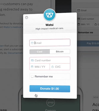

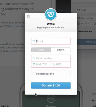
Figure 7.1
Stripe Checkout’s form animates to shake its head at you to indicate that one of the fields has an error. See the error animation in action in this video.
In Stripe Checkout, the shaking animation is paired with a red outline around the problematic fields to indicate where the error is. Animation is used as the primary indicator of an error, and the outline is the secondary indicator. Checkout continues to use animation to indicate form errors even on smaller screens, although it changes its approach slightly for the smaller space.
On smaller screens, red animated arrows appear in the fields that contain errors. The arrows shake back and forth in a similar manner to how the whole form moved on larger screens, and the arrows are outlined in red. In both contexts, a shaking animation and the red outline are used to indicate errors on the form. Using motion to indicate the errors, instead of introducing an error message that will cause the page layout to reflow, means that all the form fields are in the same place as when it was being filled out. Users won’t have to rescan the page, or the form, to find their place again.
You probably noticed that one of the other strengths of animation is at play in this example as well. The shaking animation contrasts with all the other animations in Checkout, which helps it stand out in the design even more and demand your attention.
For a slightly different approach to animating error message feedback, Crowdcast.io also uses animation for its error messages (see Figure 7.2). The motion used to present the error messages helps differentiate it from the orange focus outline used elsewhere in their form. Animating this feedback allows them to use the same space for different error messages while calling attention to the feedback by putting it in motion.

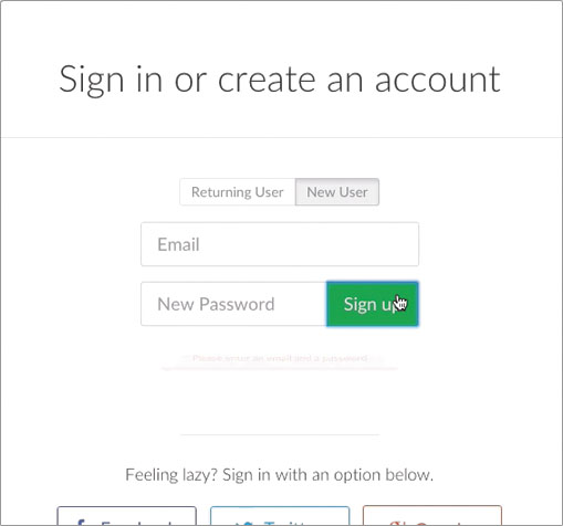
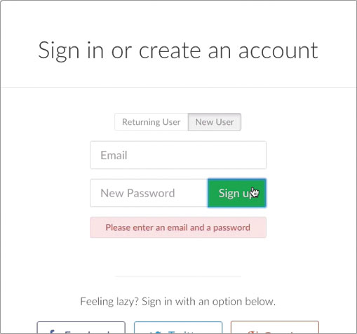
Figure 7.2
Crowdcast.io’s animated error messages. You can see them in action here
Visually Confirm Tasks Without Losing Your Place
Animating feedback can open up opportunities to provide feedback on interactions as they are happening without disrupting the entire interface visually. Small changes of state — even just within something like a button — can give added feedback on what is happening behind the scenes.
The Slides.com interface takes advantage of this in a number of places throughout its web-based interface. Their buttons often double as processing indicators or confirmation messages, one of which is the log-in button that turns into a loading indicator as you’re being logged in (see Figure 7.3). This helps to show that something is happening and that your button click has registered as loaders are meant to do — all with the elements that are already present on-screen.
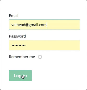
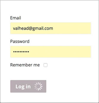
Figure 7.3
Slides’ log-in button animates to act as both the log-in button and the account loading indicator. You can see it in action on Slides.com, or in this video
Within the application itself, while you’re creating a presentation, you encounter similar kinds of animated feedback. The save button icon animates from a disk icon, to a loading spinner, to a check mark (see Figure 7.4). It indicates along the way that your data is in the process of being saved, and then confirms that it has been saved—all within the very compact space of the button you’ve clicked. The animations allow this button to have both multiple states and multiple functionalities.


Figure 7.4
By transitioning between these three states, the save button in Slides gives timely feedback as to the status of the current document and what is going on behind the scenes. See it in action in the video version.
Other buttons in the interface have multiple functionalities as well. That’s part of why these are so effective for Slides.com. The consistency with which they’ve chosen to give their animated feedback — in this case, through multifunctional buttons — makes it easier to know where to look for this feedback. As you use the interface more and more, you start picking up on these consistencies, which makes the behaviors of the app feel consistent and familiar to you over time.
Stripe Checkout provides similar feedback through its Pay button (see Figure 7.5). The Pay button animates from its initial state, to a loader, to a confirmation checkmark in order to indicate that the payment has been processed. This same behavior happens on both the larger viewport version and the smaller viewport version of the payment form for a consistent experience.


Figure 7.5
Stripe Checkout’s pay (or donate) button does triple duty as the button, loading indicator, and payment confirmation all in one place. See it in action in this video clip.
Loader Animations That Convey Progress
Loading animations is a common way to show users that something is going on in the background — that the machines behind the interface are working on something, and they’re not ready to show it just yet. These loaders are often animated, and are usually generic or nonspecific about the activity taking place — for example, showing a spinner or counting up to 100%. There’s an opportunity here to do something better for your audience. The more informative and customized your loader animations are, the more likely they are to create a positive experience for your audience. The more real feedback you can give, the more satisfactory the loading experience will be for all involved.
For example, Shopify.com has a very informative loader that appears when you set up a new account (see Figure 7.6). The loader animation consists of a few lines of text fading in and out as your new account is created in the background. Each line suggests a step that is taking place behind the scenes: “1 of 4: Creating your account” “2 of 4: Initializing your store.” These exact steps may not really be taking place as each line appears, and the loader may not truly represent how long it takes to create a new account, but neither of those things matter. What matters is that people waiting for this loader to do its thing feel informed and confident that what they have requested is happening. Plus, it makes for a much more pleasant waiting period — one that fosters a sense of anticipation instead of frustration or stress. The way the information is offered step-by-step, focusing on the progress, makes it seem as if the waiting time is shorter, which is an added bonus.
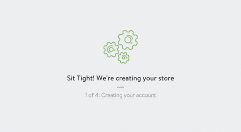
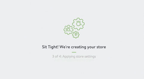

Figure 7.6
The loader shown while your Shopify account is created tells you what’s happening behind the scenes as you wait. Watch the full loading process in this video.
Contextually Fit Loader Animations, not Generic Spinners
Realistically, there are going to be times when you really don’t know how long a loading operation will take while things are happening in the background. Sometimes, it really is a sit-back-and-wait kind of situation, and there is no additional or incremental feedback available to share. In those cases, creating a custom loading animation, instead of opting for a generic loading bar or spinner, can improve the experience.
A customized loader can create added trust because it’s not the same generic spinner that has let you down a million times before. Anecdotally, as users of an interface, we’re willing to give a customer loader — one that’s new to us — the benefit of the doubt. If nothing else, a customized contextually appropriate loader animation will show a greater attention to detail and care put into the design of the experience.
The Sure Payroll and FreeAgent loaders don’t give any indication as to exactly what is happening behind the scenes or how far the task you’re waiting for has progressed, but they do provide an interesting and visually fitting indication that something is happening (see Figures 7.7 and 7.8). The calculator animation appears when Sure Payroll is processing a newly submitted payroll, and FreeAgent shows the numbers jumping into a box while you export your user data. Both of these are much more enjoyable to encounter than a generic spinner, even if they don’t actually provide more information than one.


Figure 7.7
Sure payroll’s loader animates sums on a calculator while it calculates your totally payroll costs. Watch the video here to see it in action.


Figure 7.8
FreeAgent’s custom designed loader shows numbers jumping into a box as you wait for your user data to be exported. Watch the video version here.
In my years of designing websites, I’ve always felt that custom loaders made for a more satisfactory experience, but it was never something I looked into beyond that gut feeling. The folks at Viget, on the other hand, have done a small study on loaders and came to some interesting conclusions. Their small experiment found that participants were more willing to wait for custom loading animations than generic loading animations. And participants were even more willing to wait for loaders with novel and engaging animations. Those are some interesting results! There are many other contextual aspects — especially user context — at play for any given loading situation than could be accounted for in this experiment. But overall, this experiment supports the idea that investing a little time into creating a customized and interesting loading animation will pay off with positive benefits to the user experience.
Another recent piece on loading animations confirms that the topic of loading animations is often more nuanced than you might initially think. In the article The Psychology of Waiting, Loading Animations, and Facebook, Rusty Mitchell suggests, based on findings from Facebook’s research, that when load times are very long, generic spinners cause users to blame their device for the slowness, not the app that is being slow. While very intriguing, that finding brings up more questions than it answers with so few details available about the actual study it stems from. The main thing it suggests is that there is a limit as to how long users will wait, regardless of how informative or well designed the loader animation is.
Make Waiting Go by Faster
One of the often overlooked benefits of animation’s use of time is that you can use it to make waiting times seem to go by more quickly (see Figure 7.9). An animation can’t exist without taking up time, since time is part of its very definition. When you take animation and use it where you essentially have time to kill, it can have positive results. Filling up time that would be there anyway with an informative animation can make that time seem to go by faster, thereby improving the perceived performance of load times and other unavoidable waits.
Instances where additional information needs to be fetched from the server, data requires processing, or similar behind-the-scenes activity needs to occur are perfect opportunities to use animation to fill that time in a meaningful and useful way.
Showing skeleton content while content is being loaded can make it seem like things are loading faster. A study from the VTT Technical Research Centre of Finland found that showing a hint of content was perceived as faster by users when compared with a loading spinner animation. The main findings of the study indicate that the sooner you show some hint of the new content, the faster the load time is perceived to be. Findings like these are likely why we’re seeing skeleton content used more and more instead of generic loaders, or in conjunction with loaders, in many sites and applications. Luke Wroblewski came to similar conclusions based on his work on the Polar app, suggesting “Skeleton screens are another way to focus on progress instead of wait times.

Figure 7.9
Facebook uses animated lines and squares arranged in a way that suggests the content is arriving soon so that load times will be perceived as happening faster.
Both the research on loading animations and the potential perceived performance gains are very convincing evidence to consider designing a more creative loader solution when wait times must occur. A more creative solution that hints at the content to come, could mean the wait times are perceived as taking less time by focusing on the progress being made.
Whether the behind-the-scenes progress is known or unknown, loading time gives you an opportunity to show that you care about your users when you design the animation well. Designing the details in these situations can go far toward earning your users’ trust and patience. The same applies to all the feedback examples discussed in this chapter. These points of potential mistakes, errors, or waiting are chances to shine with your attention to detail and transparency.
Staying on Point
Animation can help make feedback better by:
- Animating effective and attention-grabbing error messages.
- Visually confirming behind-the-scenes tasks in context.
- Animating meaningful loading indicators.
- Providing an early hint of content to make wait times feel shorter.
If you are interested in reading the rest of the book, you may purchase it at Rosenfeld
Val Head
Val Head is a designer based in lovely Pittsburgh, PA. Her work ranges from projects on the web to interactive installations to print. She is the author of The Pocket Guide to CSS Animations, teaches CSS Animations on Lynda.com, and hosts the All The Right Moves tutorial screencast.
You can find her on stage speaking at events like An Event Apart and encouraging others to do the same as the co-host of the Ladies in Tech podcast. She also co-founded the popular Web Design Day conference, and leads workshops around the world on Interface animation for the web.


