Save

The Client
Smart People, Inc. is an education company offering in-person language courses to teenagers. Their main attraction is a summer camp where students partake in collaborative activities to learn English or Spanish as a second language. However, many students are unable to attend the summer camp due to cost and time reasons but still want to access the curriculum. As a result, Smart People, Inc. wants to offer an online learning platform to students that cannot attend the summer camp in person.
Competitive Analysis
Analyzing the space that Smart People, Inc. was trying to enter, there seemed to already be a large number of competitors that dominated various areas of the Online-Learning-Platform Market.
A few dominant companies stood out:
– DuoLingo is a language-learning platform focused on gamification
– MarcoPolo is a STEAM-focused platform also utilizing gamification
– Lynda utilizes traditional video lecturing to teach technical skills
– GoFluent utilizes video lecturing to teach business skills
– Tandem is an app linking native language speakers through video chat
– Preply is a private tutor platform
In order to accurately gauge what area of the market Smart People, Inc. should enter, I ranked these six companies using a Market Positioning Chart.
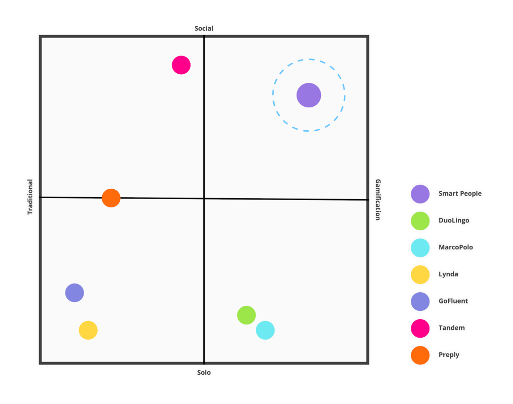
Based on the competitors’ business models, I was able to segment companies based on two variables, Traditional vs. Gamification and Social-Learning vs. Solo-Learning. As is visible from the chart, there is a huge gap in the market where Gamification and Social-Learning collide, and as such, this is the “Blue Ocean” that Smart People, Inc. should target.
User Research
With only about a day to gather insightful data about the exact consumer that Smart People, Inc. should target, I set out to learn as much as I could. I focused my research on teenagers’ relationships with the following: learning during school, learning through online platforms, and learning a new language.
Quantitative Data
Below are some of the prominent statistics that really capture teenage sentiment:
– 36% of teenagers sited boredom as the number one reason they disliked school
– 90% of teenagers don’t complete all their online coursework
– 40% of teenagers think learning vocabulary is hard
Qualitative Data
After interviewing a few teenagers, the following quotes really stood out:
– “I just don’t know why I need to learn Spanish. I’m never going to use it.”
– “We just end up texting or snap chatting when we’re stuck on a problem.”
– “Just black text over a white background.”
– “If I get stuck, there’s like no one to help me. It’s a lot of extra work.”
Data Synthesis
Feeling confident in my research, I dissected and organized it using an affinity map. From the map, I pinpointed recurring themes and defined the target users’ pains and gains.
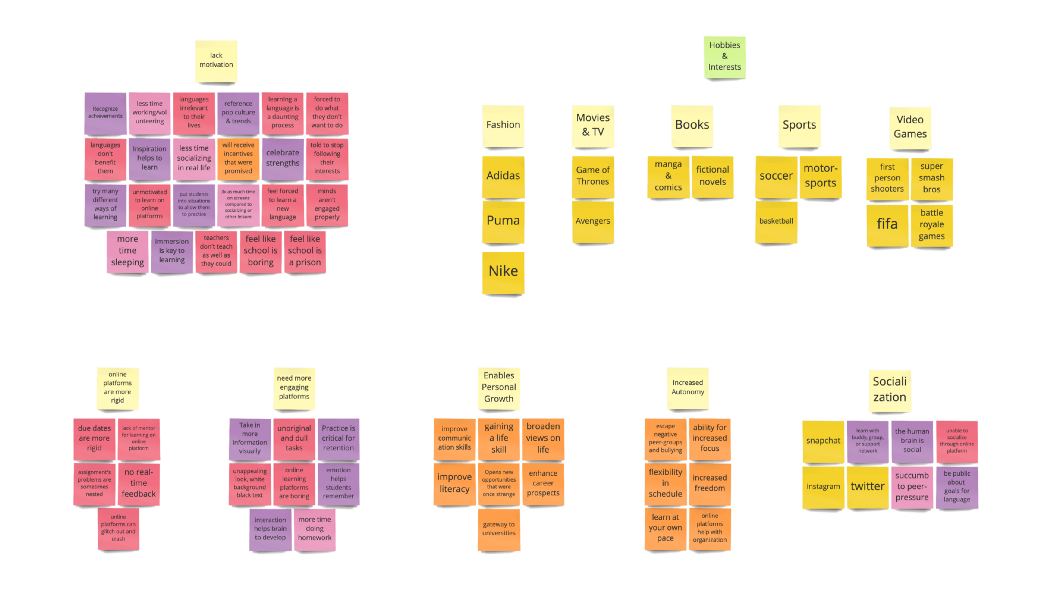
Pains & Gains
Top Three Pains:
– Learning a Language is Daunting & Irrelevant
– Online Platforms Lack Social Connection
– Current Learning Methods Lack Engagement & Stimulation
Top Three Gains:
– Languages Enable Personal & Career Growth
– Online Platforms Allow Greater Autonomy
– Working Outside of School Allows Increased Focus and Organization
User Persona & Their Journey
The picture that the research painted really brought to light how unmotivated the average teenager is when it comes to both school and learning languages in general. They love to hang out with their friends (whether online or in-person), play video games/sports, and watch “TV” (Twitch/Netflix/YouTube). By contrast, they find school boring and think languages are both difficult to learn and irrelevant to their lives. From this, I crafted my persona, Demotivated Dean.
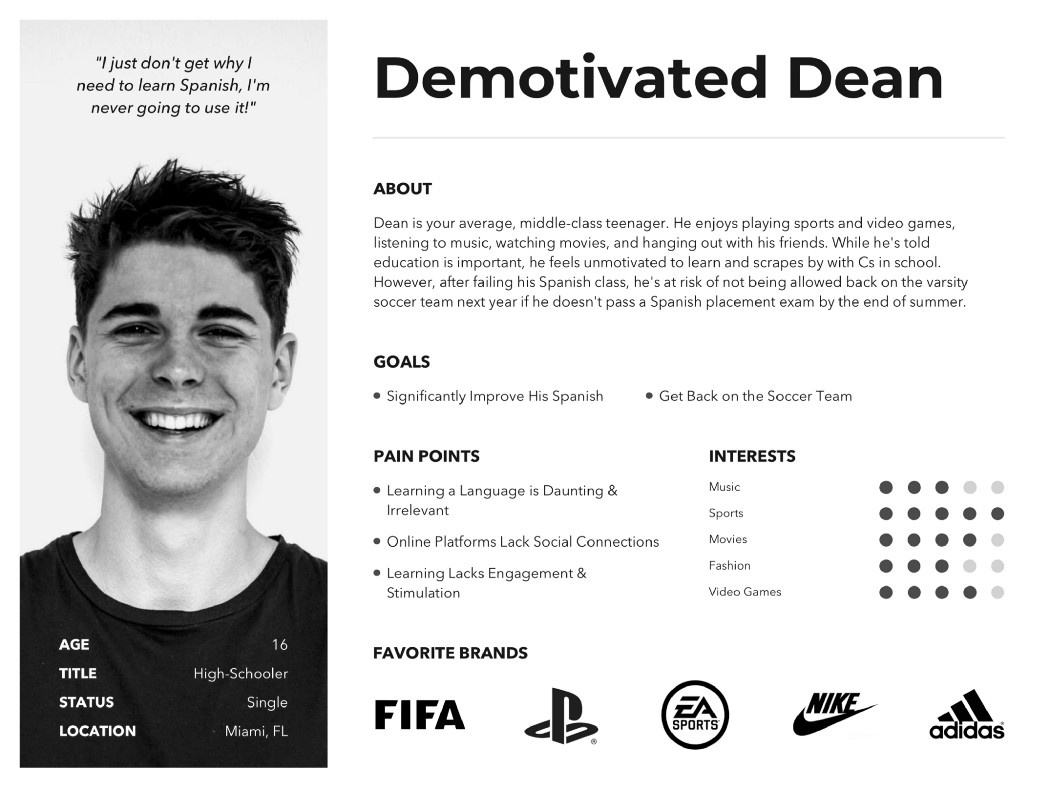
After bringing Dean to life, I put together a User Journey Map. To do so, I honed in on the data to see what an average school day looks like for Dean. I made sure to focus on his pains to really imagine what he feels while he’s sitting in class bored or struggling to finish his homework after school.
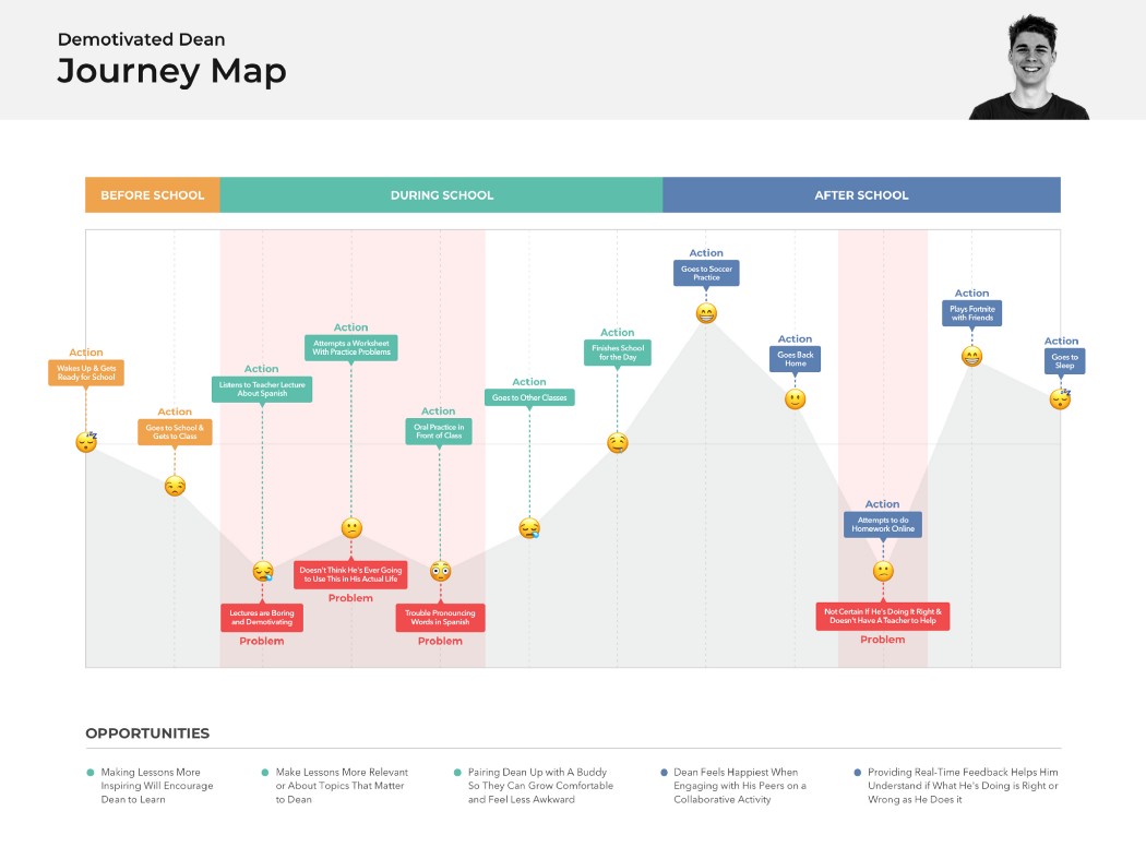
After breaking down his daily struggle, it became a lot clearer where the opportunities for design were. This leads me into ideating how the new platform could truly help Dean.
Ideating on Possible Solutions
My ideation session began by reversing Dean’s pains and turning them into How Might We statements. I then used these to come up with different ways to aid the specific issues.
- How might we help unmotivated teenagers feel more engaged and stimulated while learning
- How might we help unmotivated teenagers feel less overwhelmed while learning a new language?
- How might we help unmotivated teenagers create a social connection over online learning platforms?

After producing about 15 or so ideas for each statement, I then began grouping them into related topics. This gave me a list of possible features that I could include in my online platform.

While many of these features offer different forms of value to Dean, I set to weed out the most valuable ones. I did this by organizing the various features using the MoSCoW Method.
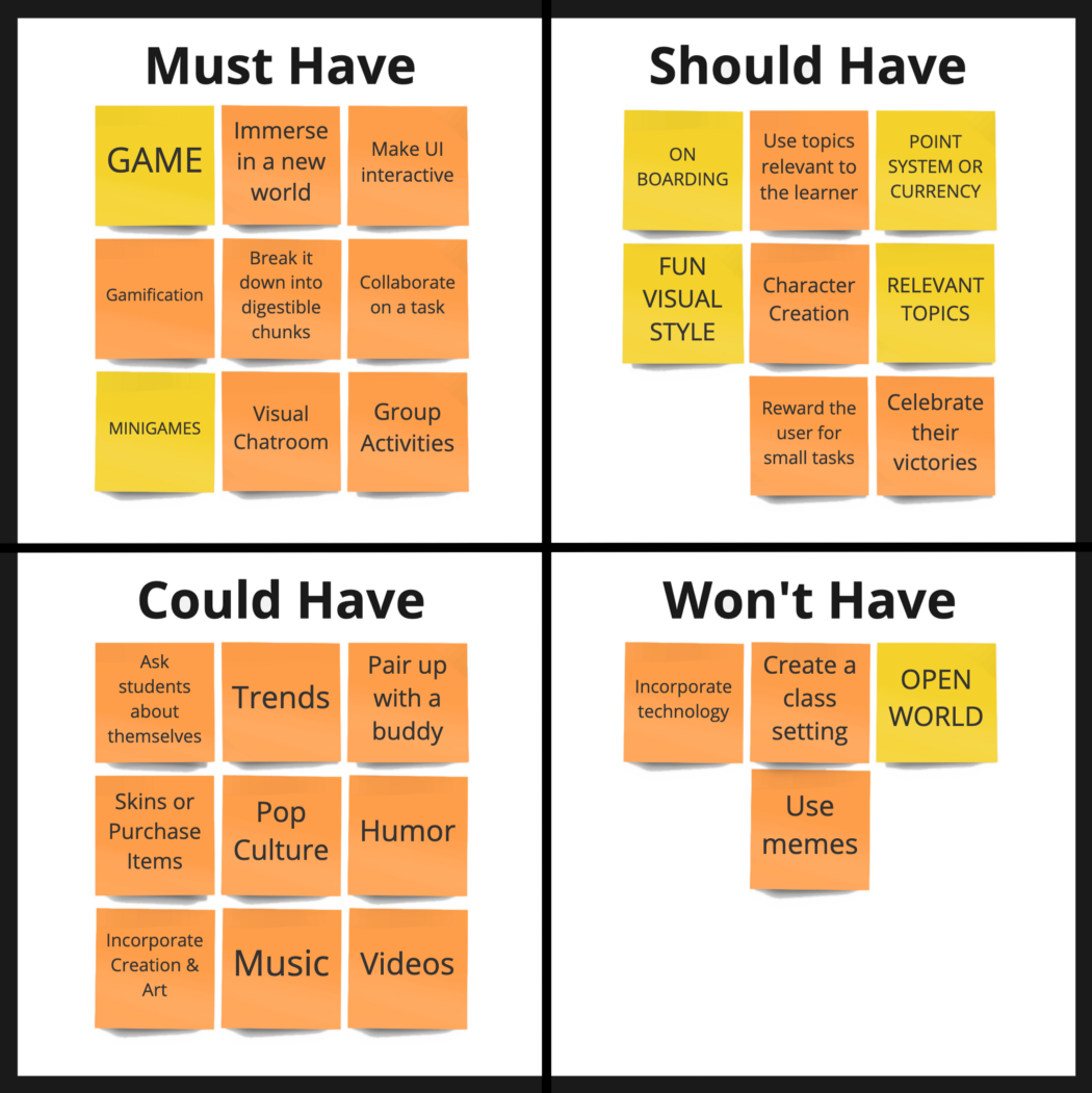
Considering that the biggest pain point was a general lack of engagement and stimulation, I judged gamification as the feature that offered the most value, followed by social interaction.
My Proposed Solution
As is visible from the data, schools and traditional online learning platforms are failing to engage teenagers. As a result, they aren’t motivated to learn, much less learn a new language, which they find irrelevant and daunting.
As a side note, gamification is an educational approach to motivate students to learn by using game elements in a learning environment. Its main benefit is that it maximizes enjoyment and engagement by captivating the student and inspiring learning. Tying this in with the social and competitive aspects that teenagers already seek, it seems a fitting solution to Dean’s struggles.
Thus to create an online learning platform that actually engages and stimulates teenagers to learn a new language, I propose an immersive game world where the user learns through collaborative mini-games and exploration over various levels.
Mapping Out the User’s Interaction
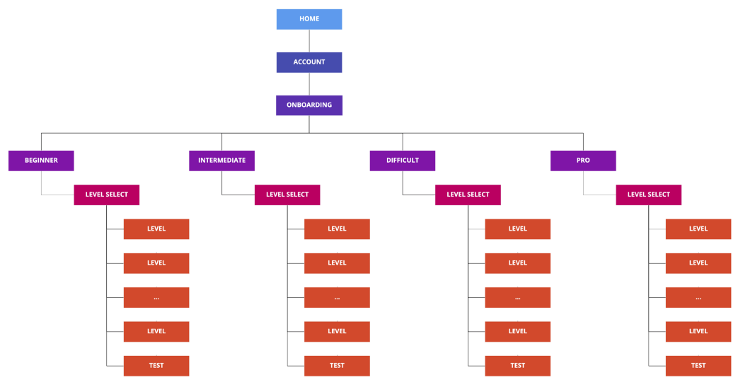
Running with this idea, I laid the groundwork in order to bring it to life. I began by constructing the Site Map in order to visualize how the level-structure would work. I then mapped out the User Flow for the user’s interaction from the moment they log in to the moment they complete a level.

Sketching Out & Testing the Concept
Relying on the Site Map and User Flow, I sketched out Lo-Fi wireframes of the product.
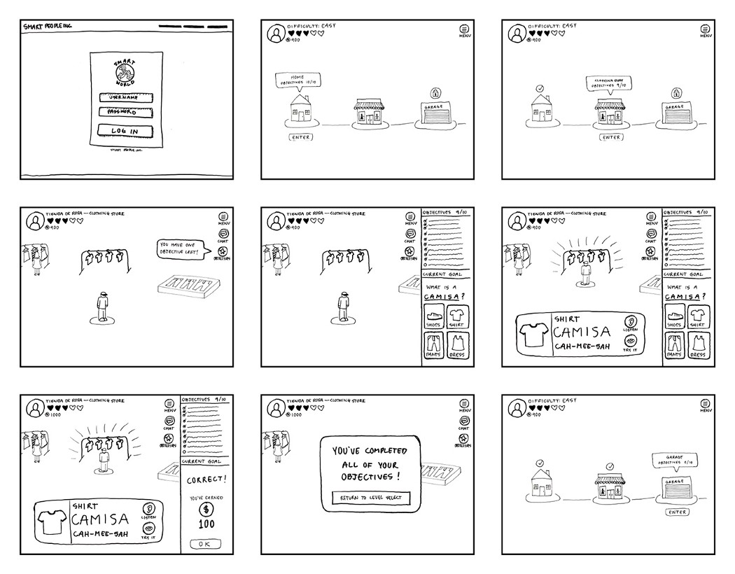
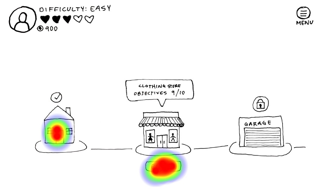
To help me catch some of the usability errors, I prototyped the hand-sketched wireframes. I then imported them into the maze.design for heating map the different screens, and capture other data. Altogether, I ran five tests.
The testing was comprised of three tasks:
1. Login and select a level that has not been completed yet.
2. Find out what your objective is and find the required item.
3. Complete the objective and return to the level select screen.
During the testing, I caught two major issues. The first occurred early on, as 2 out of the 5 testers had difficulties easily identifying incomplete levels. They were confused by the inconsistent check-marks and vague wording.
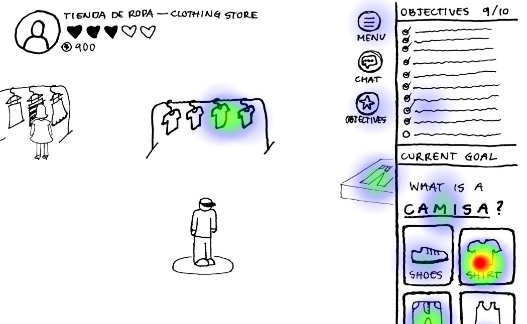
The second and more impactful issue happened during the second task. Here all five testers either hesitated or were downright confused by what they had to do. Instead of reading their objective and returning to the game to complete it, they were instantly trying to guess the answer and would ignore the exploration portion of the game.
Mid-Fidelity Wireframes
Focusing on the new data insights, I made some changes to the design when making the Mid-Fi wireframes. I cleared up the confusion with the checkmarks and vague wording on the level select screen, as well as tweaked the game model to make the objectives (now called goals) less quiz-like and instead added a quiz at the end of the level to compensate and ensure the users are learning.
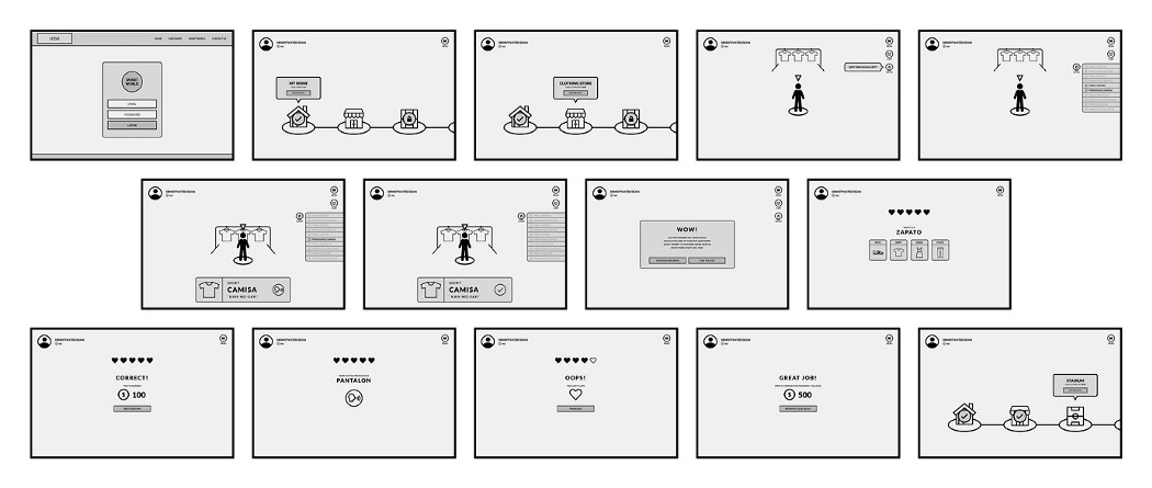
The mid-fidelity prototype can be viewed here: https://invis.io/DNRMVKJSARP.
Next Steps
From here, I would like to continue to test the interaction between the game world and the user interface, making sure that they flow together whereby the interface boosts the experience of the game and doesn’t fixate the user. In addition to this, expanding the functionality to include mini-games and user collaboration would be optimal to the goal of the product.
As the game continues to develop, I would measure the time it takes users to complete each level’s goals to make sure the goals aren’t too time-consuming or ineffective at teaching. I would also measure whether or not the quizzes at the end of each level can be passed within a reasonable amount of attempts.
Alvaro Gil
I’m a human-centered designer with years of experience in visual design. I thoroughly enjoy bringing products to life, starting with people’s needs and ending with stunning interfaces that are as impactful as they are a joy to use.


