First off, accessibility is tackled at the design stage.
For my engineering or product friends in the audience, this statement is not meant to deter or depreciate any effort that takes place in other sects of product development. Rather, it means if we think about accessibility from the start, we allow ourselves the opportunity to reduce development time, safeguard our company from legal trouble, and create something fundamentally more usable.
The way that we in Workday Productivity Technology (an arm of Workday that creates software that allows people to analyze and manipulate their company’s Workday data) think about accessible designs is through lenses. Each lens offers a perspective that relates to peoples’ physical and psychological capabilities.
So, if a design is a means to communicate something, then each lens provides a discrete connection to a user’s physical or psychological abilities. How these lenses are utilized (or not) by designers directly affects retention, task effectiveness, delight, efficiency, and more. The lenses we consider in PT Design are:
- Animation and Effects
- Color
- Keyboard
- Audio and Video
- Controls
- Font
- Images and Icons
- Layout
- Material Honesty
- Readability
- Structure
- Time
While all are important to consider when designing, in this article I will be diving into our experience looking through the lenses of animation and effects, color, and keyboard.
Animation and Effects
Who doesn’t love a good blip, swoosh, or zip? Animations provide context, help orient people, and visualize brand spirit. The only problem is, when designed improperly, people seeing the animation could misinterpret its meaning, ignore it as fluff, or undergo physical reactions like headaches, projectile vomiting, and even death. (Yes, your animation could kill people!)
Stepping away from this dark underbelly for a moment, when done correctly, animation can make a product more accessible and more usable.
Consider the example below:
Our team had a feature where we needed to enable someone to remove a UI element from the screen, and then somehow re-access it. We chewed on the problem, prototyped, iterated, and came up with a solution we thought covered all fronts. The proposed solution was: when a person hovered over the element a “Dismiss” button would appear where they could then dismiss the element from the screen and move it to the header. The happy path looked like this:

Made sense to us (at the time)
Unfortunately, as soon as we sat down and tested the idea, we knew we had not covered all fronts. The path most participants took looked like this:

Panic! At The Prototype
Participants expressed that they understood they had removed the UI element from the screen successfully, but they had no idea “where they put it.” Instead of looking in the global header for the UI element, participants would navigate off course or completely give up.
The mental model that we envisioned did not match that of our participants. Our idea had start and endpoints that were physically disparate, and we were not closing that loop. We needed a way to connect the dots. Lo and behold, animation came to the rescue.
On dismiss, we animated the element in a flowing path from the bottom right to the header and added a pulse around the landing spot to solidify the element’s new position. When designing the interactions and visuals, we continuously referenced the World Wide Web Consortium (W3C) guidelines on Animation to ensure a usable and accessible animation.
The revised path looked like this:

Ah…understandable and accessible
We then tested the prototype with the “dismiss animation” to a vastly improved result. Participants were able to easily track the element’s transition and knew precisely how to re-access it. We made the product more accessible and more usable with one adjustment. We learned that if the starting state is clear, and the end state is clear, animation can help communicate the relationship between the two.
Questions we learned to address:
- Expectation: Will users know exactly what will happen before they interact with an element?
- Understanding: Will users know exactly what happened after performing an action?
- Animation: Are we animating because it is pretty or because it is helpful?
- Adverse Reactions: Is there any aspect of this animation that could cause physical or psychological harm?
Lens of Color
As designers, we shouldn’t feel guilty about being enamored with the latest subtle, off-pink pastel of the week. What we should feel guilty about is using it prominently in our designs when approximately 300 million people will not be capable of seeing it.
Color blindness or Color Vision Deficiency (CVD) affects approximately 1 in 12 men and 1 in 200 women in the world. When designing with color as a primary tool, we need to be intentional about how those colors will be interpreted by people with visual impairments. We’re talking about roughly 5 percent of our users.
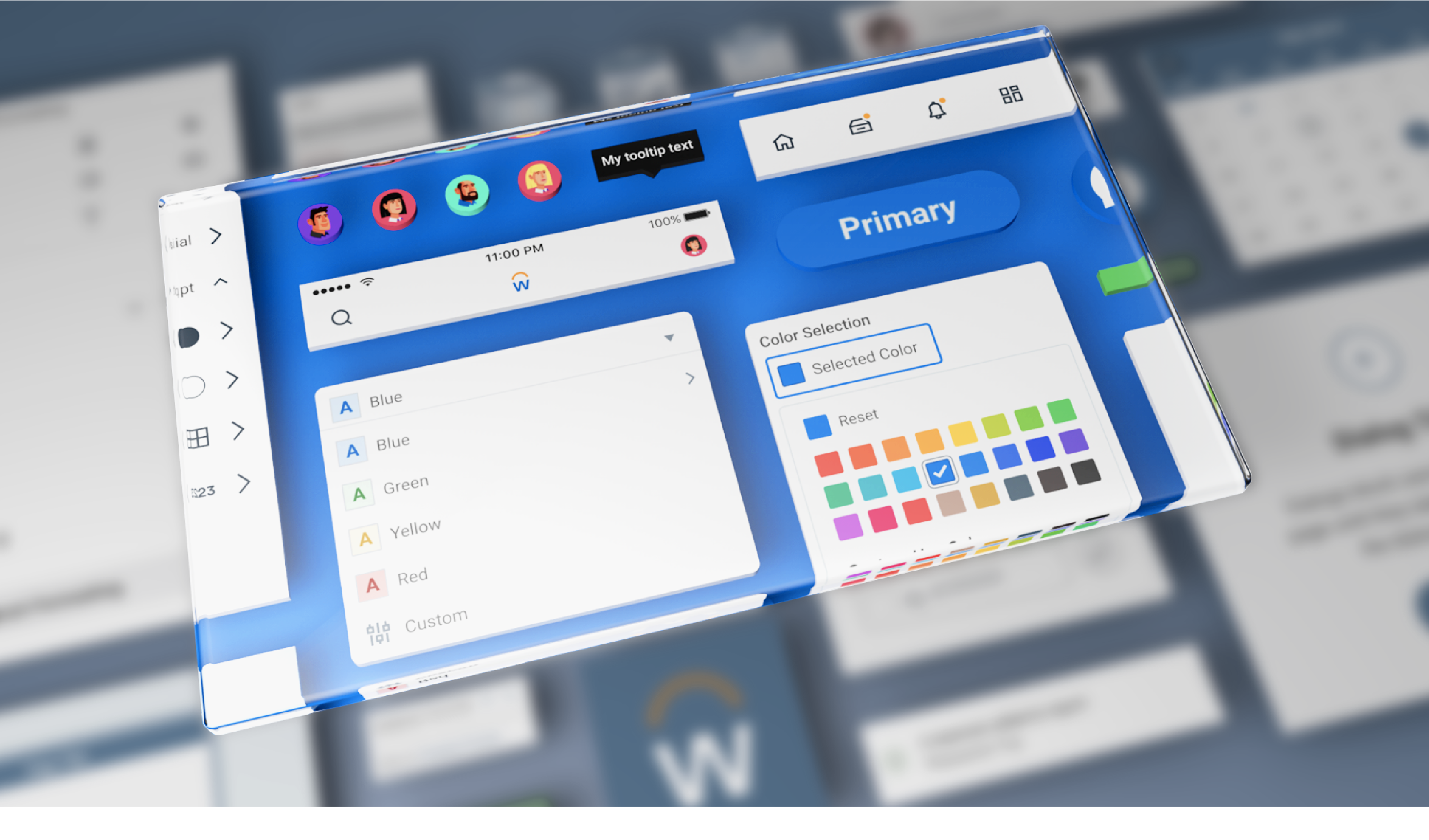
Consider our common Workday colors displayed with their CVD counterparts:

Spectrum of CVD types and the percent of the population they affect.
As with everything accessibility, context is king. In areas where a user’s comprehension of a set of information depends on color, we viewed the information through the various CVD lenses.
For example, we used a charting exercise to measure how our data visualizations stood up to a color-blindness test. We gathered some common pairings and looked at how they performed using the Figma plugin Color Blind. Consider the orange-green-blue pairing below. We could see several instances where paired visualizations were nearly indistinguishable from each other.

An unruly concoction of color-contrast and color-blindness tomfoolery
This exercise had uncovered issues for deuteranopia, protanopia, tritanopia, and achromatopsia vision types. So, returning to our color options, we developed a scheme that would allow us to produce the most amount of contrast between successive elements in a data visualization for all types of visibility.

Updated color pairings = upgraded understanding
We came out of this with improved default color settings for our charts in a way that would increase accessibility. Along with that, in order to make sure that color was not the only defining feature of a visualization, we developed new text styles and layouts with visual markers to help further distinguish unique elements.
Questions we learned to address:
- Meaning: If we removed the color from this element, what would be lost?
- Color: Is color the only distinguishing factor of an element in the design? Does this impact understandability if it’s viewed through a CVD lens?
- Readability: Does every color combination pass the 4.5:1 color contrast ratio?
- Understanding: Do we have any color pairings that could confuse if viewed through a CVD lens?
Lens of Keyboard
Ever had your magic mouse die and you were forced to use your keyboard to navigate around your screen? Same.
Thankfully though, an experience like this enlightened me to the news that one of our PT products had no focus states (visual or interactive) which made navigating the product via keyboard nearly impossible. Consider the component below:

Where am I…
Of the 6 interactive elements, can you guess which one is in focus?
Fun fact: it’s the “View Reference”button. Since PT sometimes builds custom components outside of Workday’s design system Canvas, we had built this message container using <div> tags and not <button> or <link> tags.So even though the “View Reference” link is interactive, a user would never know it.
To address this oversight, we specced out states for all of our interactive elements according to Canvas guidelines and sat down to implement.

Our canvas standard visual focus states applied to our Text Button.
We set out with an objective to increase usability by utilizing the new “state” designs and increase accessibility by shifting our HTML semantics to <button> or <link>.

You get a focus state, and you get a focus state…
After we implemented the new semantics (and corresponding visuals), the component became accessible via the keyboard alone. Again this gave us a better shot of connecting with everyone’s unique physical and psychological capabilities. Along with this navigation upgrade, we got the chance to add more obvious visual styling to the interactive component at large (accessible design for the win, again).
Questions we learned to address
- Navigation: Do all interactive elements have interactive tags allowing a keyboard to access them?
- Visuals: Does a keyboard-only user always know where the focus is on the page?
To wrap up, a few notes:
- Everyone’s capabilities are unique; therefore, everyone’s experience interacting with the world is unique. Consider each lens when creating something that might be interpreted in different ways, depending on a person’s physical and psychological capabilities.
- Starting with an accessibility-minded approach to design, engineering, and product will ultimately save you time, money, and headaches.
- Testing accessibility-based decisions for yourself is a great step. But getting your products into the hands of people with varied accessibility needs is the best way to measure if something works.