Buttons are one of the main UI elements in interactive design. Some of the more complex interfaces can have hundreds of buttons on a single website. Most businesses measure their success by button clicks. So it’s crucial to communicate to the user how a button works and where it’ll lead them. Over the years, our design system has fine-tuned the craft of our buttons.
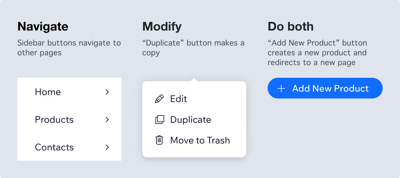
Buttons allow users to control the product and achieve their goals. It can help them navigate the interface, modify content or both.
Principles
As Google explains, a good button design follows 3 principles. It must be Identifiable, Findable and Clear. We keep close to these principles at Wix.
Making a button clear
A button must clearly communicate what it does, with zero space for interpretation. Text is the primary element that explains intention.
Of course, you can include an icon which helps to identify and understand the context. But without any text, it’ll lack full meaning. The text is a promise of what exactly will happen when that button is clicked.

Sometimes buttons need to include multiple messages, where the text and icon can even have different meanings.

Case study
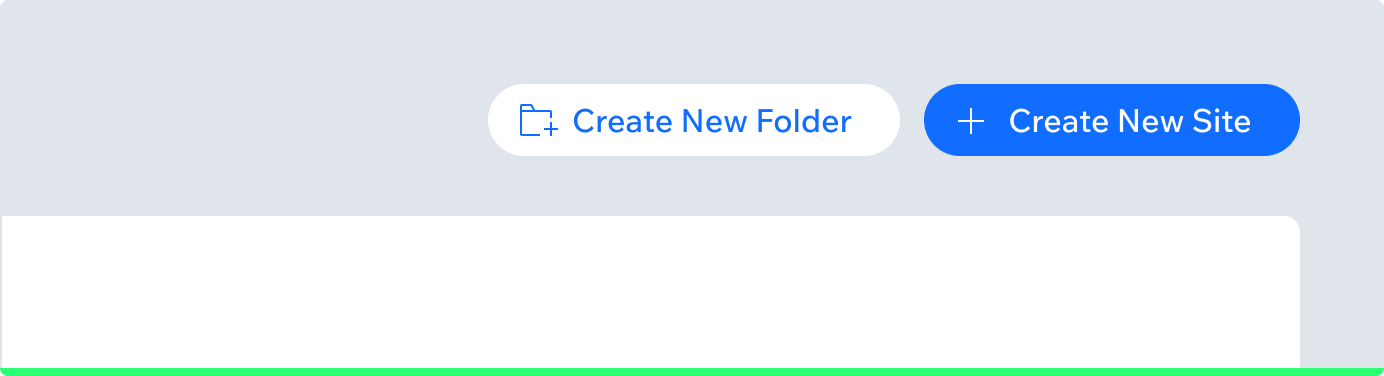
In 2019 the OS Team at Wix decided to change the button hierarchy. When we first launched, our design system had buttons with text only in our primary CTAs. Any secondary CTAs we had on the page were indicated with just a button — no text. After our update, we turned all our icon-only buttons into text or text + icon buttons. This small change led to a huge increase in click rate for “Create New Folder”. The top bar actions next to the primary CTA got more exposure too.
This visual comparison shows how the upper layout won the test against the bottom layout:

Making a button findable
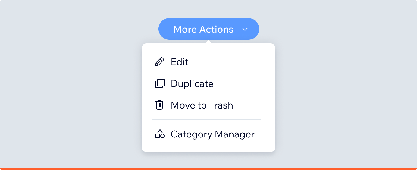
Actions must be located where users expect to find them. The main action must always be visible and positioned in the top area. Navigation actions can look neutral but also must be visible. Only the least important actions that don’t affect the main path (e.g. “delete”) can be hidden under popovers.
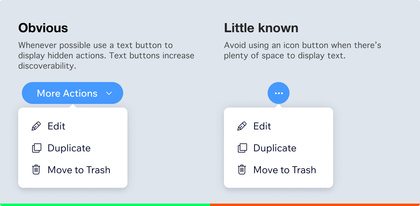
Avoid placing tool actions with navigate buttons in the same list. Users might not expect to find buttons that are out of context.
Making a button identifiable
Users must easily understand which interface parts are static and which are clickable. Wix uses blue color for all major actions. Lighter blues can be used only as the button’s background color.

In some cases, like on colored backgrounds, the blue color can’t be used due to the contrast. Then, text, contrast and shape plays the major role in making the button look recognizable and distinct from the rest of the environment. Following Web Content Accessibility Guidelines helps to provide a good text contrast, so the majority of users will be able to read it.

Text
Text is the primary element that explains the button’s intention. It should be clear, predictable and simple. Start with a verb to encourage action. Verbs must tell the user what happens once a button is clicked so they can predict the next step. Use simple language that will be recognized by any age group.

Case Study
Wix’s Photo Studio Team performed an A/B test which showed that users engage more when buttons are displayed with text. The application tested three layouts; icon only, text below the icon and text on the side. Versions with text won the experiment.
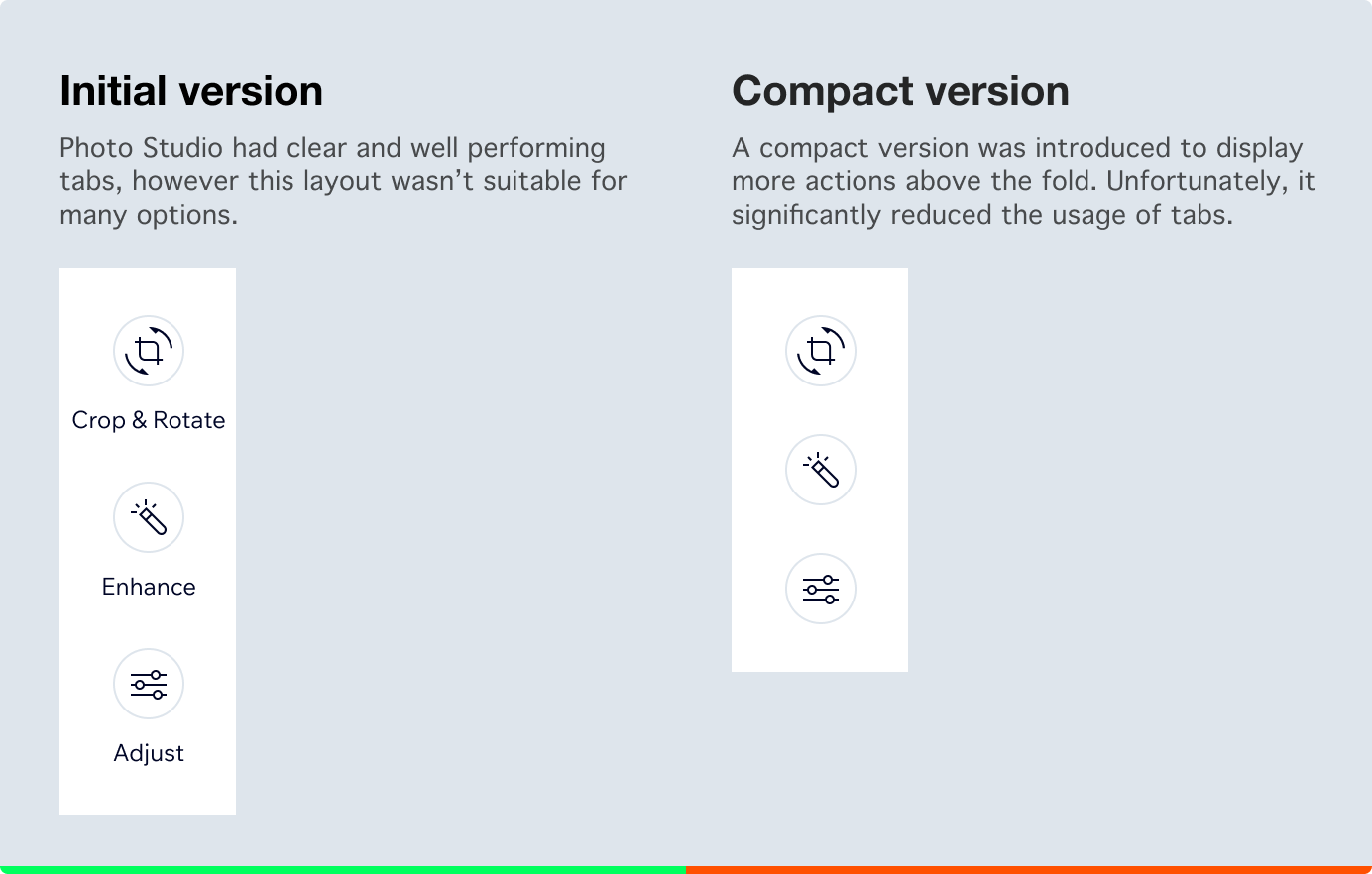
After a failed test, the layout was reverted to the original.

This study showed that text plays a crucial role in making buttons clear and actionable.
Text in context
A button’s text should reflect the context. Make sure the user is aware what action is available. For example, alert modals appear fast and change the layout. Therefore, the potential actions must be very clear.

In modals that just state the facts, like “Success” or “Two users can’t edit at once”it’s ok to use less descriptive buttons such as, “Got it, Thanks”.
Icons
Icons help users understand the context. However, icons can often be misinterpreted. Icons don’t encourages users to take action in the same way text does. For this reason, you should use single icon buttons with caution.
Icon buttons work great for professional tools where a user will regularly click buttons and memorize them. Placing icons next to a button with text will increase the chance of being noticed by users.

Case Study
Side navigation testing showed that Wix users engage more with drill-in buttons that have arrow icons.
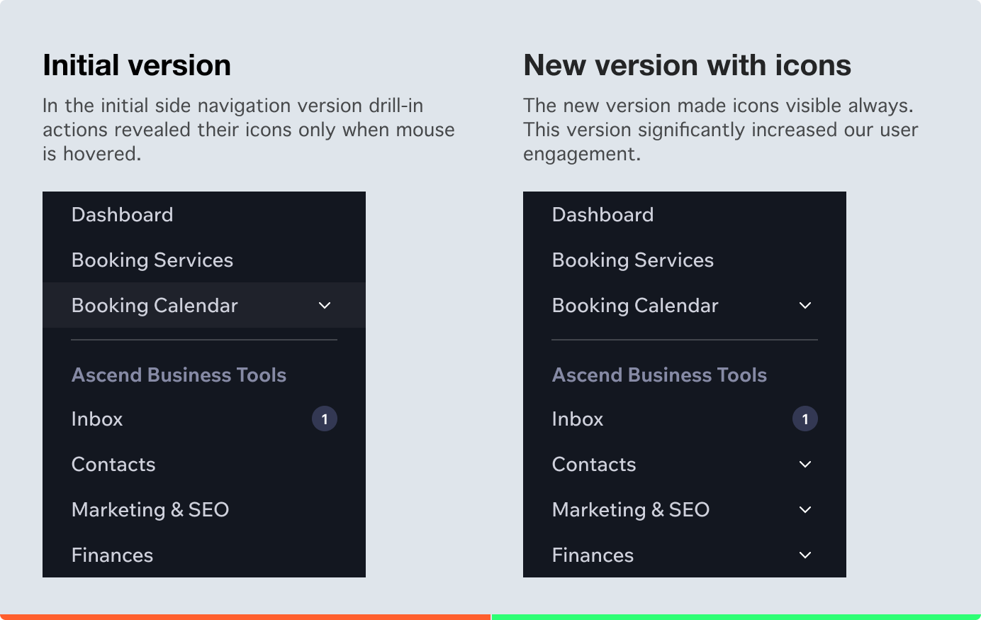
This study shows how text and icons can give additional context when used together. This helps users understand what buttons leave the page and what buttons display more options.
Hierarchy
Applications tend to have multiple actions. Some actions are always used, others just occasionally. Not every button needs full attention but all buttons must be discoverable. A good hierarchy means every action will be discovered easily when needed. There are multiple techniques on how to create a good hierarchy.
Placement
The most important actions must be put in the most visible area; at Wix it’s the top of the page in the right hand corner. The lower the button, the less discoverable it’ll be.
In languages written left to right, users start to read from left, that’s why it’s good to display the main call to action last on the right side. Users can take an action once all options are already presented. According to psychologist Herman Ebbinghaus the first and last elements in a sequence are the easiest to memorize. This tendency is called the serial position effect and it’s used in UX design.

Emphasis
All buttons must be recognizable actions. Use emphasis to achieve that. Note that not every button must be emphasized at the same level. A single page should have only one main action. Other actions should be secondary or tertiary.

Style
Each button can have a style based on its own intention. A set of styles creates a design language which customers use when working with an application. There can be a different style for general, navigation, social share or upload buttons. Each brand product can have its own set of button styles.

Size
Buttons can appear in multiple sizes. Large buttons should appear in large and spacious layouts, tiny buttons should be used in small and crowded spaces.

Summary
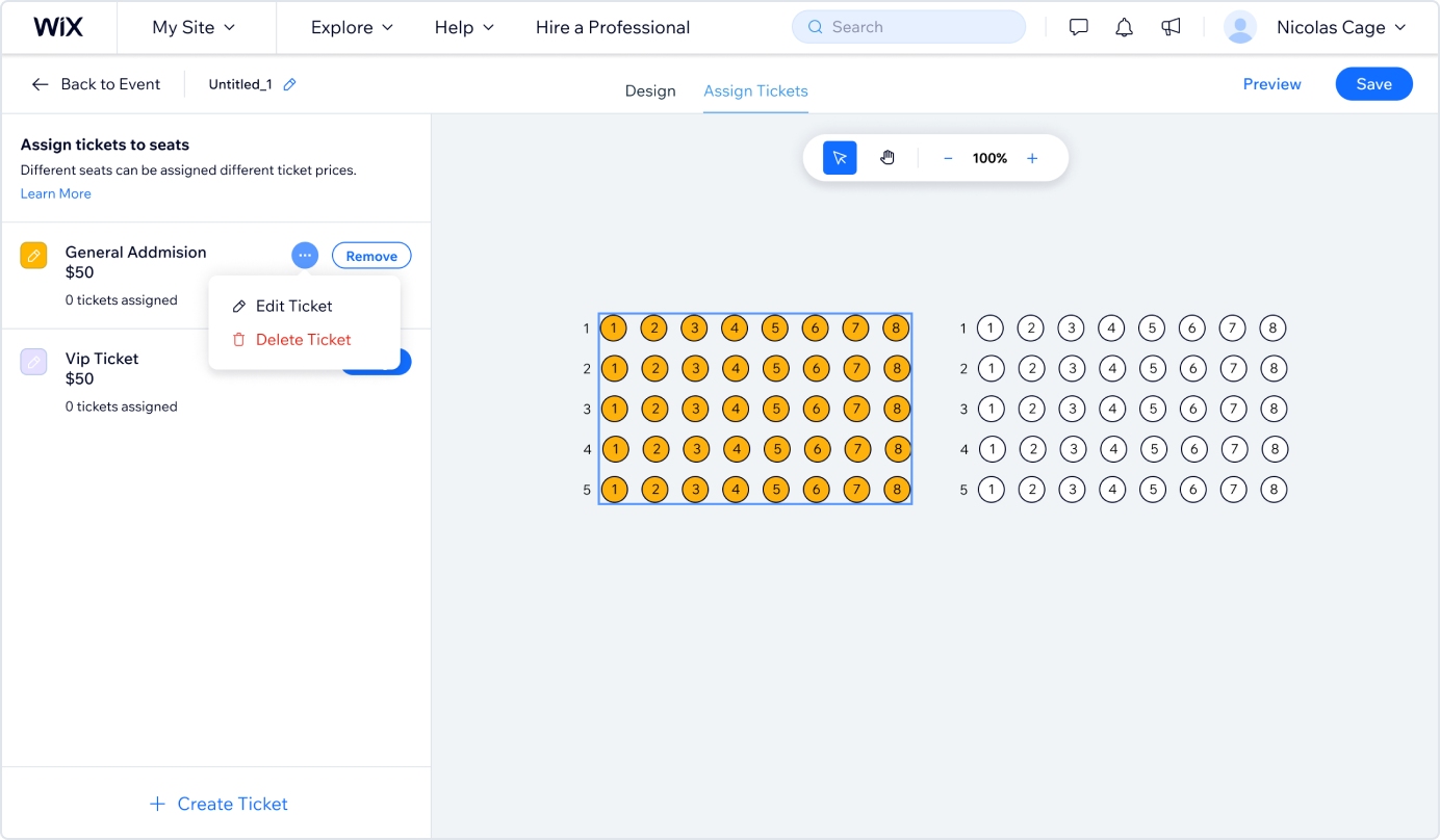
A well organized hierarchy between the actions creates harmony on the page so it’s easy for the user to read and understand. For example, Wix Seatings Map Builder shows how button’s different properties make a clear hierarchy between actions — primary, secondary and least important.
- Primary: Highest contrast, crucial for the main goal.
- Secondary: Recognizable on the screen without any clicks, assisting the main goal.
- Least Important: Hidden under the Icon Button and are not really connected to the main goal, e.g.: “Edit Ticket”.
Each action has a clear text label that helps users to understand the button from first glimpse. Icons in the buttons are plain and recognizable by industry standards.
This article is a collection of experiences from multiple designers from many teams. A big thanks to everyone who shared their case studies, insights, and feedback or simply designed great products that inspired this article.
Originally published on medium