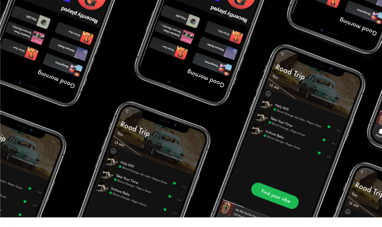
This case study was completed as an independent project during a four day sprint while I was a student at Ironhack. I was challenged to create a new feature to an already existing and highly adopted app, so I chose to work on one of my favorite apps for streaming music, Spotify!
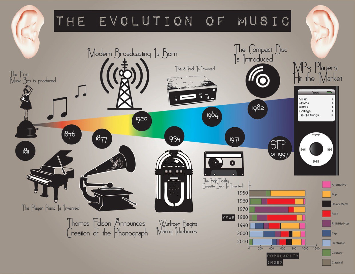
Music streaming has changed so much over the past few years in response to the digital revolution. What seems to feel like a lifetime ago, people were using MP3, Napster, iPods and even resorting to not so legal ways to download and listen to music. And before that, there were CDs, cassettes and vinyls. Although the idea of having a record player at home and lining up outside the store to buy the latest music drops seems charming and entertaining, I couldn’t imagine not having music at finger tips — available whenever and wherever I want it! The evolution of music streaming in itself is a topic I could talk about for hours, but for this case study, I will be focusing on the modern music streaming platform — Spotify.
This week’s design challenge at Ironhack was to incorporate a new feature for an existing and highly adopted app. I chose Spotify because it completely changed the streaming industry in 2008 by setting the trend for subscription based music streaming services. It has also been my music streaming platform of choice for years now.
During this four day sprint, we focused more on visual design and Atomic Design Principals and developed our ideas to hi-fidelity prototypes. I was both excited and nervous about this weeks project since it was my first solo design project, but I am big on challenging myself, so I felt that it was the perfect time to tackle my own project.
So, let’s get started!
DISCOVER
Just to give you a bit of background, Spotify is a music streaming platform — the biggest in the world by number of subscriptions. It was founded in Sweden by Daniel Ek and Martin Lorentzon, and eventually launched in 2008. As of March 2020, they have 248 million monthly active users, compared to Apple Music that has about 68 million users. Spotify uses a freemium model that offers users a free tier that includes ads, and a premium subscription for a monthly payment.
“Our mission is to unlock the potential of human creativity — by giving a million creative artists the opportunity to live off their art and billions of fans the opportunity to enjoy and be inspired by it.” — Spotify Mission Statement
Lean UX Canvas
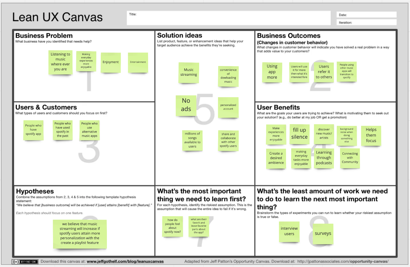
Using the Lean UX Canvas, I outlined the current state of Spotify and wrote down my assumptions that I began within boxes 1–4. Since this is a living document, I revisited it to make updates as I went through the Design Thinking Process.
Competitive Feature Analysis
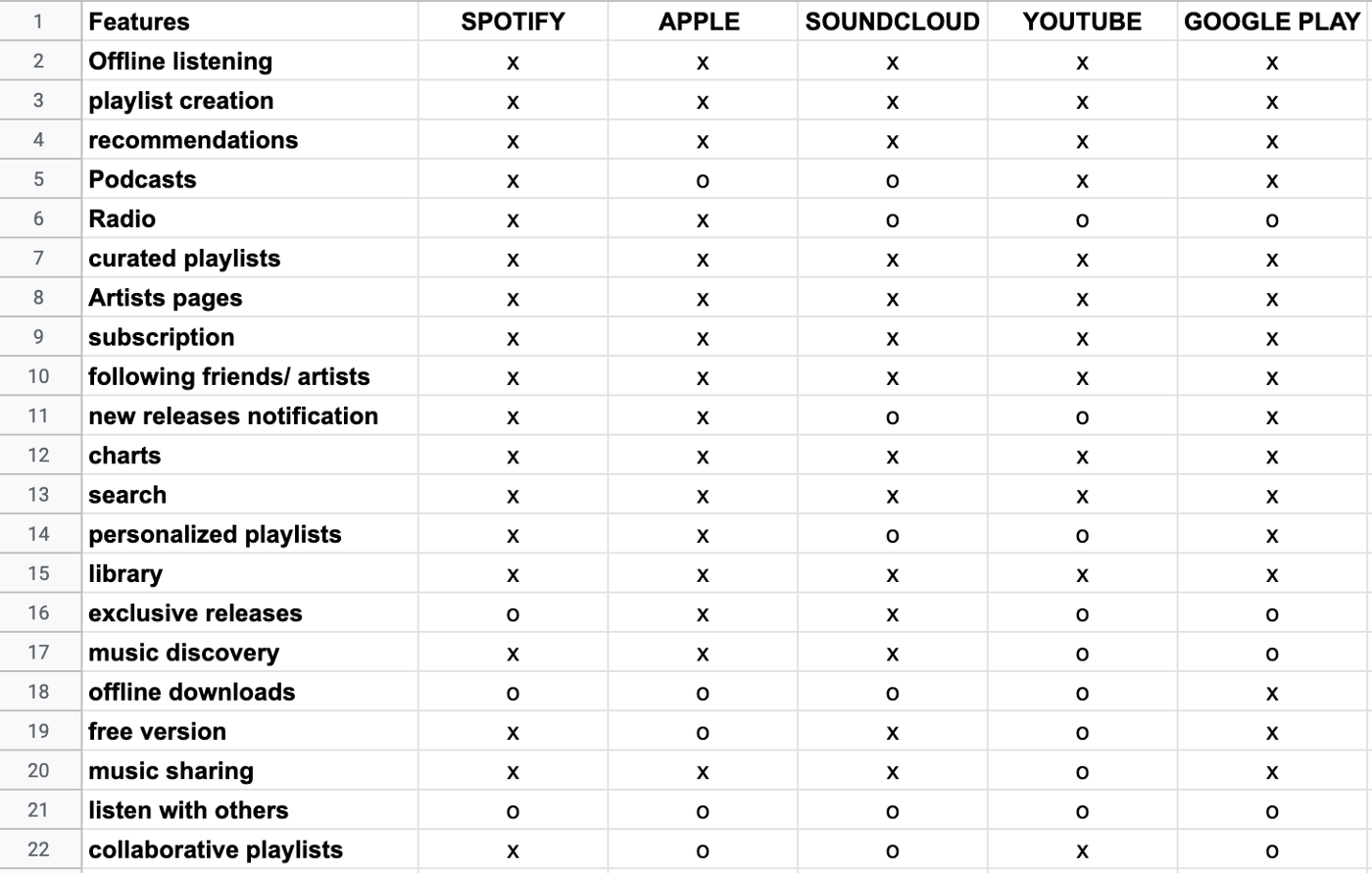
I started off my research with an analysis of Spotify’s direct competitors — Apple Music, Youtube, Soundcloud, and Google Play. I compared their features in the snapshot below.
Competitive Positioning Chart
I mapped out the competitors’ positions in relation to the axes to better visualize areas of opportunity and the competition. I decided to compare them based on the level of social interactions that they facilitate and the level of personalization that each platform allows for their users.
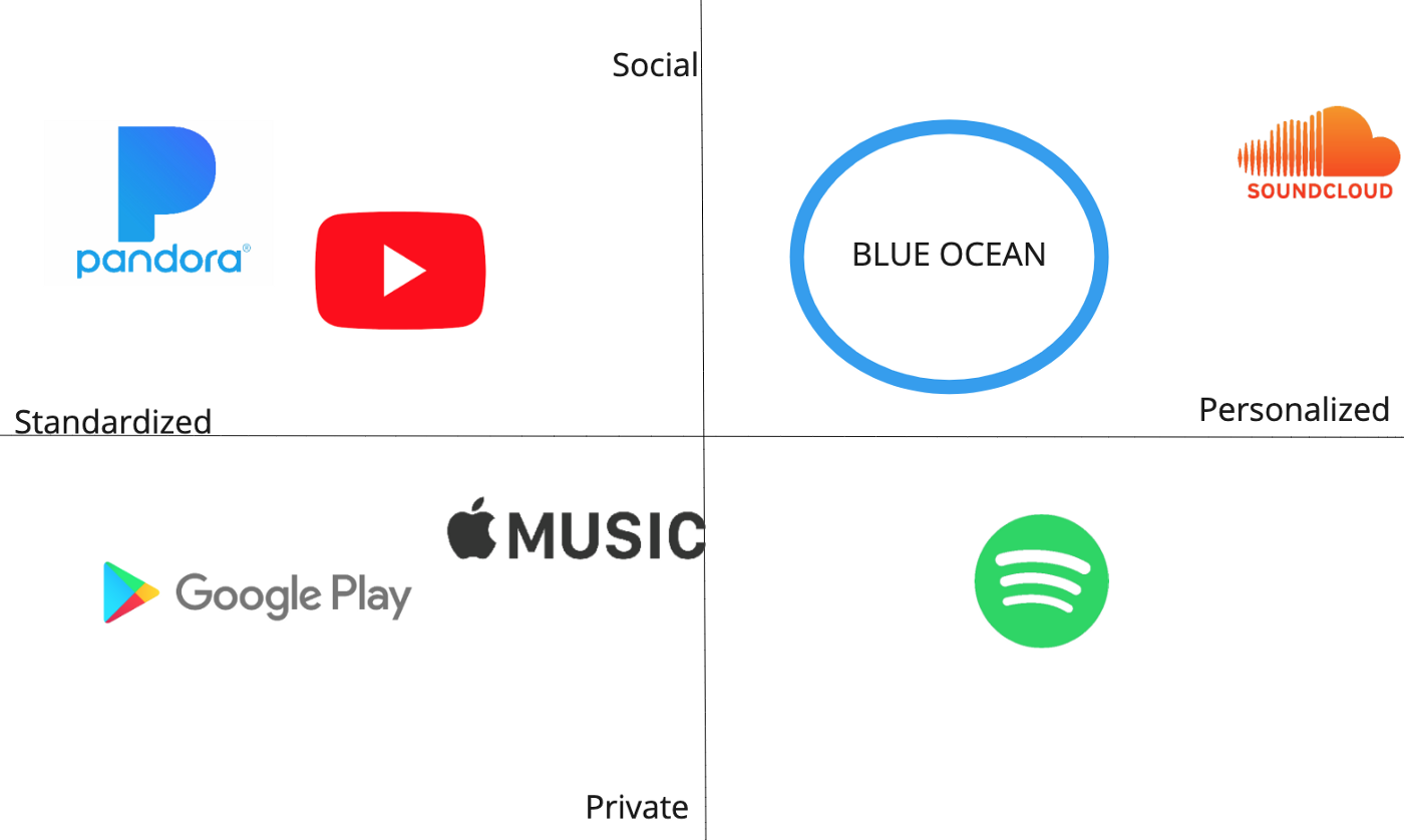
Spotify’s app can be personalized for premium users but is more so for private use. The “Blue Ocean” is an opening in the current market without many competitors which symbolizes an area of opportunity that I believe Spotify can enter with an additional feature. Although I had originally wanted Spotify to move towards a social adaptation, I decided to pivot later on in the process to create a more advanced personalization feature after getting some user insight.
User Research
Survey
I started off my user research with a survey of 12 questions. Surveys have been a really valuable tool for gathering a large amount of quantitative data, so I took some time to craft my questions to reflect the information I really needed at the beginning of my process.
I posted my survey in a Slack channel and a few Reddit pages related to music and received about 65 responses in 24 hours.
Here are some important statistics relevant to my project:
- About 60% of respondents said they use Spotify
- 90% said they listen to music for both pleasure and when doing other things (driving, working)
- Only about 1/3 of people like the personalized playlists that their platform creates for them
The last bullet point validated the need for a better-personalized playlist feature, so I decided to run with it and dive into some more user research to see where I can add value!
Interviews
I conducted 5 interviews with people who use Spotify and/or Apple Music. I got A LOT of valuable insights from my interviews. One of the most surprising pieces of information that I found was the fluid nature of my interviewee’s streaming service choices depending on their needs. Their preferences constantly shifted based on the music experience they were looking for, attributing each platform its own function and purpose.
For example, users brought up the variety and diversity of music that Youtube and Soundcloud offered. When asked about finding new music, 4/5 people said they find more new music either through Youtube or Soundcloud.
“If I was able to find new music easily on Spotify, I wouldn’t be using Soundcloud or Youtube.”
However, I had to keep in mind that these platforms have an advantage for music discovery because some music is exclusively on Youtube or Soundcloud.
DEFINE
I converted all of my recorded interviews and survey results into digital sticky notes using Miro. This week I discovered a new tool in Miro that made data synthesis so much faster! In the sticky notes feature on the sidebar, there’s a “Bulk Mode” button that allows you to type several sticky notes at once instead of doing them one by one. This cut my synthesis time down by so much! (Credit to our TA, Kathryn)
Affinity Map
After dropping all of my data onto sticky notes, I organized them onto my Affinity Map with themes and color-coded them by streaming service. I found that several of the insights were very much interrelated with one another, so connections between ideas are indicated with arrows.
The most prominent themes are:
- Playlists
- Finding new music
Many of the smaller headers are sub-themes that branch off of the two bigger themes.
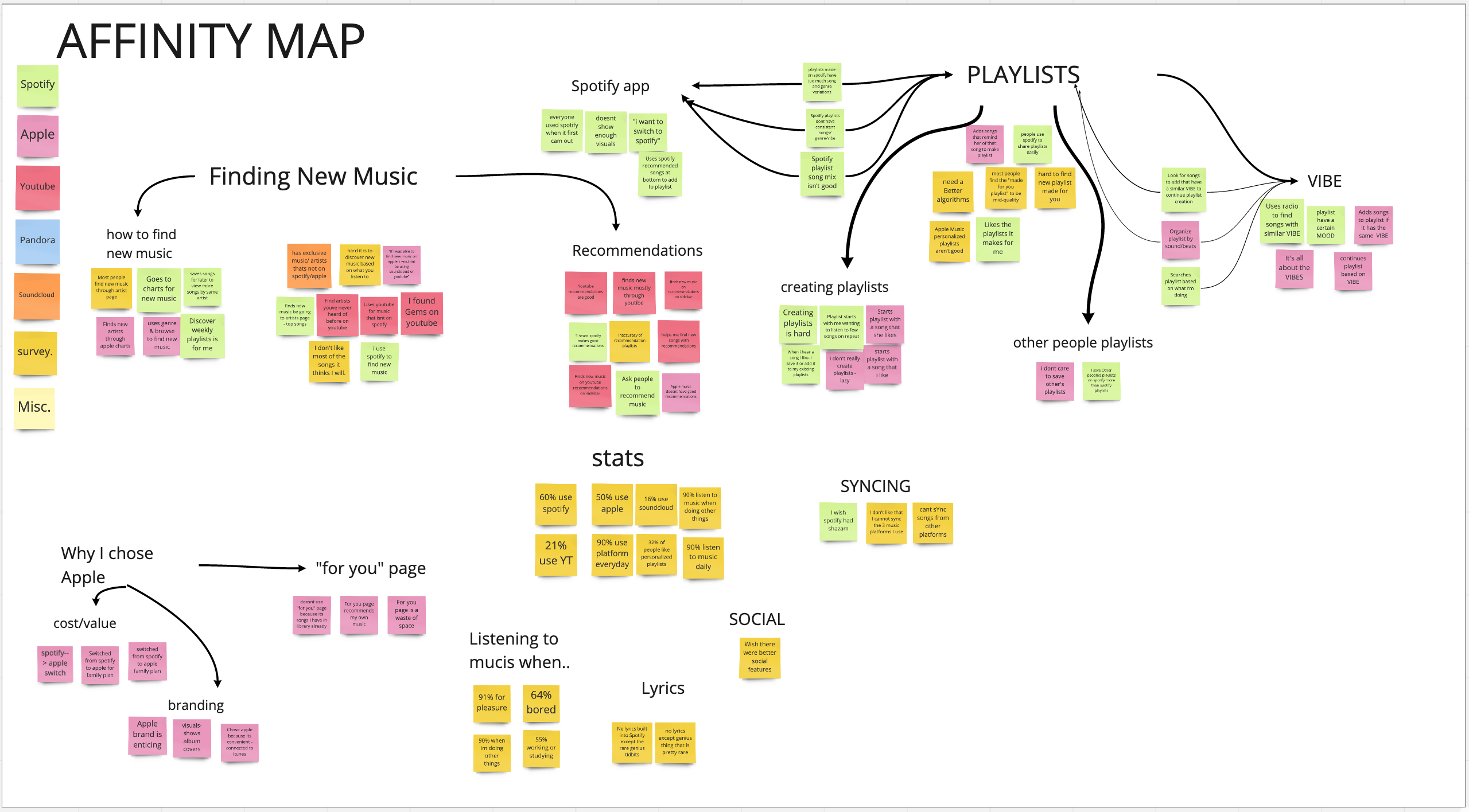
Some key findings:
- Most of the data points were related to finding new music and playlists
- People find a lot of new music on Youtube
- Playlists are defined by their “vibe”
- The word “vibe” came up a lot in the interviews — this will be an important term that I will revisit later in my case study
- Songs on a playlist should have a similar sound and consistent genre variation
- People value finding new music/artists that are aligned with their preferences
Customer Profile
Stratagyzer’s Value Proposition Canvas is another great tool for identifying customers’ jobs (things they need to get done), pains, and gains. This tool helps us better understand the customer we are creating value for. The customer profile connects directly to the second part of the canvas — the value map, which describes the elements of the value proposition.
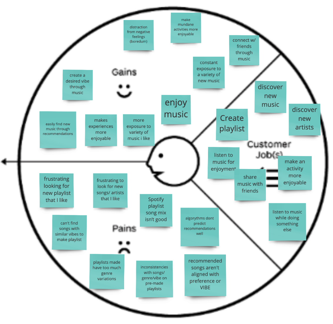
Customer jobs can be functional, social and emotional. Most of the customer jobs above are either emotional or social, which indicates that several gains and pains also fall into that category.
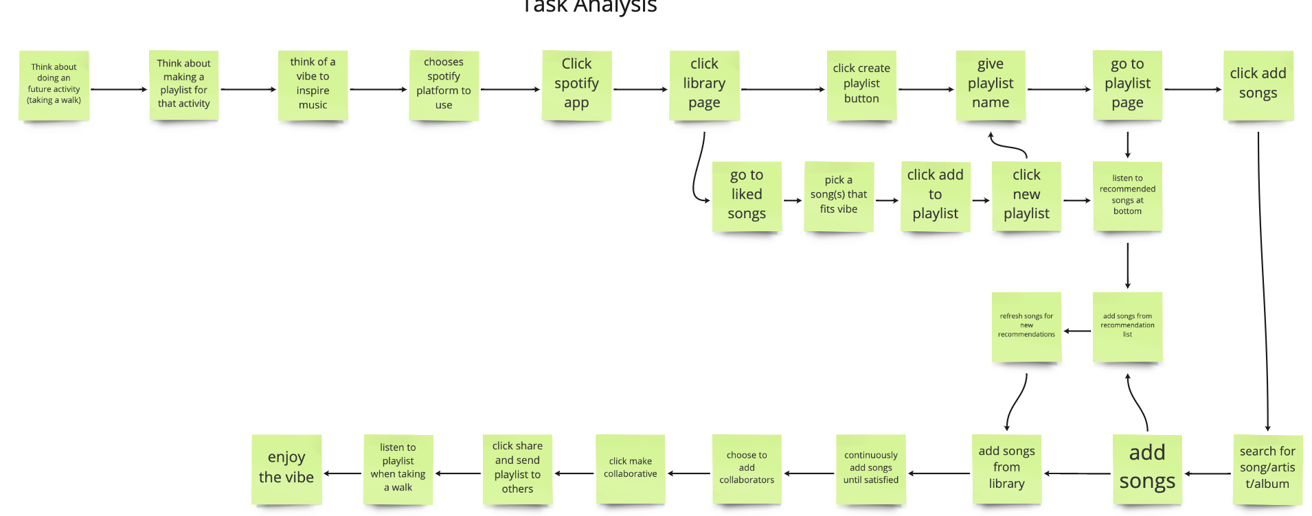
Task Analysis
The task analysis is a visual used to map out the path that users take to create a playlist. Although there are several different ways to create a playlist on Spotify, I used my interview data to choose the steps that users would usually take.
User Journey Map
A user journey map is useful for getting a more complete view of the user’s experience for a specific task. The goal is to find the significant low points or problems that the user is facing. It’s also a great time to highlight the thoughts and emotional aspects of the user’s experience.
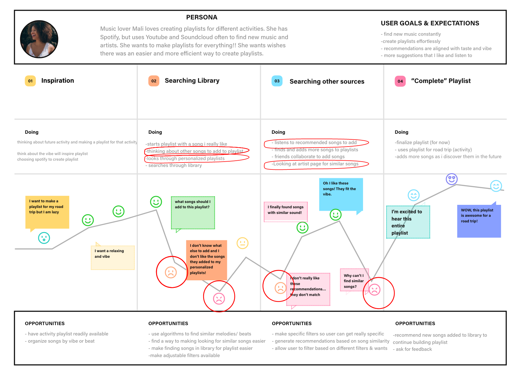
The user’s journey is centered around creating a new playlist for an upcoming activity (like a road trip). First, the user may think about a future activity, which will motivate them to create a playlist to make it more enjoyable. The user experiences low points when:
- Thinking about suitable songs to start the playlist
- Looking through their library to find songs to add to the playlist
- Listening to the songs recommended by the Spotify Algorithm
- Trying to find similar songs to the ones they already have on their playlist
After identifying these four pain points, I quickly wrote down some opportunities and ideas to use during ideation.
I synthesized the pain points into a problem statement.
Problem Statement

Then, I converted the problem statement into four “How Might We” statements:
- HMW make sorting through the personal library easier and more specific to users preferences
- HMW make newly recommended songs align more with users taste and requirements for the vibe
- HMW help users curate songs with a similar sound to make creating a playlist easier
This is just another way to frame the problem by turning them into questions to better prepare myself for ideation!
DEVELOP
Ideation is one of my favorite parts of the process!
Collaborating with my classmates Sebastian Benitez, Christina Rice and Dave Ostergren for a brainstorming session was awesome! We came up with about 80+ ideas in 15 minutes using the time-boxing method to really push us forward.
Here’s what our brainstorming session looked like:
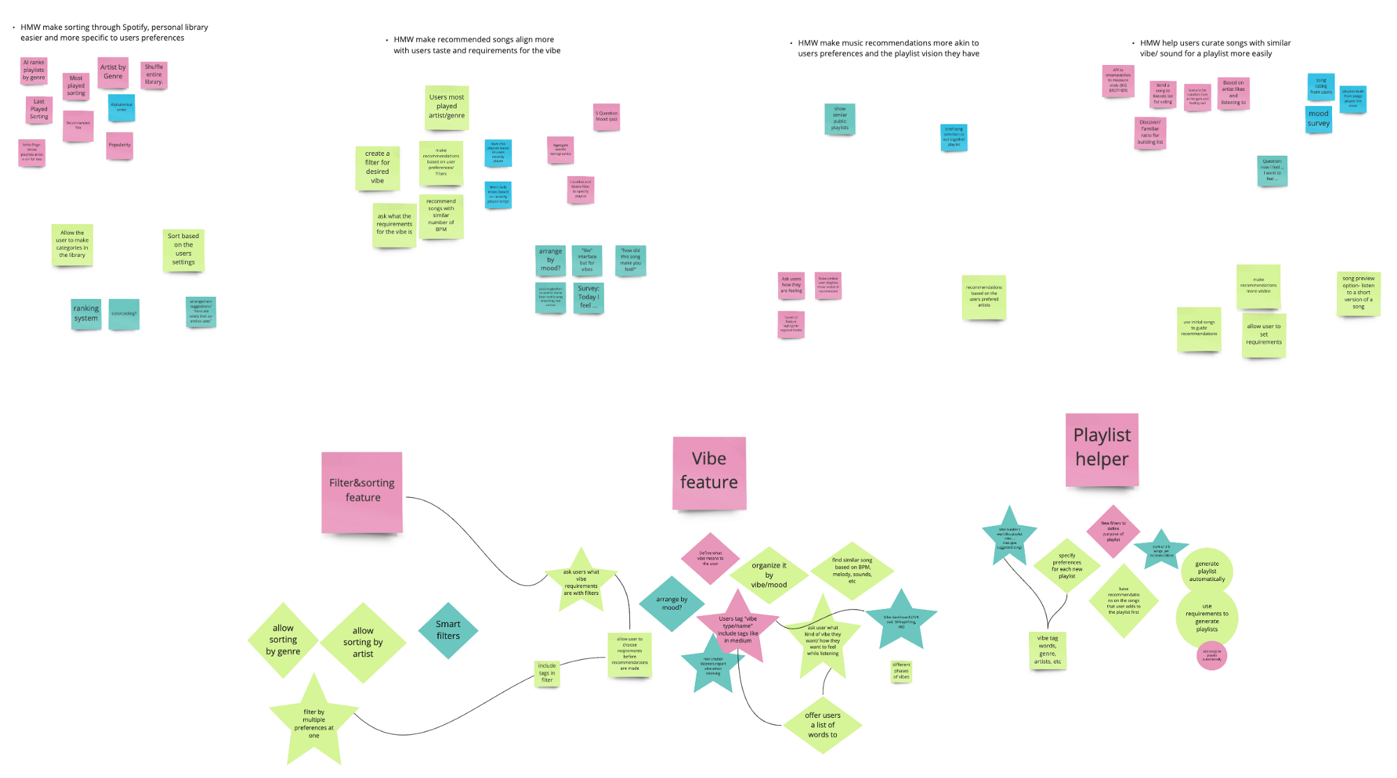
After brainstorming some ideas for each HMW statement, I reshaped the best ideas into stars and diamonds then made three umbrella headers that the ideas are categorized into — A sorting/filter feature, a “vibe” feature and a playlist creating helper.
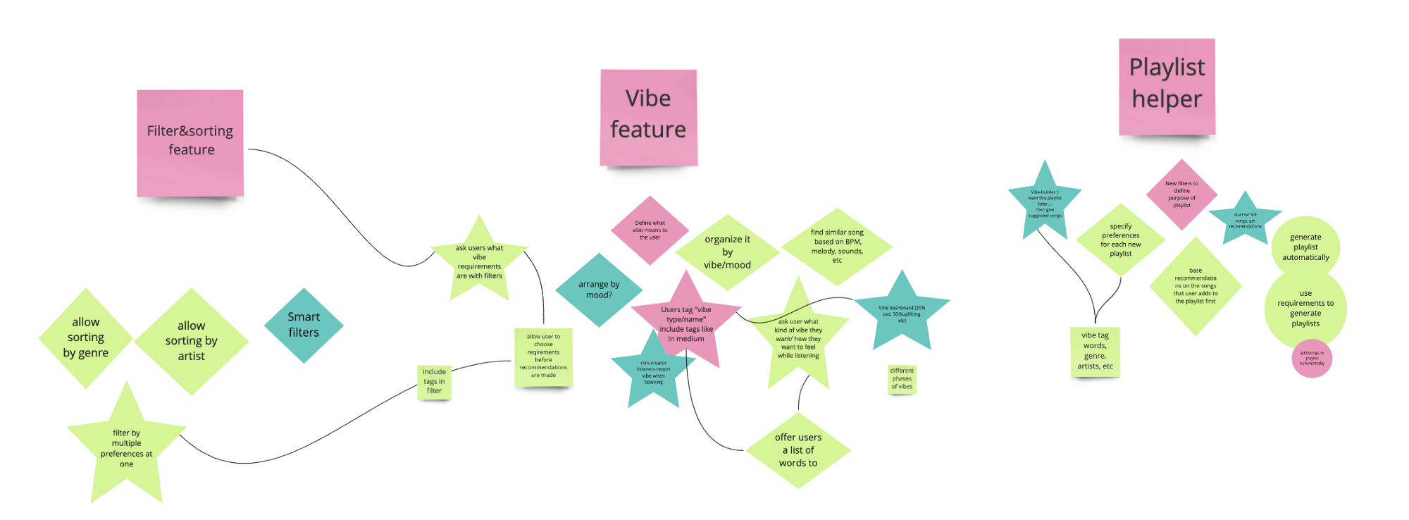
Organizing all of the the contents and ideas from the brainstorming session was a vital step before moving on to prioritizing the ideas since there were so many to consider and analyze. I really enjoyed this part of the process because it allowed me to arrange the detailed ideas under three overarching ideas and set myself up for prioritization.
MoSCow Method
I further categorized the ideas from brainstorming into the MoSCoW Method chart pictured below to prioritize the features into Must Haves, Should Haves, Could, Haves, and Won’t Haves.
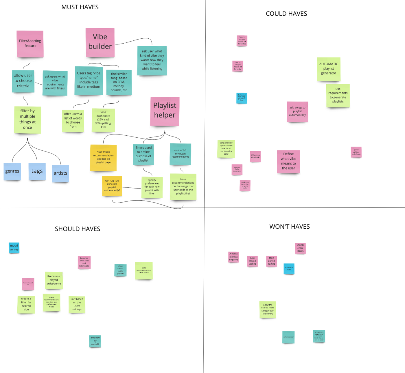
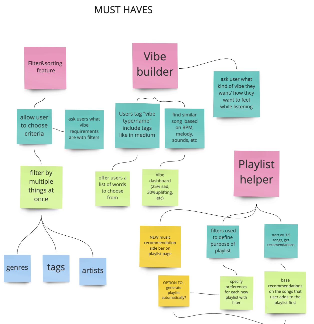
The must haves are the mandatory features that are key to solving the users problems. These include the three umbrella solutions and their corresponding ideas.
After prioritizing the features, I was able to define the products necessary to make my idea work, in addition to the gain creators and pain relievers on my Value Proposition Canvas.
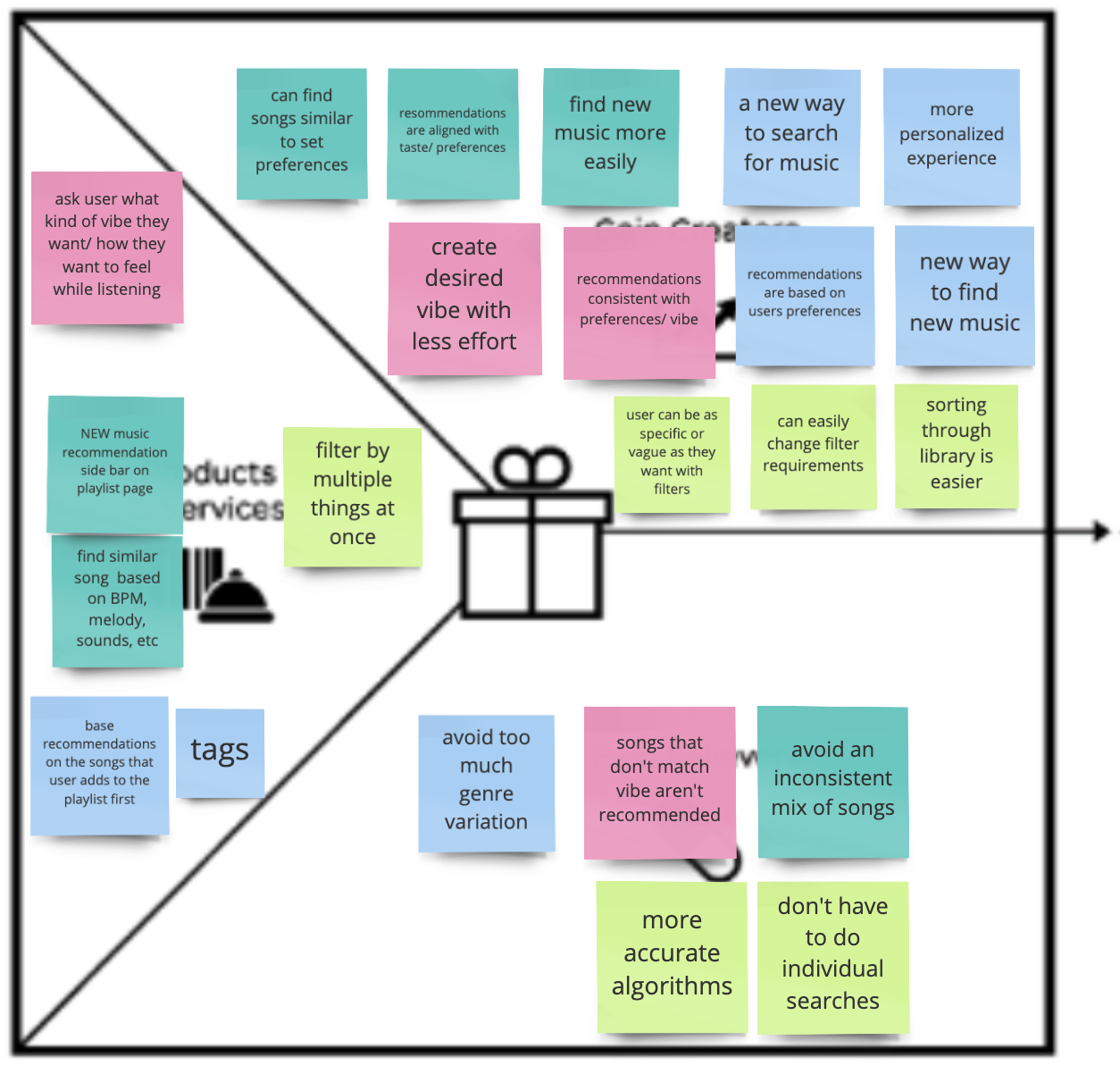
The products and services on the left of the canvas are color coded to correspond with the gain creators and pain relievers on the right.
Just to recap, the pain points are :
- Thinking about suitable songs to start the playlist
- Looking through their library to find songs to add to the playlist
- Listening to the songs recommended by the Spotify Algorithm
- Trying to find similar songs to the ones they already have on their playlist
Although the sprint was short and my workload for the week was high, I still wanted to incorporate a solution that solved both problems related to creating a playlist AND finding new music.
MVP

My Minimum Viable Product includes a solution to address both pain points (creating a playlist and finding new music).
Job-To-Be-Done
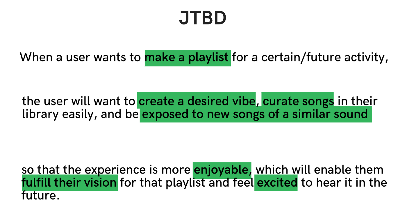
When Spotify users want to make a playlist for a future activity (I used an upcoming road trip for this scenario), they will “hire” Spotify to create a desired “vibe,” curate songs in their library (already saved songs), and be exposed to similar songs — the perfect opportunity to suggest new songs for the playlist based on user specifications like specific genres, artists and tags.
At the end of the day, the goal is to make whatever experience that the user is creating the playlist for to be more enjoyable. So my job is to help them fulfill their vision so that they are excited about hearing it in the future, and hopefully listening to it several more times.
User flow
Next, I created the user flow based on this job-to-be-done to create a visual representation of the path that the user will take to create a playlist with the new feature. The user flow also includes instances of human interaction (taps) and places where onboarding is necessary.
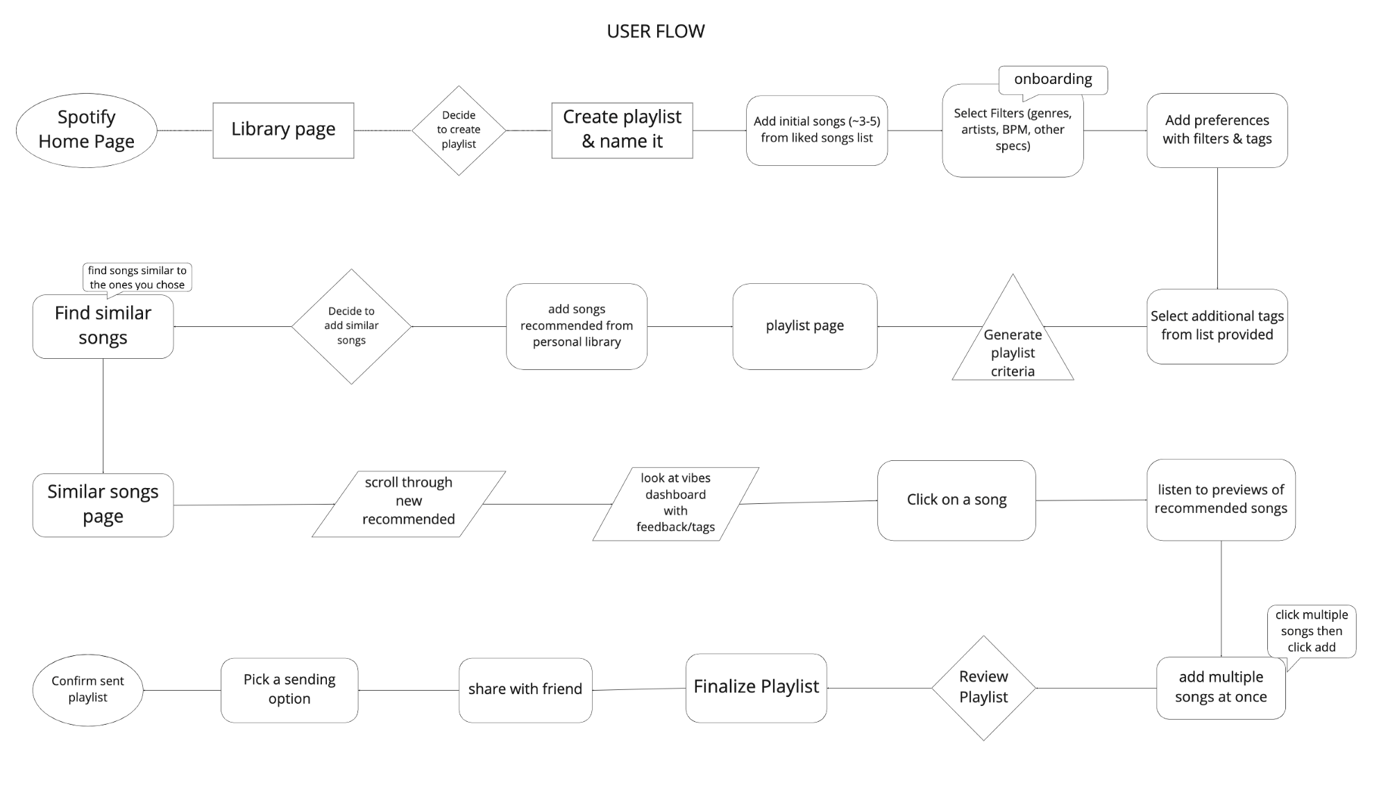
PROTOTYPING
I created a low-fi prototype for the process of creating a playlist, incorporating the new filter feature.
Low-Fidelity Prototype


After conducting usability testing using Maze, the heat maps indicated that many miss-clicks occurred where there were no clear guidelines for each step and also when people followed their natural tendencies. Seeing where people tapped enabled me to design the feature so that it would fit into their mental models instead of trying to go against it.
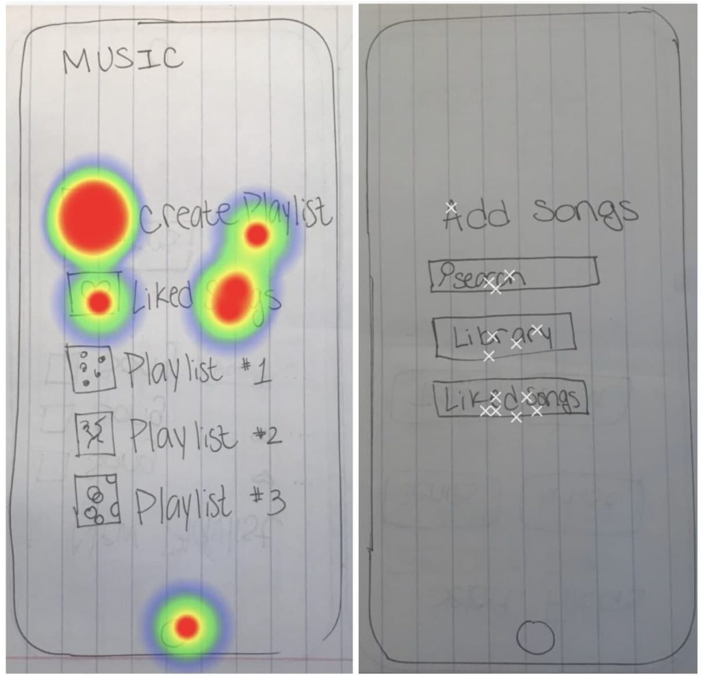
For example, many people clicked “liked songs” on this screen because that’s what they are used to doing when they create playlists. So I used this insight to make the next iteration more intuitive by guiding the user through the liked songs page to pick a few songs to start the playlist.
Another indication that people go to their “liked songs” or “library” to create a playlist using songs they already have saved.
Mid-Fidelity Prototype
For my mid-fi, I used the atomic design principles to build out my “atoms” and “molecules” that would later become icons, buttons, and footers that I used repeatedly throughout the entire design.
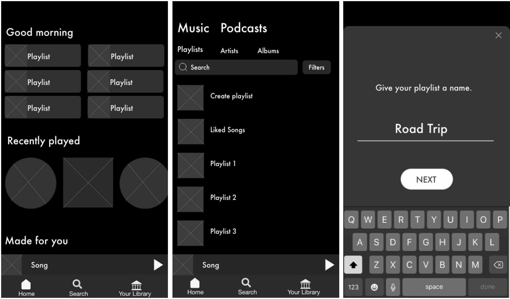
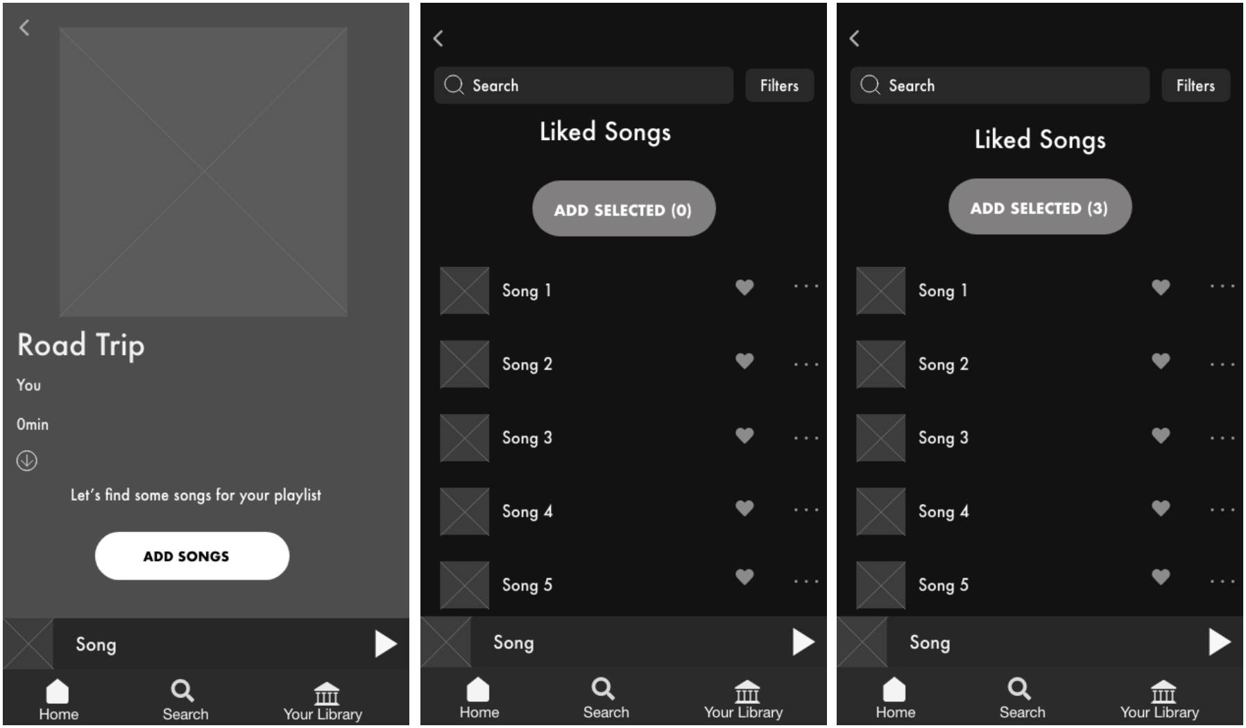
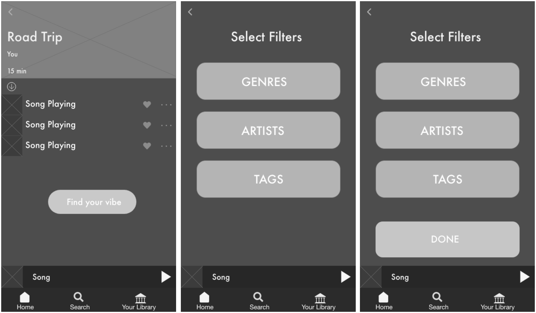
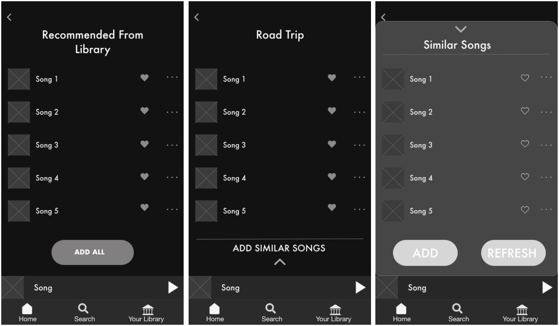
After testing my mid-fi, I added a few more changes to the layout of the screens and updated the prototype with colors and pictures for my hi-fi.
Hi-Fidelity Prototype
Here is a high level overview of my hi-fi prototype. I tried my best to make it look as close as possible to Spotify’s interface!
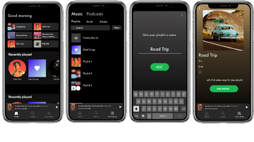
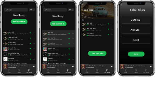
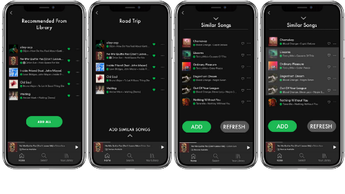
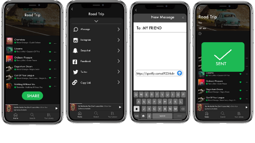
Here’s a step-by-step micro-level view:
The process begins by going to the library and pressing “create playlist”and giving it a name. Let’s say we are going on a road trip!
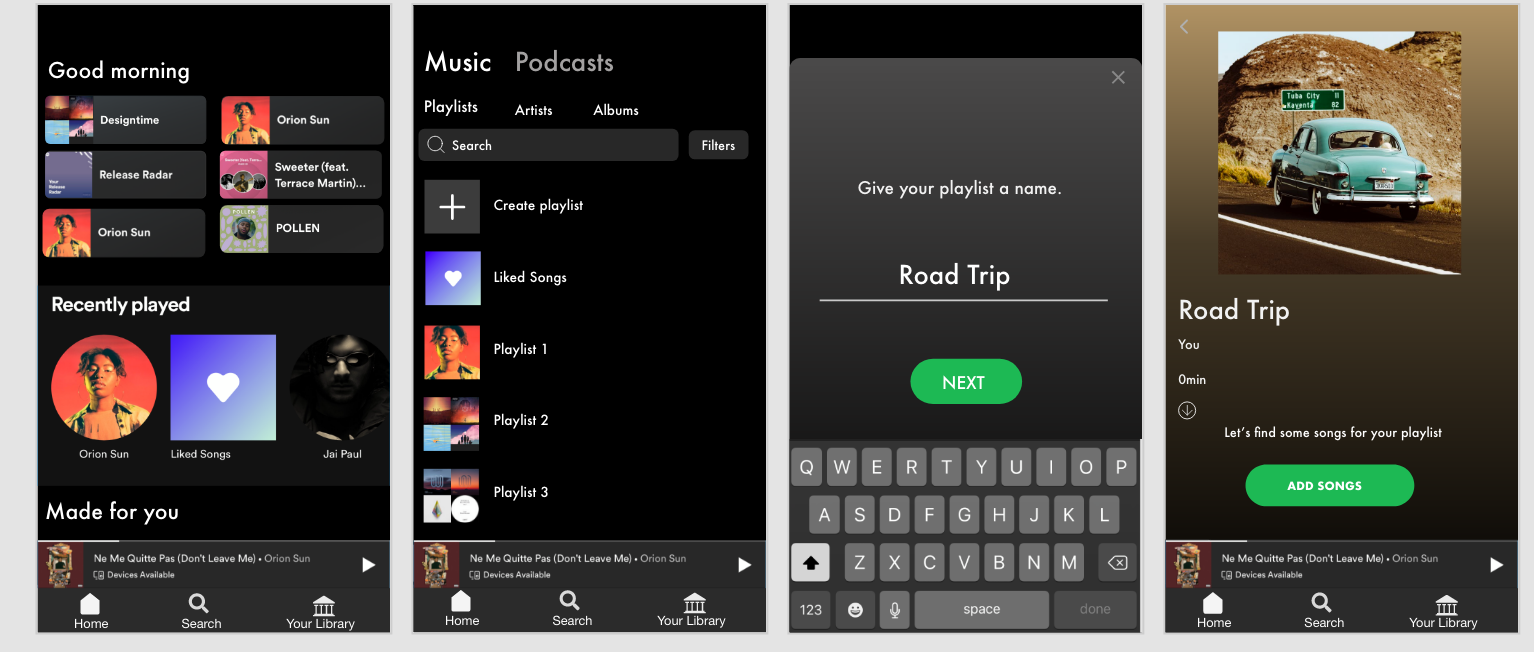
After pressing “add songs” users would go directly to the liked songs page and would be prompted to choose as many songs as they would like to start the playlist as a basis for the “vibe.” Once a few songs are selected, users go to “Find your vibe” which is where they can specify preferences for suggestions.
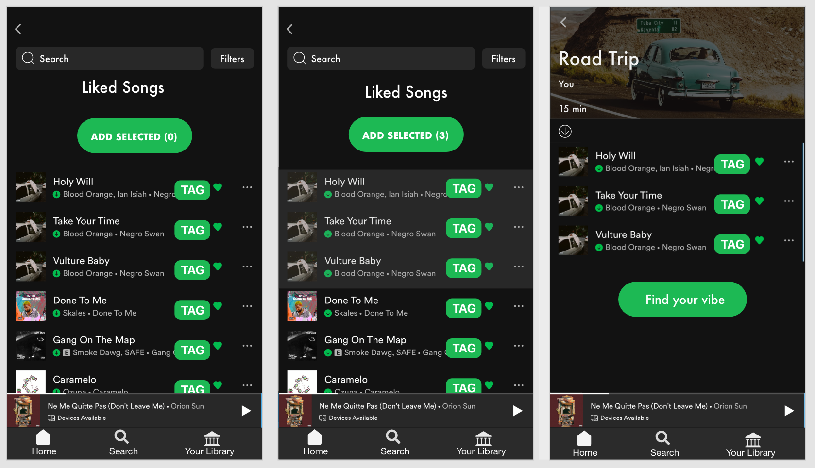
The tag can be defined as a label or set or labels attached to each song. Songs can have several tags that describe their “vibe” or mood. Tags are reported by users themselves, and the most prominent tag is displayed on these screens. However, if the user wants to find songs with the same tag, they can click each tag to be taken to the “tag dashboard” where songs with the same tag are listed. — This is yet another way that users can add songs of a certain “vibe” and find new music!
Then, users go through the filter feature of drop down menus to select their specific criteria for suggestions. Here, the user can be as specific or as vague as they would like, to accommodate very specific preferences and those who are more open to a variety of suggestions.
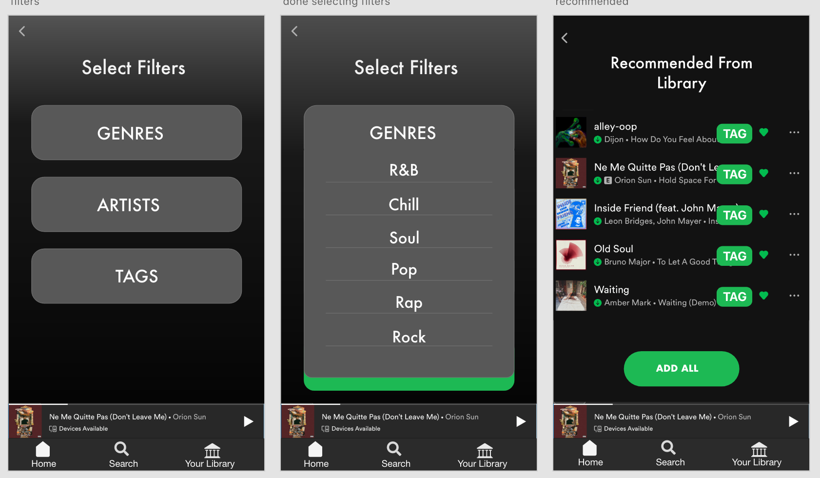
Spotify will first recommend songs within the library of saved music and users will have the option to add all or a add a few to their playlist.
Then, there will be an option to add *new* songs that are similar and also fall under the user’s preferences that were designated earlier.
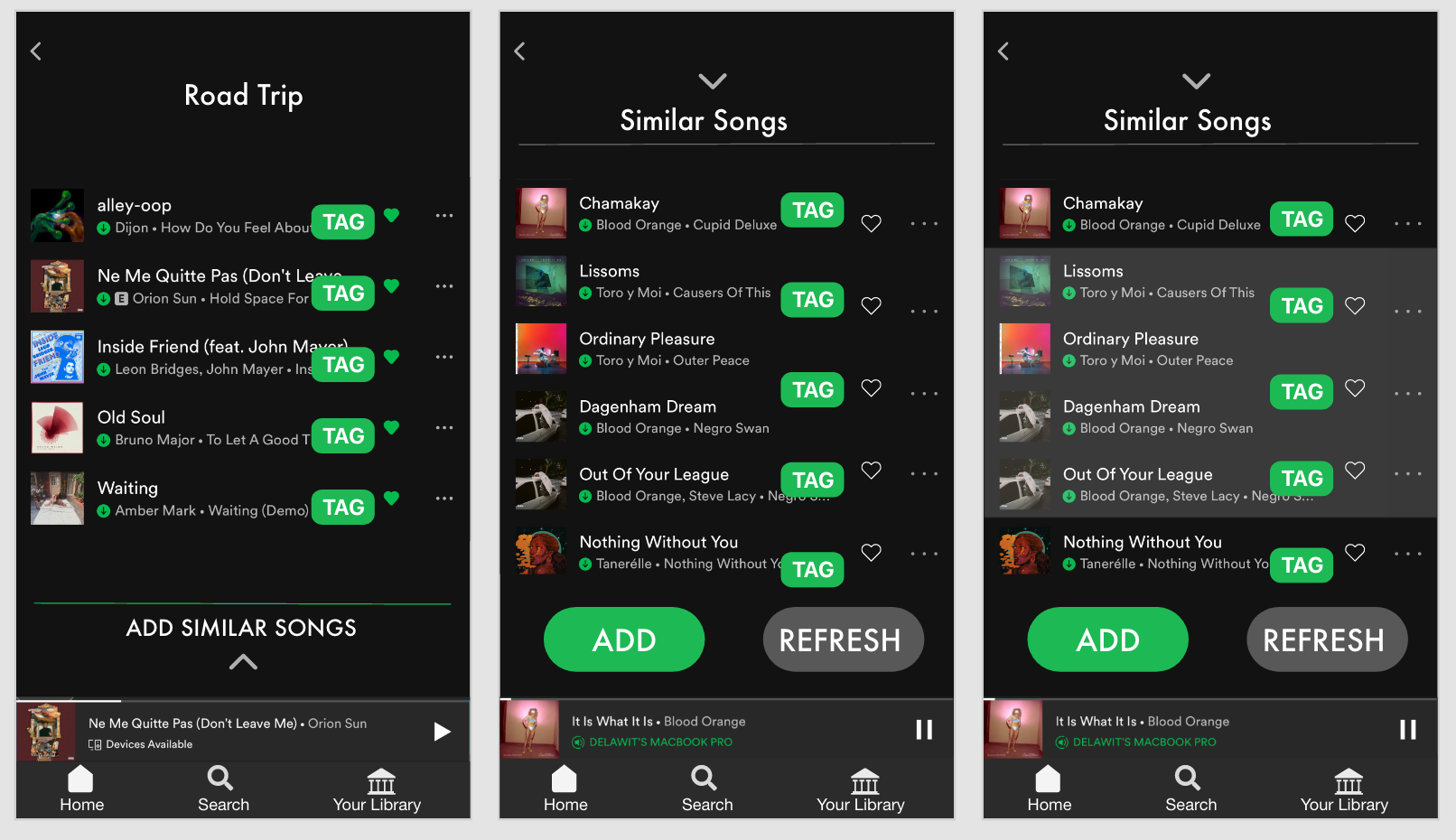
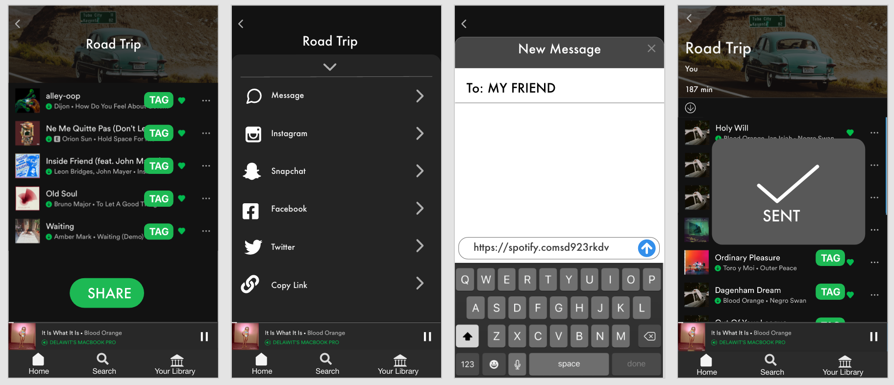
The user can also share their playlist with a friend for collaboration!
Here’s a link to my presentation if you would like to see a live walk through of the hi-fi! (Go to slide 30)
Success and Failure Metrics
We will know if the new feature is a success through these metrics:
- Less time creating playlist
- Higher Satisfaction
- More People Use Feature
- Save newly recommended music
And we will know if the feature is a failure through these metrics:
- More time creating playlist
- Lower Satisfaction
- Users don’t Use Feature
- Disproval of recommended music
Knowledge Gaps
If I had more time, I would’ve loved to do some in-person usability testing with some of my friends to get some more insights on the way they use Spotify. I would’ve also loved to dive deeper with a second round of interviews focusing on the other music streaming platforms that they mentioned, like Youtube, to see which features they find most valuable and exactly how they use them. I believe that there are features that Spotify could potentially adopt from the other music streaming platforms that would give users additional value.
Next Steps
- Finish atomic design inventory
- Test the hi-fi prototype and make another iteration
- Develop the tag feature for multiple functions
Takeaways
I am not the user even if I use the app! Although I am a loyal Spotify user, I had to keep reminding myself not to accept my assumptions as facts. It’s a universal UX principal to always keep the users at the center of the design.
Adopt the users’ language and make it a part of the product! Like I mentioned earlier, the word “vibe” kept coming up in my interviews, so I knew that this is something that may be universally understood across the music listening community. I incorporated it into my design to further relate to the users and use a language that they can appreciate.
Overall, this project was extremely rewarding! Spotify is an already amazing music streaming platform with features that go above and beyond. So the challenge to create an additional feature that adds value was definitely challenging. I enjoyed going every step of the Design Thinking Process and being able to go all the way through a hi-fi prototype!
Let me know if you have any thoughts or comments! Feel free to connect with me on LinkedIn as well. And if you’re in the mood to listen to some of my *very much incomplete* playlists, here’s my Spotify.


