1) Delight your users
Craft moments of joy:
Tiny delights can significantly shape overall impressions. The value of these small moments lies not in their utility but in their ability to be fun, uplift their mood, or be a source of inspiration.
So consider how you might spike your users’ emotions — with the simple aim of making the moment enjoyable or notable.
Key Benefits:
- Engagement: Positive feedback loops encourage repeat usage.
- Sharing: Delightful experiences are more likely to be shared, expanding reach organically. Word of mouth is the best marketing.
- Happiness: Enhances overall user satisfaction and emotional connection with the product.
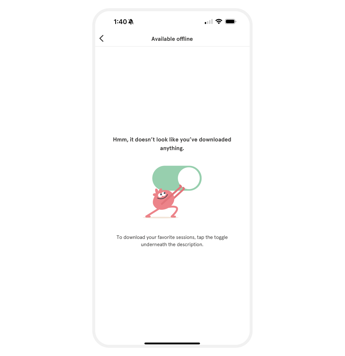
This concept emerged when I was working on this empty state at Headspace. My aim was to make sure it was delightful and educational.
I highlight this to illustrate that joy in design isn’t always about fancy confetti animations. A slight shift from an irritating empty state to a smile-inducing moment can spark just the right amount of joy.
Simplicity works.
All credit goes to Ryan Cox, for bringing this idea to life in minutes on his ipad. He’s such a talented and kind human.
2) Make the effort visible
The labour illusion — where perceived effort = value
Make the effort behind your service visible to enhance perceived value. This is because we have a tendency to perceive products and services more favourably when we’re aware of the effort that was put in to create it.
Key Benefits:
- Conversions: Demonstrating the effort improves conversions.
- Trust: Users are more likely to value and trust services they perceive to be more labor-intensive.
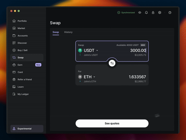
At Ledger we’ve added a loader before we show users our partners quotes. In reality, the quotes are calculated in milliseconds.
Why?
To increase the perception of value on the quote screen. Reading that Ledger is finding me “the best quote” makes me feel like there is something special being prepared for me and that there is a lot of work happening behind the scenes. The truth is, there really is.
Next time you use a flight comparison site such as Kayak or Skyscanner, take a moment to notice their artificial waiting screens.
3) Use faces
The power of human connection:
Incorporate human faces to draw attention and evoke empathy.
- Directional: Utilize faces looking towards CTAs or important content to subtly guide user attention. This works and has been proven time and time again. Source
- Keep it authentic: Use genuine, relatable photos of real faces. Midjourney is almost there, but be choosey and make sure they actually feel real. Here are some beautiful examples w/ prompts but I’m not sure how real they really feel yet… You be the judge.
- Consider the emotion: We subconsciously mirror others. Choose faces that convey the desired emotion you want to evoke in your user.
Key Benefits:
- Engagement: Faces create a personal connection.
- Trust: Authentic visuals foster trust and humanize your product.
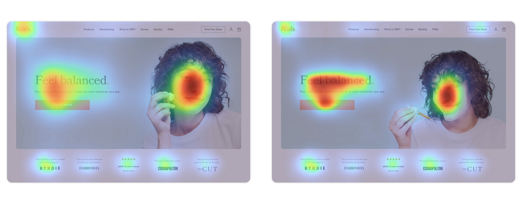
When working with Feals to boost their landing page’s e-commerce conversion rates, I conducted heatmap tests to select the optimal hero image to increase clicks on the primary CTA.
The directional gaze image emerged as the clear winner, revealing the powerful impact of guiding viewer attention with simple visual cues.
This insight also informed the creative team’s strategy for photoshoots. Ensuring they captured images with purposeful gazes, they were able to build a scalable library of attention-commanding visuals.
4) Utilize scarcity
Limited availability drives action:
Utilize scarcity to create urgency and encourage immediate action.
Misleading scarcity:
It’s all too common to see ‘limited-time’ offers, complete with countdowns, that aren’t genuinely limited. Don’t do it. It’s lazy and undermines trust when users notice the same ‘urgent’ deal later.
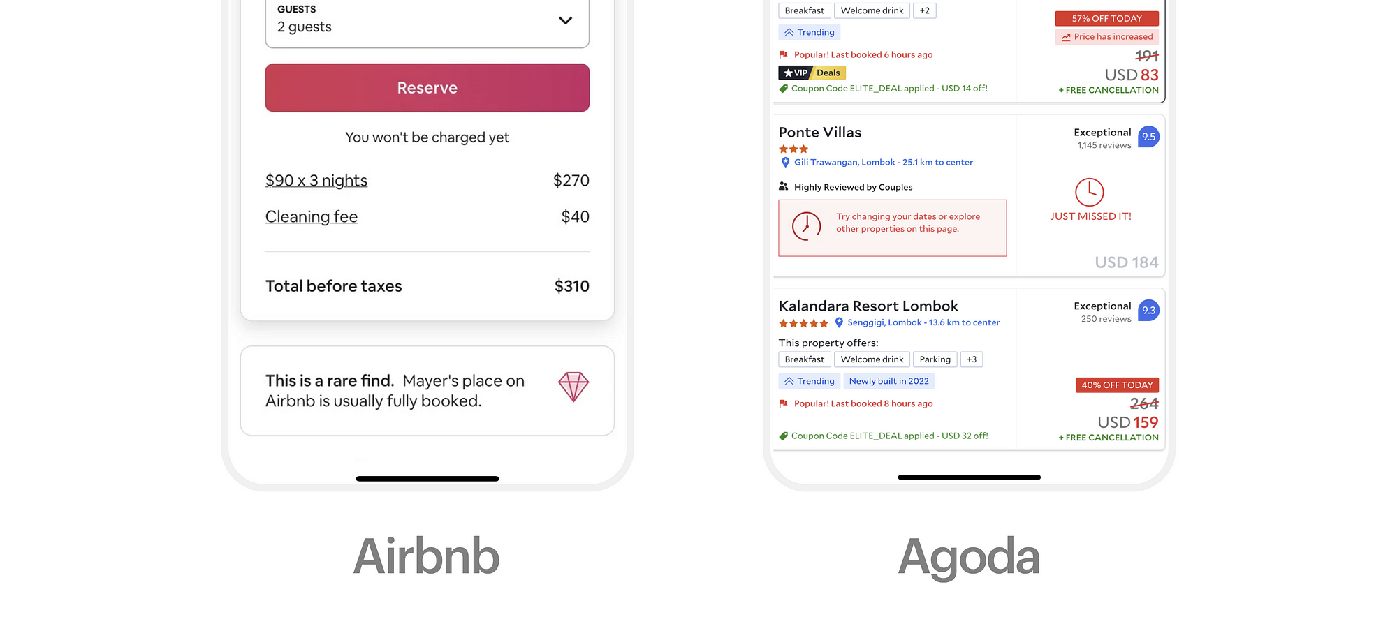
Consider ways to ethically utilize the scarcity effect to maintain your products integrity and ensure you don’t compromise on long-term trust. I love the way airbnb have approached scarcity in the example above. It’s clever because it both nudges you to book the stay and validates your decision to book a gem 💎
Key Benefits:
- Conversions: Scarcity leads to higher conversion rates as users feel compelled to act quickly.
- Perceived value: Scarcity can make the offer feel more exclusive or special. We naturally tend to want what we can’t have.
5) Encourage personalization
Endowment effect = People more greatly value things they’ve put work into:
This is also known as the IKEA effect, where we place more importance on the things we’ve built ourselves.
Personalization is at the heart of all habit forming products. We all love things that feel tailored to our preferences. They resonate emotionally and are infinitely more memorable.
Allow and encourage people to personalize their experience. It will enhance their sense of ownership and perceived value.
Be mindful to find the right balance to ensure you don’t overload the user with too many inputs at the beginning of their journey. Top product teams employ progressive personalization, subtly guiding users to tailor the product — over time—to their needs.
To go deeper on this one, I highly recommend Nir Eyal’s book — How to build habit forming products.
Key Benefits:
- Retention: If people feel like they own something, or have invested into personalising an experience, they’re less likely to churn.
- Engagement: Ownership leads to more frequent and prolonged use, increasing overall engagement.
- Sharing: Users who feel a sense of ownership and love for the product are more likely to tell everyone they know about it. It’s human nature.
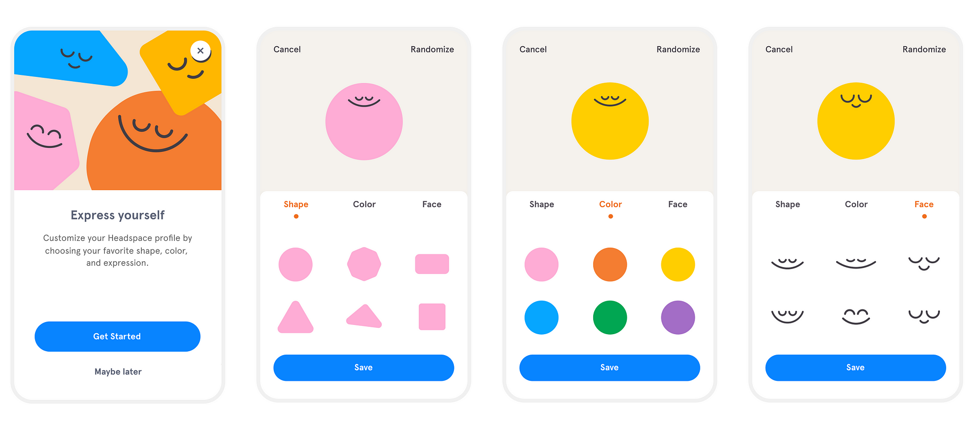
A memorable moment when working on community features at Headspace was the avatar creator. It allowed you to personalize your very own character. The aim was to increase engagement with our community features and I wanted people to form an emotional attachment to their character as well as their practice.
Ken Seeno showed me his figma prototyping skills that day and they’ve stuck with me ever since. Here’s the prototype if you want to take it for a spin.
6) Start small to achieve more
The foot in the door effect:
People who first agree to a small request, are more likely to then agree to a big request later.
Freedman and Fraser, who came up with this idea, said it’s a gentle way to get someone to agree without making them feel forced.
Never use this to manipulate. This should be used to encourage behavior or change that people have already expressed is a desired outcome.
So in the context of a product that promises positive change (e.g. fitness or positive habits) this is how you should approach it:
- Start small: Begin with easy tasks that doesn’t take much effort.
- Step it up: Slowly make tasks a bit harder after the first few easy ones.
- Cheer them on: Give quick positive feedback or rewards for small tasks to keep users motivated.
- Keep it consistent: Remind users of what they’ve already done to encourage them to keep it up. Apple fitness does this all the time: “Almost there! You can still close your rings.”
- Show success stories: Share how others using the product started small and achieved their goals as time went on — to inspire and guide.
Key Benefits:
- Engagement: Initial small commitments increase the likelihood of further user investment in the product.
- Trust: Starting with small requests builds trust and reduces the intimidation of larger commitments.
- Value: Users who invest time and effort into a product are more likely to perceive it as valuable.
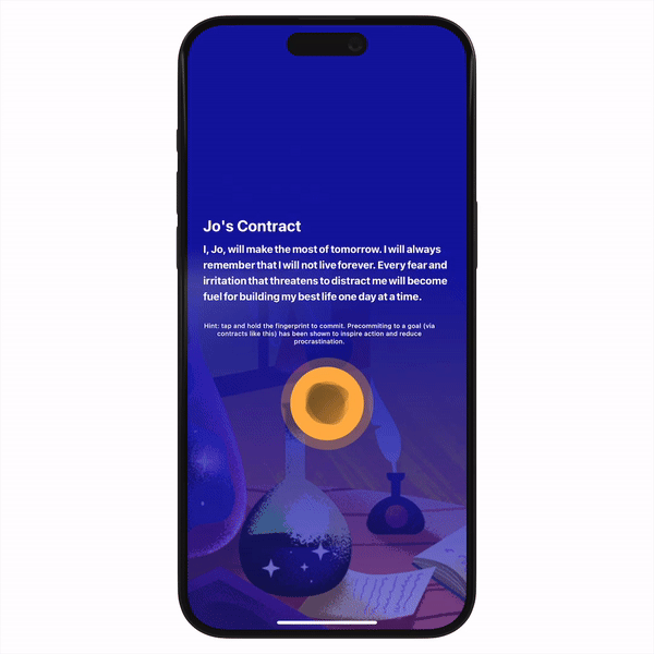
In the Fabulous app, during onboarding, they show you a promise with your name on it. You “sign” it by pressing your thumb on the screen.
Even a small step like a thumb press can make you more likely to try the app and commit to your goals.
Small steps can lead to big outcomes.
7) Leverage loss aversion
We subconsciously avoid losing:
Loss aversion is a cognitive bias where the fear of loss outweighs the joy of gain. This principle is deeply rooted in our psychology. We are hardwired to instinctively avoid losses. Explore the psychology of this further here.
Experiencing a loss feels 2x as impactful as achieving a win. In other words, losing $100 will “hurt” more than the joy of gaining $100.
This is how you might leverage loss aversion effectively:
Highlight potential losses: Start by subtly highlighting what users might lose if they follow through with an action. This is not about creating fear but rather about emphasizing the value of what’s at stake.
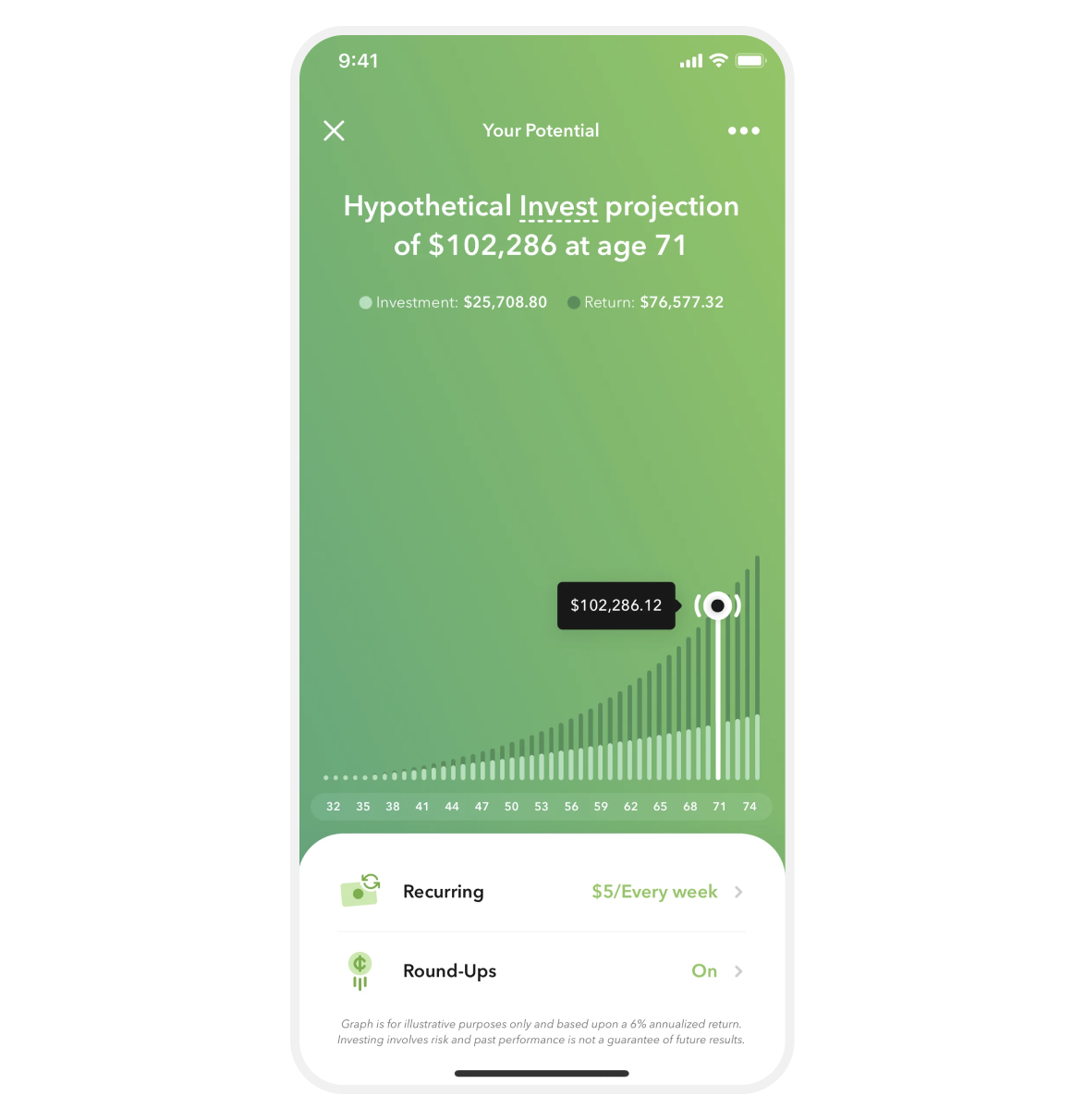
Acorns are using loss aversion in a very clever way here. They reframe your potential loss as gains. Giving people a clear projection of what is at stake if they aren’t able to part with $5/week.
Provide assurance: Offer immediate validation or confirmation when users take actions that could lead to loss, reinforcing their decision and reducing anxiety. For example if people make changes in their settings and tap the back button — show a success toast telling em’ their changes were saved. Instant positive feedback helps build confidence in the product and their choices.
Remind people of their commitments: This is easy to do and motivates and encourages continued engagement. For instance, for a fitness app, after someone completes a workout, show a summary of their progress with a message like “Great work! You’ve completed 5 workouts this week. Keep up with your goal!”
Showcase success stories: At our core, often what we truly desire is transformation. Use social proof to share examples of how others have successfully transformed themselves without experiencing loss. For example for a language learning app, highlight stories from users on the benefits they gained and the losses they avoided by sticking with the program: “I almost gave up, but now I can confidently converse in Spanish, it’s really created a new spark in my relationship!”
Key Benefits:
- Churn: People are less likely to give up if they are given reassurance along the way.
- Conversions: People may be hesitant to make large commitments. It’s why a free trial works so well, it removes hesitation and fear of loss.
- Trust: People will trust products that communicate transparently about the potential outcomes of their actions.
Bonus tip: opt in toggle
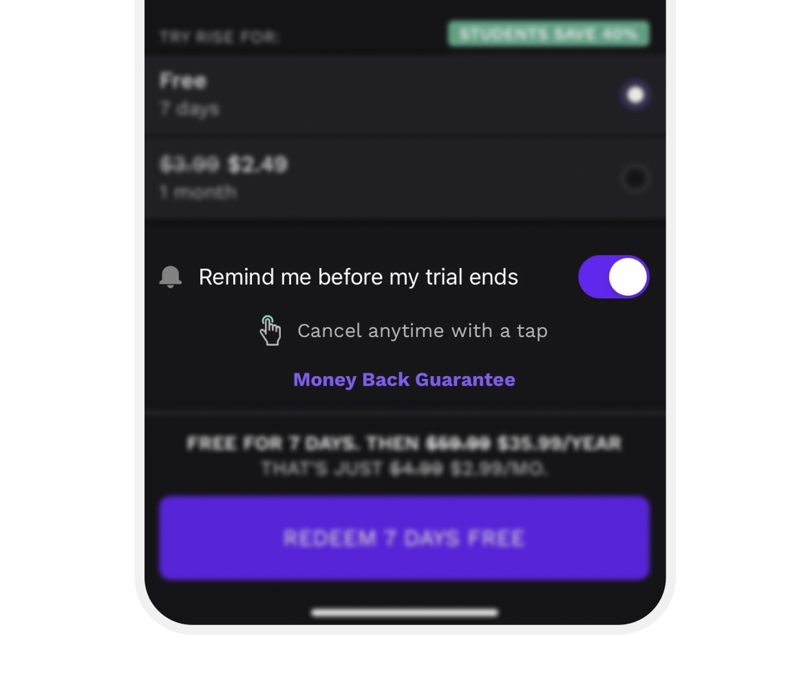
Rise takes a different approach by allowing users to opt-in for reminders. This personalized approach could offer a greater sense of reassurance, as it involves a deliberate choice. It might also be a perfect moment to prompt users to turn on those pesky push notifications.
Final Thoughts
Beyond usability, the secret to building products that resonate lies in a deep understanding of how people think and behave.
I emphasize benefits like conversion, churn, trust, and engagement for a reason: they’re the cornerstone of successful digital products. Using this language to back neurodesign principles helps you impact crucial outcomes. It’s about making you a sharper designer and a persuasive advocate for designs that align with your company’s goals.
Remember: Key metrics are your blueprint for getting designs shipped.
Appealing to our intrinsic motivations is why I love being a product designer. It’s such a practical blend of design, psychology and business.
Your Neuro Nuggets:
- Delight your users: Make interactions memorable.
- Make the effort visible: Show the labor behind your work.
- Use faces: Connect on a human level.
- Utilize scarcity: Harness the power of desire.
- Encourage personalization: Make every experience uniquely theirs.
- Start small to achieve more: Build greatness step by step.
- Be clear on the consequences: Guide decisions with transparency.