Imagine if every time you walked into a McDonald’s the menu was different, the food was different, or the prices were different. If you had to relearn McDonald’s every time you walked in, it would be less attractive as a fast food restaurant. People rely on consistency and past experience for fast decision making. Inconsistencies cause delayed responses and, in some cases, unwanted errors.
Imagine if every time you walked into a McDonald’s the menu was different, the food was different, or the prices were different. If you had to relearn McDonald’s every time you walked in, it would be less attractive as a fast food restaurant. People rely on consistency and past experience for fast decision making. Inconsistencies cause delayed responses and, in some cases, unwanted errors.
McDonald’s lovers have learned the menu through frequent visits to different McDonald’s locations (same brand, different locations). Conversely, web users learn standard web behaviors by frequent visits to different websites (different brands and markets). The more consistency there is, the easier it is for users to find their way within a single website and to move from one website to another. Deviation in standards can cause delays for users or cause unwanted user behaviors, such as abandonment in favor of other companies. However, this does not mean that creativity should be banned or that reinvention of the wheel is no longer needed. After all, today’s Mercedes looks quite different from Karl Benz’s first gasoline automobile.
Restroom signs are fun examples of how creativity and consistency can coexist. Designers often take the familiar male and female symbols and propose their own creative interpretations, offering a unique look-and-feel to a universal symbol.
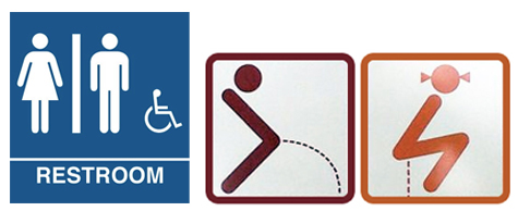
As long as it doesn’t interfere with the goal of the sign—i.e., providing a clear direction and organization—creative designs can offer great ways of uniquely conveying the message.
Macro-Level vs. Micro-Level Consistency
There are two ways of ensuring consistent design. One way is to follow well-established market standards used in other sites (or even other media). This is macro-level consistency. The other way is to establish a new set of rules that remain consistent within a specific site, which I refer to as micro-level consistency. Through the usage of graphic design fundamentals such as colors, type, shapes, layouts, and grids, designers may elect to use the macro approach, the micro approach, or a combination of the two, in order to achieve consistency. This can help build users’ trust, improve the speed of usage, enhance readability, and encourage certain behaviors and emotional responses that should result in better experiences.
Consistency through Design Fundamentals
Color Consistency
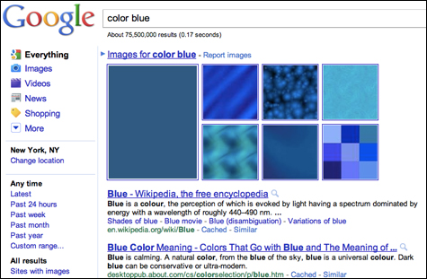
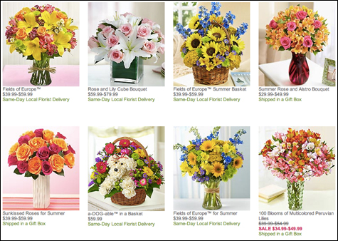
Color is interpreted by the brain faster than words and, when used correctly, serves as a great visual cue for the functions and behaviors of site elements. Web users learned to trust that blue text (whether underlined or not) is most likely a link that will lead to another page. This is a macro-level standard that has been adapted by many websites.
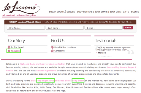
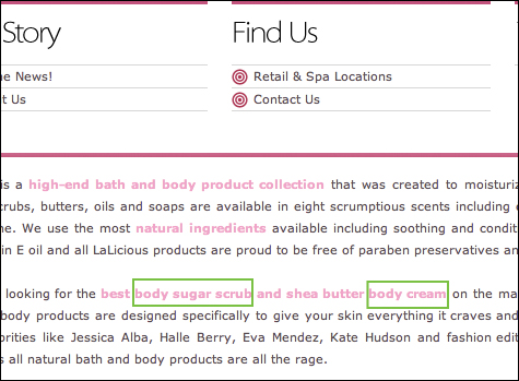
LaLicious, a bath-and-body product line, chose a micro approach for their website design, using the color pink for links. The usage of a different color for links does not by itself cause inconsistency. However, in this case, the pink text elements function as links only in some cases (boxed in green in the screenshot below), while in other cases the pink text is just plain text. This inconsistency creates confusion as users realize they cannot trust the message conveyed by the colors and are forced to hover over each element to determine its functionality.
One solution to this might be to underline links even when they’re not being hovered over. This would differentiate them from non-link pink text elements. Or the color pink could be used for links only. If there is a need to highlight certain words, a bold style could be used instead of text color to indicate emphasis.
Type Consistency
Typography is the style and arrangement of typeset matter. In communication design (with which UX design has significant overlap), the appearance of words is as important as their meaning. Type attributes such as typeface, size, spacing, margins, etc., need to be carefully planned in order to best convey a message and direct users’ attention. Users look for familiar patterns of either macro-level or micro-level consistency to quickly scan pages and complete tasks. News sites mimic newspaper type styles, using larger fonts (in many cases bold styles) for main headlines, medium-size fonts for sub-headlines, and smaller fonts for article copy. This macro approach allows quick page scanning and fast decision making as users scan content and determine what to read.
Let’s take a look Amazon, the largest online retailer in the world. Within an Amazon.com product page, there are thirteen different font treatments in the product description alone, and the full page includes additional styles. Thirteen styles are too many for users to memorize and decipher to quickly learn a system and reuse it properly. Further, the current micro system lacks visual organization, making it difficult for users to quickly scan the page.
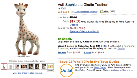
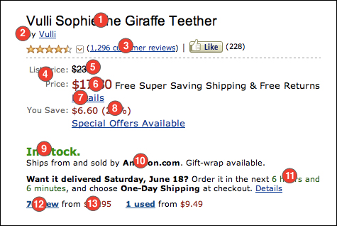
- Font Key (Photoshop point settings):
- 1. 20 point, black
- 2. 12 point, black
- 3. 12 point, blue, underline
- 4. 12 point, gray
- 5. 14 point, black
- 6. 18 point, red
- 7. 14 point, blue, underline
- 8. 14 point, red
- 9. 16 point, green
- 10. 12 point, black, bold
- 11. 12 point, green
- 12. 12 point blue, underline, bold
- 13. 12 point, red
By contrast, here is the same product as presented on eBay. Two font colors and five font sizes and styles are consistently used throughout the product description creating a clear visual path and quick information scanning.
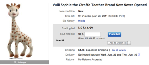
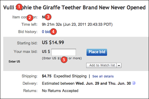
- Font Key (Photoshop point settings):
- 1. 18 point, Black, Bold
- 2. 12 point, gray
- 3. 14 point, black, bold
- 4. 12 point, blue
- 5. 10 point, black
Shape Consistency
Shapes are the building blocks of graphic design and are often used to organize and separate information. Together with type, color, grid, and layout, shapes can confer meanings and certain feelings onto page elements such as copy and images. Circular shapes, for example, will soften an overall look-and-feel, while the sharper corners of a square will appear rigid and orderly.
Shapes are often used to direct the eye through the design and keep the user’s interest while moving from one element to the next. Inconsistent usage of shapes may disorient users and interfere with their performance of tasks.
Most sites present their products using a square- or rectangular-shaped areas. This macro approach works well as it is easy to implement and serves the purpose of organization.
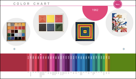
The Museum of Modern Art (MoMA) often produces small, informative websites for each of their exhibitions. The designers for their color exhibition website broke from the standard square/rectangle shaped product display (macro), presenting the color exhibit site in a unique and fresh light. Each product is presented within circular shapes, each in a slightly different size and alignment. The circular shapes were most likely designed to represent the color wheel (considering the exhibit topic) and give a softer and more playful look to the page. Further, the different size circles and alignment changes were carefully planned and achieved a fun yet organized atmosphere that is easy to navigate.
Layout and Grid
Think of a grid as a plan for your page layout with one goal in mind: a seamless user experience. It provides guidelines for page content and organization, and establishes a modular structure that allows layout variations without affecting readability and consistency.
The site’s main navigation design needs a careful consideration when designing the page layout. A website’s navigation is its table of contents and one of the main cues for users about the depth of the site and their position within. It is therefore essential to create a navigation system that is easy to locate and use.
A macro-level standard is to position the main navigation either at the top of the page or on the left-hand column (for left-to-right languages, anyway).
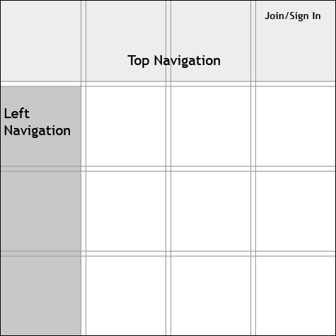
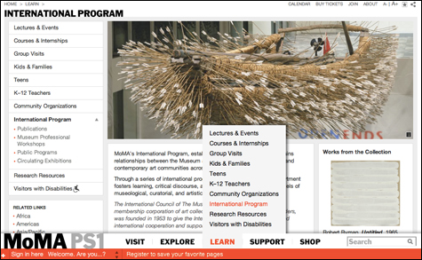
The main navigation for MoMA homepage is placed at the bottom of their page layout (a micro approach). This causes multiple issues:
- A natural readers’ flow is from left to right, top to bottom. A top navigation often serves as an anchor and a starting point for a page, as well as a comfortable position for users to return to if lost. Placing the navigation at the bottom not only sends users searching for the navigation when they first encounter the page, but also forces them to keep jumping from bottom to top (navigating at the bottom, then jumping to the top of the page to view the content).
- Breadcrumbs and page titles were treated as a macro grid approach as they were positioned at the upper left-hand part of the page. This causes a complete visual disconnect between the main navigation, breadcrumbs, and page titles, which should all work together to serve one purpose: telling users where they are in the process.
In conclusion, keep thinking outside of the box but don’t forget the box still exists.
The boundaries of convention, although invisible, have taken a while to establish, and following them will keep you on target. Communication design and UX design are about sending a message for people to read, understand, and follow. Whether you select a macro approach or design a micro system, the goals remain the same: a seamless user experience.