A person’s behavior on the Web is highly goal-driven. People have something they want to accomplish, whether it’s making a purchase, finding a recipe, or learning how to do something new. Inherent in many web page designs, therefore, is information to help a user perform an action. For example, if you design a button that must be clicked to reach a desired goal (e.g., placing an item in a shopping cart), then shadowing the button so it appears to be raised will help your audience understand that the shape is a clickable object.
In addition to these types of visual cues, we often write instructions to assist users in knowing what to do next. These instructions guide the eyes and minds of the individual to look at the appropriate place and to take the appropriate action.
Mental models
Designing and writing the instructions that are part of the UI design is both an art and science, involving copywriting and design skills as well as an understanding of how people use mental models.
A mental model is a person’s internal mental representation of how things work. It’s a broad conception of causal actions and their effects. People apply their mental models to new situations so they don’t need to relearn everything from scratch. This helps to make us cognitively efficient.
Through experience, users develop mental models of how different types of websites work. They learn the types of actions to take on an e-commerce site versus the types of actions that will work on a photo-sharing site. This means people will apply their stereotype or mental model of similar websites to make assumptions about how your website works.
This is one of the main reasons UI instructions are so important. People have an unpleasant experience when their mental models are inaccurate or incorrect. It causes frustration, errors, and inability to accomplish a goal. A frustrated user might look for another website that’s easier to use.
Writing easy-to-understand instructions and presenting them in an aesthetically pleasing way can ward off these types of problems. Good instructions will guide website visitors, even if their mental models are imprecise or erroneous.
So here are some guidelines for writing UI instructions that I’ve gleaned from years of designing online learning as well as gems from usability research.
1. Know the subtleties of your audience
When you know the characteristics of your audience, you can imagine them and direct your words to them. Unless your visitors are a savvy, homogeneous group, it’s best to assume they’ll need some guidance to achieve their goals.
Think beyond the obvious audience characteristics to consider the subtleties of how readers might perceive and react to your words. Will they understand idioms? What about humor?
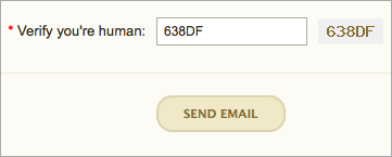
Notice the example above. The humorous instructions on the CAPTCHA form could only work with a sophisticated and experienced audience. Inexperienced computer users and those who are not fluent in English would have no idea that “Verify you’re human” means to type the alphanumeric characters in the box.
2. Balance brevity with getting the point across
Finding balance is always an issue. When writing UI instructions, include enough detail so users know exactly what to do, but not so much detail that it becomes difficult to process the information. People can only process small amounts of information at one time.
You can help the situation by writing instructions in plain and simple language, which should help visitors accomplish their tasks efficiently and quickly. Try to use short sentences when possible. For example, this sentence could easily be broken into two: “Click the Add to Cart button, then click Check Out at the top of the screen.”
3. Remove irrelevant information

This guideline goes along with the brevity advice above, but is often best to do at the end of the writing process. At the end, you look at your writing from a different perspective. It’s easier to see which information is irrelevant, because it adds to the confusion quotient. Deleting extraneous and superfluous details will tighten up the final copy. In the example above, the communication could be more effective with fewer words. There’s no need to sacrifice clarity for personality. With balance, you can have both.
4. Select the most effective and accurate words
The task of writing accurately involves a subtle discrimination between words with similar meanings. Usability research shows that people scan a web page rather than read it. Thus, your wording should communicate effectively while someone is on the fly and barely paying attention.
Use words that promote clarity. “Select a date” is okay, but “Click on a date” is more accurate. Avoid double negatives, such as “I do not want to unsubscribe.” 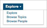 Also, stay away from jargon that some people won’t understand, like industry acronyms and technical terms. Speaking of precision in word choice, when you look at this menu on the right, do you understand the difference between Explore and Browse?
[Note: There is some disagreement over whether “select” or “click” is more appropriate for people using assistive technologies.]
5. Write in the active voice
The active voice is crisp and clean and will move people to take action. The passive voice makes readers yawn. Compare this sentence in both voices:
- Active – “Click the Journal link to search for an article.”
- Passive – “The Journal link should be clicked when you are ready to search for an article.”
6. Place the instructions aesthetically
Designing UI instructions can be a challenge. You must determine where they belong in the visual and information hierarchy. Although they need to be noticed by users, they shouldn’t be so prominent that they overpower the page. And as a design element, they must fit in well with the surrounding environment. Bottom line: Plan for instruction text during the initial phases of design.
7. Communicate relationships through vertical spacing
If the instructions are longer than one line, it’s important that readers know which instructions belong together. The leading (or vertical spacing) between related sentences should be large enough to enable legibility yet small enough to show the sentences are associated. When there are several steps, keep each step separate by increasing the line spacing. Number the instructions if they are complex or will be perceived as such.
8. Select a typeface that enhances legibility
Think hard about the type as a design element. Use a typeface and style coherent with the rest of the site design. Consider the size of the font. The user instructions must be legible by people of all ages. Avoid bitmapped text whenever possible so users can enlarge the text if necessary.
9. Use graphics if they will help you communicate
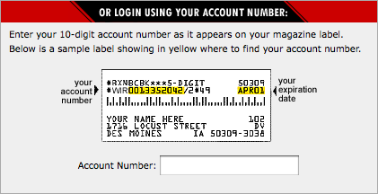
Yep. Sometimes it’s nearly impossible to say something in words. A graphic provides support and makes text comprehensible, as in this explanation of where to find your account number on a magazine label.
10. Make it personal
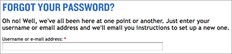
It’s okay to add a little personality to your UI instructions and system messages. It might help your visitors have a pleasant or humorous experience. Just ensure that your between-the-lines message can never be interpreted as a put-down. For example, the instructions above help visitors feel better. After reading the message, you don’t feel like such a loser for failing to keep passwords in a place where they can be found.
11. Make your instructions accessible
It’s important that people who have difficulty reading small print and/or use devices to read computer screens can read your small print instructions.
Some basic accessibility guidelines for writing user interface instructions are to: avoid using graphical text so it can be enlarged (discussed in #8 above); provide text alternatives to graphical content so it can be translated into other forms such as Braille; and clearly separate the instructions from the background so they can be easily seen. In addition, use hyperlinks contextually so that they make sense if the person can’t see the screen. For example, a link that states, “Instructions for using this form” is better than a “Click here” link.
12. Test your instructions
Test instructions with sample audience members, people outside of your office and with no prior knowledge of what it is you are doing. Observe one or more people performing the task for which you’ve written instructions. Note any difficulties they have and revise the instructions. Repeat the process until people accomplish the task without problems.
You may be surprised at the time and effort it takes to write effective UI instructions. Yet it might be one of the most valuable endeavors you pursue in designing a successful UI. Through the simplicity of comprehensible instructions, you can achieve so much—user assistance, appropriate tone and personality, and showing that you care.