In the new Mac OS X Lion operating system, there has been a noticeable change to the interface: the removal of the scrollbar. Users can adjust their settings to add scrollbars back in, but the fact that this option is even offered speaks volumes about the diminishing role of this once-indispensable interface element.
Since the early days of GUIs, the scrollbar has provided a way for users to navigate around an object that’s too large to fit within a window. However, over the past few years, users have been given other ways to scroll: mice with scrollwheels, laptop trackpads with scrolling capabilities, and a new set of gestures for mobile devices and tablets. With this reduction of the role of scrollbars, it’s important for designers to be conscious of the scrollbar’s benefits and drawbacks, and to know how to replace it with other elements that have similar benefits.
Benefits of the Scrollbar
In addition to allowing the user to scroll, the scrollbar has several other important benefits. The height of the scrollbar relative to the window corresponds to the height of the visible content relative to that of the full content. This provides an at-a-glance sense of scope and orientation. In addition, the mere existence of the scrollbar indicates that content is hidden, and communicates the direction users must scroll to find it. Furthermore, when navigating a long piece of content, the scrollbar offers a way to rapidly move to a specific point within that content. Finally, the universal familiarity with the scrollbar makes it a very intuitive interface element for the vast majority of users. It provides all these benefits elegantly and efficiently, without distracting from the page content.
Drawbacks of the Scrollbar
Despite these benefits, the scrollbar has several drawbacks that have led to its diminished importance. First, it adds to interface complexity at a time when designers are striving for, and users are demanding, simplification. Secondly, it’s positioned inconveniently. If you’re within the flow of a task, moving your mouse all the way over the right side of the window to scroll up and down is distracting. Another drawback of the scrollbar is that it moves on a continuum and not in defined increments, which isn’t optimal in some situations, such as paging through eBooks and navigating a series of objects (e.g., a photo album or a slideshow).
Scrolling on Computers and Mobile Devices
For web pages and mobile devices, scrolling vertically is very standardized. Content almost always extends vertically, so an indication of how to find hidden content is rarely needed.
Due to the drawbacks mentioned above, the scrollbar has been replaced with other methods of navigating content panes. In mobile devices, users swipe vertically upon the content itself in order to scroll. In most cases, the scrollbar briefly appears when the content loads, then quickly disappears. It only reappears again when scrolling is activated. This gives users a sense of orientation and scope without consuming precious screen real estate.
On computers, the scrollbar’s primary function—scrolling—has been made almost irrelevant by hardware innovations. Apple laptop trackpads enable users to scroll with a two-finger swipe, and their touch-sensitive mice allow scrolling with a vertical swipe. On many Windows-based computers, the right edge of the trackpad has a defined area for scrolling, while mice commonly have a scrollwheel. In web browsers, using the up and down arrows scrolls the content as well.
In addition, sites such as Google, Facebook, and Foursquare are overriding the standard browser scrollbar with a narrower, lighter version, matching Apple’s slimmed-down scrollbar.
Scrolling on the iPad
Unlike mobile apps and websites, iPad apps are extremely variable in terms of their layouts, often utilizing multi-column, magazine-style displays. Designers of iPad apps are also much more experimental in their use of gestural interactions. Consequently, interfaces are very unstandardized, so having indicators that show how to navigate is important.
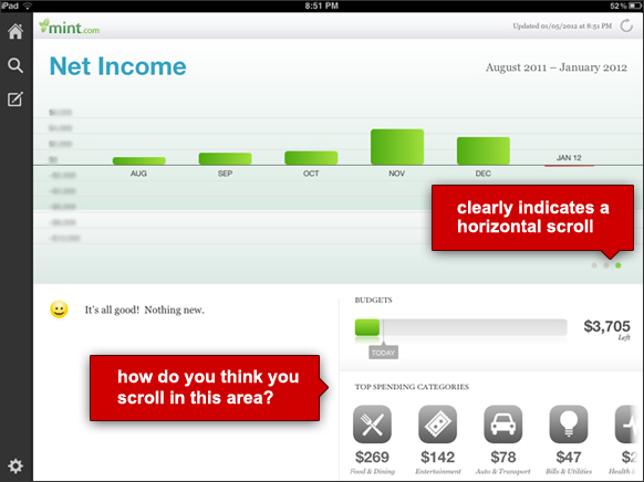
The Mint app (below) provides some examples of these indicators. The top graph area uses a series of dots as a clear indicator that a horizontal swipe reveals more content. By showing a specific number of dots, and the user’s position within the set, it also provides orientation and scope.
In the lower right, the row of spending categories fades off the screen to the right, which is an often-used indicator of continuation, suggesting that content curves off the screen like a scroll.
In this example, users can actually vertically scroll the lower-right area as well. But this capability lacks any visual indicator, making it difficult to discover.
Like the Mint app, the USA Today app uses a subtle fade at the bottom of their main screen to suggest continuation. They also cut off the content at the bottom of the screen, suggesting that you can scroll vertically to see the rest.

To compensate for an unclear scrolling mechanism, the Wall Street Journal app shows detailed scrolling instructions. This technique is used in other apps as well; Flipboard and The Daily provide instructions on some screens to “flip” or “swipe” to continue.
This type of instruction is often necessary for apps that allow innovative gestural interactions. However, for an action as basic and essential as scrolling, apps should adhere to conventions and include visual affordances that clearly imply the interaction method.

Wired actually created a custom scrollbar for quickly scanning through their magazine. While it doesn’t exactly have the traditional scrollbar functionality, its benefits match those described above: it allows the user to scroll, indicates how to see hidden content, and provides a sense of orientation and scope.

Conclusion
Since the early days of GUIs, scrollbars have been built into windows so designers could just take them for granted. However, as the prominence of system scrollbars has reduced, designers need to be more conscious of them, and understand the benefits of scrollbars that are lost when they’re not shown. For all platforms, it’s increasingly up to designers to decide whether to use scrollbars, how to format them, or how to use other methods to replace the many benefits of this once-indispensible element.