Traditional usability guidelines propose that error messages should be rationally informative. However, error messages are also inherently brand messages. Branding seeks to create emotional responses to products, and failure evokes emotional responses. Current failure reflects backwards to prior experiences and forward to prospective experiences, and the form of an error message is indicative of the the brand’s sensitivity to the user experience. Error messages are therefore a critical strategic moment in brand awareness and loyalty.
Fred Wenzel refers to error mascots, such as Twitter’s Fail Whale (Figure 1) as fail pets. Fail pets are of particular interest in terms of branding because they can result in brand recognition through earned media. However, that same recognition carries the danger of highlighting service failure. This article discusses the rise of and changes to the depictions of fail pets, from the initial, highly recognizable fail pets, to markedly more cautious error message imagery in later products.
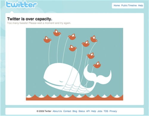
Figure 1: Twitter’s Fail Whale: The first fail pet
A Brief History of Error Message Infamy
As personal computing took hold in consumer markets, error messages became infamous among lay users as terse, jargon-laden, unhelpful, enigmatic, and ugly proof of the inhumanity of computing. Notable examples include Microsoft Windows’ “blue screen of death” (BSOD) (Figure 2) and Hewlett-Packard’s “PC load letter” (Figure 3). These error messages were so recognizable that they became powerfully associated with perception of the brands and their products. In Microsoft’s case, the BSOD became even more strongly linked to the brand as successive versions of the Windows operating system retained to same ugly and cryptic error message even as the operating system itself was ever more polished. The BSOD highlighted the fact that the interface was a veneer, undermining the company’s claims of innovation.
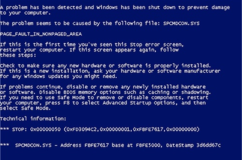
Figure 2: Microsoft Windows XP “Blue Screen of Death”
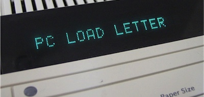
Figure 3: Hewlett-Packard “PC Load Letter”
While usability guidelines of the era certainly did point out the problems with such error messages, the Internet era has brought increased appreciation of design and of the social-first nature of modern consumer computing. This is apparent in the changes to the display of HTTP status codes such as “404 Not Found.” As Jesper Tverskov points out, the typical early display of 404 errors literally displayed only the error code (Figure 4).
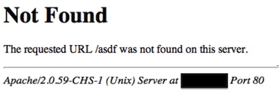
Figure 4: Apache default 404 error message
However, as web development matured, web browsers began to offer users “friendly” error pages (Figure 5). While this was undoubtedly better for users overall, from a branding point of view users lost not only the technical connection the desired website but were also removed from its branding, which could lead to abandonment of the website.
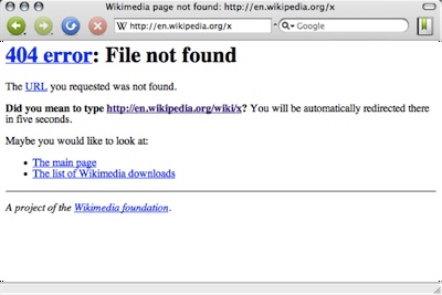
Figure 5: Camino “Friendly” 404 page (Source: en.wikipedia.org)
Starting around 2001, websites began to offer customized error pages in an attempt to retain branding. The first customized pages simply branded the error with the website logo and perhaps a search field for the site. Yahoo’s error page has remained unchanged in this format since 2004 (Figure 6).
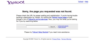
Figure 6: Yahoo!’s 404 error page
Since then, 404 pages have evolved into more geek-oriented humorous messages that promote the website’s brand image. For example, Blippy.com created a sensation when it featured an interactive 404 page that combined its cute hand-drawn drawn style with the double rainbow meme (Figure 7).
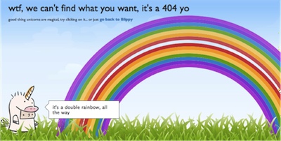
Figure 7: Blippy’s 404 error page created a sensation using the “double rainbow” meme
Web 2.0 and the Rise of Fail Pets 1.0
As important as customized 404s were, it was the Fail Whale’s arrival on the shores of Web 2.0 in 2008 that marked a sea change in the adoption of whimsical error messages (Figure 8).
The story of the Fail Whale is well documented. Twitter’s original 503 Service Unavailable message displayed a LOLcat (Figure 8).
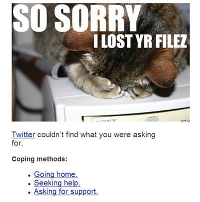
Figure 8: Twitter’s original 503 LOLcat error page (Source: Paul Downey)
In 2008, Twitter was getting attention both its unique approach to social sharing, but also for its all-too-frequent scaling problems. As Rob Walker reported, Twitter founder Biz Stone “decided [the LOLcat] was too jokey and turned to iStockPhoto, where he encountered [designer Yiying] Lu’s illustration [“Lifting a Dreamer”], which nicely suggested a team effort to accomplish something difficult. Plus, it was supercute.” (Figure 9).
Figure 9: Twitter’s 503 error page showing the Fail Whale
In terms of branding, the birds in the image bear some resemblance to Twitter’s own logo, which is surely no accident. However, the birds caught users’ attention much less than the cute whale did. On May 30 2008, Nick Quranto dubbed the image “Failwhale”. From that moment on, Twitter users began an unofficial campaign to popularize the concept, depicting it in cartoons, tattoos, art installations, games, and much more. The Fail Whale became earned media of a particularly important stripe, because Twitter users treated it as a badge of membership. Getting members to love your error message rather than revile it is quite an achievement.
When web-comic artist The Oatmeal found Tumblr facing similar scaling issues as Twitter, he proposed that all web services should have cute error mascots. Tumblr listened and officially commissioned The Oatmeal to create their 503 page (Figure 10).
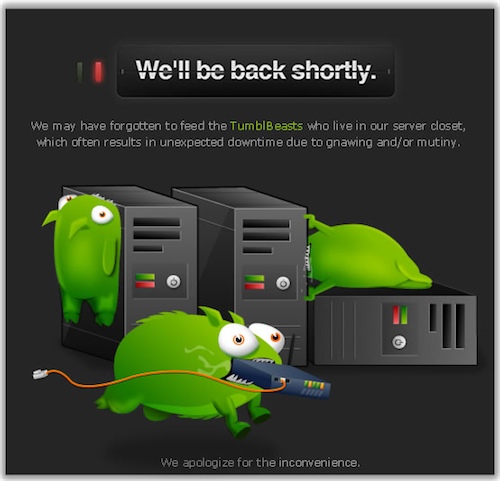
Figure 10: Tumblr’s 503 error page showing the Tumbeasts
Since then, a number of services have used fail pets on their error pages. Github features its Octocat mascot on animated 404 and 500 error pages, but also has an angry unicorn on its 503 error page (Figure 11).
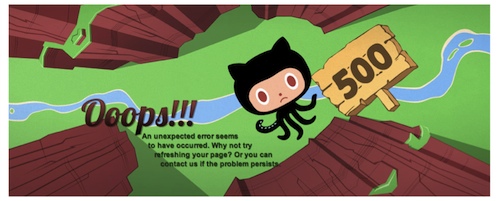
Figure 11: Github’s 500 error page featuring Octocat
The Case Against Fail Pets 1.0
However, fail pets that are as recognizable as the Fail Whale may be on a downswing. Zappos, which was praised for using Dash the Dog as a branding opportunity for its 404 pages (Figure 12), has changed to an unnamed sad penguin image (Figure 13).
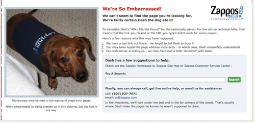
Figure 12: Zappos.com’s old 404 error page featuring Dash the Dog (Source: Fredericana.com)
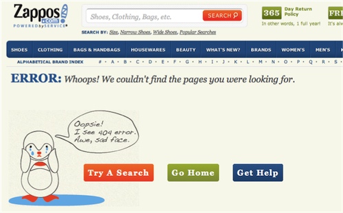
Figure 13: Zappos’s current 404 error page featuring the unnamed sad penguin (Source: Zappos.com)
Indeed, the Fail Whale, Tumbeasts, and Neatorama’s Neatokraken have started to appear less frequently, and not just because the services have largely solved their scaling problems. Tumblr seems to have removed the Tumbeasts, presenting a far more staid, professional error page with no imagery at all (Figure 14).
Figure 14: Tumblr’s current Tumbeast-less 503 error page
When the Firefox 3.1 Crash Reporter was being redesigned, developers on the Mozilla Blog debated the possible use of Foxkeh, the official Firefox Mascot in their error pages. Lead designer Alex Faaborg wrote: “I’m not sure if we want to create something that is too memorable since it will inevitably become the symbol of our failure (blue screen of death). Instead of people saying ‘I’m sick of Firefox crashing’ they will say ‘I’m sick of the [insert metaphor we select here]’”
Evidence for users becoming sick of the metaphor certainly exists for the Ars Techica Moon Shark (Figure 15), used throughout the site for a range or errors. Users have reported being unhappy with seeing Moon Shark so regularly (although that might also be because Moon Shark is not as cute as the Fail Whale).
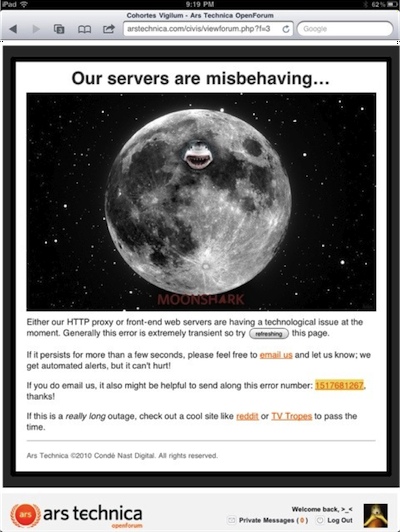
Figure 15: Ars Technica’s somewhat unloved Moonshark
Evidence for users becoming sick of the metaphor certainly exists for the Ars Techica Moon Shark (Figure 15), used throughout the site for a range or errors. Users have reported being unhappy with seeing Moon Shark so regularly (although that might also be because Moon Shark is not as cute as the Fail Whale).
Mozilla has gone down a more verbal path for its various error messages. When the Firefox browser crashes and the application attempts to reload the tabs/windows that were open prior to the crash, the title of the error message and restart screen admits embarrassment (Figure 16).
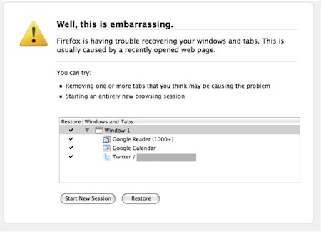
Figure 16: Firefox’s crash recovery message
Firefox’s designers have chosen to title the window with a human-sounding message—the direct address of one social actor to another. It also admits a problem but without using words such as “error” or “crash,” making it just slightly harder to pin those concepts on the application. The phrasing lightens the sense of trouble for the user while also suggesting that the user and the product have a casual social relationship.
Fail Pets 2.0
Recent error messages from Adobe Flash (Figure 17), Apple iCloud (Figure 18), Google Chrome (Figure 19), and even Microsoft’s new BSOD (Figure 20) seem to have become more restrained while still retaining some element of the value of fail pets. All four companies have retreated from unique and highly recognizable fail pets, returning to a much older Internet tradition of humanizing the computing experience: emoticons. Even though Apple’s iCloud logo is linked by design to their older System 7-9 logo, that logo itself was strongly reminiscent of emoticons. The highly simplified imagery of these new fail pets—if they can still be called that—resist a strong connection to the logo or mascot of the brand.
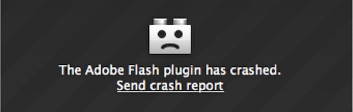
Figure 17: Adobe Flash emoticon-ized brick Flash plugin crash error mascot
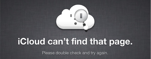
Figure 18: Apple iCloud emoticon-ized iCloud error mascot (one of a series)
Figure 19: Google Chrome browser emoticon-ized folder error mascot
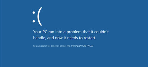
Figure 20: Microsoft 8 emoticon-ized new Blue Screen of Death
Another recent restrained version of fail pets 2.0 can be found in Google+ (Figure 21) and, in an interesting twist, Twitter (Figure 22). Both services are currently using images of robots in various states of disrepair to indicate errors. Robots may be very useful as fail pets because unlike animals, robots can suffer technological errors. Further, the more that websites use similar imagery (whether robots, emoticon-ized bricks, clouds, etc.), the less each new fail pet becomes associated with the particular brand and the more fail pets come to indicate service failure generally.
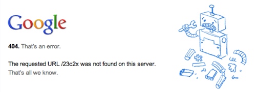
Figure 21: Google’s current 404 error page showing their Fail Robot
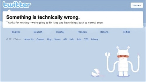
Figure 22: Twitter’s current 503 error page showing their Fail Robot
Google uses their Fail Robot for all errors, even when its image of disrepair is not well related to the problem. For example, when a Google+ Hangout is full, the broken robot is shown (Figure 23) even though it is an intentional constraint, not an error. If Google wanted to accurately depict the issue, they might show many robots trying to cram into a telephone box. But to do so would associate the robot with Google’s brand. Not creating a specialized image is both easier and shows savvy brand caution.
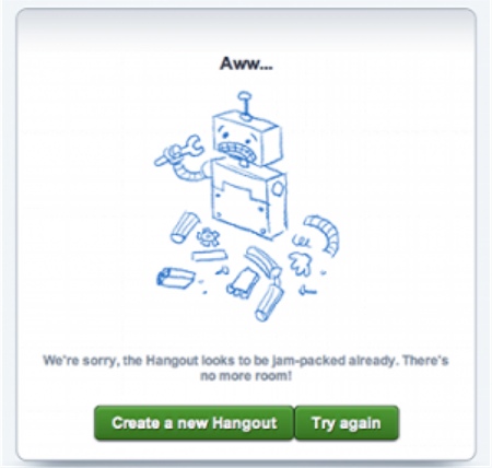
Figure 23: Google+ Hangout at maximum capacity page
Pros and Cons of Fail Pets as Strategic Whimsy in Error Messages
McCarthy, Wright, Wallace & Dearden (2005) write that “enchantment is a useful concept to facilitate closer relationships between people and technology.” They characterize enchantment as “including the specific sensuousness of a thing, senses of play, paradox and openness, and the potential for transformation.” Fail pets are a manifestation of the importance of sensuousness, play, and transformation to the relationship between service failure and the brand. That being said, fail pets have both pros and cons and should be used with caution.
Pros
- Fail pets show that a service, and thus a brand, cares, and acknowledges that users experience failure is an emotional and interactional moment.
- Fail pets allow for rapid recognition of the occurrence of error. They are far more easily recognized and likely to be comprehended than words, which people often do not read.
- Fail pets can result in earned media.
Cons
- The more popular the fail pets, especially through earned media, the more strongly associated the service becomes with failure.
- Fail pets may develop more visibility and recognition than brand mascots or logos.
- Fail pets may annoy users because they could be seen as flippant or overly cute.
- Fail pets may annoy users because they may make errors more memorable, leading to an impression that the service is always having problems.
- Fail pets may evoke specific cultural issues.
In The Media Equation, Reeves and Nass (1996) claim that anthropomorphism in UIs provokes anthropomorphic responses. In the preface they express “great pleasure of seeing some of our work included in [Microsoft’s] products.” Paul Dourish’s damning review of The Media Equation points out that the product being referred to was Microsoft Bob, an attempt to simplify the GUI via a combination of domestic metaphors and an early intelligent agent, which ranked number two in the list of ten most hated tech mascots of all time. Number one on the list was Microsoft’s even more disastrous attempt at anthropomorphism: The Microsoft Office Assistant Clippy (Figure 24).
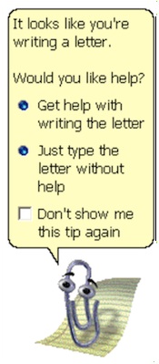
Figure 24: Microsoft’s Clippy: The most hated tech mascot of all time
The failure of Microsoft Bob and Clippy should serve as a warning to those who would deploy fail pets simply because they are cute or funny. Even given the amazing earned media of the Fail Whale, there is not strong empirical evidence that the practice of using fail pets is, in fact, working for users. This may explain the shift from strongly identifiable fail pets 1.0 to the much more cautious fail pets 2.0.
Dourish’s critique of Reeves and Nass is quite similar to Alex Faaborg’s comments on the Mozilla blog. Both provide valuable advice for UX designers considering the use of fail pets. Research carefully what kind of social reaction users will have to the particular failure, and decide whether the evocation of a highly social response is a desirable branding opportunity, or a problematic barrier between failure and resolution.
References
- Dourish, P. (1996) Review of The Media Equation (Cliff Nass and Byron Reeves, 1996). In Apple Labs Review.
- McCarthy, J., Wright, P., Wallace, J. & Dearden, A. (2005) The Experience of Enchantment in Human-Computer Interaction. Personal & Ubiquitous Computing 10(6) 369-378.
- Reeves, B., & Nass, C. (1996). The Media Equation: How People Treat Computers, Television, and New Media Like Real People and Places. Cambridge University Press.