
If you’ve ridden in a NYC taxicab in the past 6 months, you’ve likely noticed the touchscreen TV in the back seat. At first I thought this was a great innovation — GPS-powered maps to show the distance between me and my destination, real-time local news, restaurant reviews and events listings.
Then I tried using one.
As the cabbie drove wildly through the streets, frequently shifting lanes and tailgating, I bounced around in the back and held my pointer finger in front of me trying to tap on the screen. With each jolt of the cab, my hand moved. The delay between touch and response was so long that I wondered if I’d tapped hard enough or in the right place. It was only a matter of minutes before I was frustrated and nauseous, so I turned it off.
Now each time I get into a cab, the first thing I do is turn off the TV.
As a lifelong taxi-rider, I have come to accept that this is just another one of the TLC’s ill-conceived marketing attempts. Remember those recorded seat-belt announcements with celebrities voices? Big failure. Not only were they incredibly annoying, they did not cause a noticeable increase in riders buckling up. And even further back in time, in 1993, they tried putting cell phones in the back seats of taxicabs, costing a mere $1.25 per minute. Another failure.
It wouldn’t surprise me if in the next year, these touch screens were removed or replaced with better alternatives. Smart Design, in partnership with Antenna Design in NY, developed a significantly cleaner, sexier, more usable solution, which I first learned about in Sigi Moeslinger’s presentation at IxDA’s Interaction 08.
Until then, we’re stuck with what’s already been installed.
I’ve noticed three different taxicab touchscreen vendors — VeriFone, Creative Mobile Technologies (CMT), and Digital Dispatch (DDS) — and in my opinion they’re all pretty pitifully designed, from both a product design and interaction design perspective. Here’s a look at all three vendors and my thoughts on how they stack up.
VeriFone
Default Screen
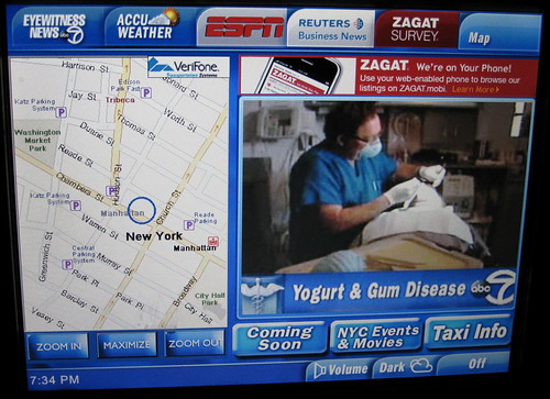
Six tabs across the top are clear, and the use of the logos is smart. With one quick scan, the user gets a good sense of the content that’s provided here — Eyewitness News, AccuWeather, ESPN, Reuters Business News, Zagat Survey, and a map — and the buttons are a big enough target area for the average-sized pointer finger.
The banner ad, a necessary evil I suppose, is well-placed, not blocking useful content or getting in the way of what the user wants to do and see. The proportion of map to TV seems reasonable; the map is easy to read and street names and landmarks are clearly marked. The circle shows the user where s/he is with the ability to zoom in and out as desired. And it’s responsive for the most part. Reloading the map takes a few seconds, but at least it works. I actually like the use of “zoom in” and “zoom out” much more than the + and – icons, which I’ve observed many people switch around. If you can state the action clearly and have the real estate to do so, no need to use an icon.
There are also settings for volume, screen brightness and the all-important Off button — very well placed in the bottom-right corner, requiring the minimum amount of effort to get to. It has a small hit space, but being in the corner you can brace your hand on the plastic around the screen and get to it quite easily (this is the basic principle of Fitts’ Law).
When the user touches any of the buttons along the top, the associated content replaces the map on the left and the TV continues to play. The selected state for each tab is pretty faint and only really recognizable on Eyewitness News and AccuWeather, but the logo banner on the top left makes it clear what you’re looking at. See the screens below:
Eyewitness News
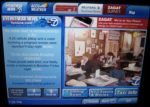
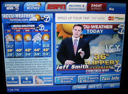
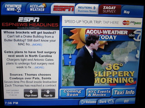
The “Scroll Down” and “Scroll Up” buttons here are a nice touch. From what I have seen, traditional scrollbars don’t work very well on touchscreens, and the reality is that the cab is moving around too much for it to work anyway. You’ll notice though on the following screens that the scroll buttons aren’t consistent from screen to screen — their placement shifts, the button colors and labels differ. Is this such a big deal? Not at all. But it’s still amusing to see.
Accuweather
ESPN News Headlines
Reuters News
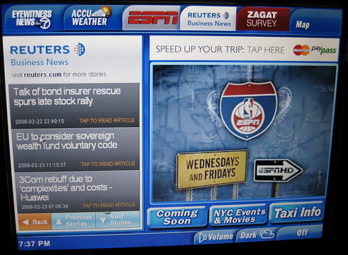
Zagat Survey

Full Screen Map
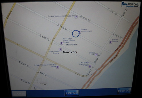
The map tab at the top and the Maximize button on the left-hand side both make the map fullscreen.
Taxi Info
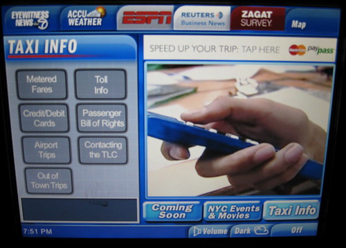
At the time that I took these photos, the Coming Soon and NYC Events & Movies buttons did not work. The Taxi Info button launches the above screen with categories of information they provide. This is similar content to the big yellow sticker that used to be affixed to the back of the front seat, often protected behind a plate of Plexiglas. Now that they’re removed this from most cabs, the info is hidden away here. I would argue that some of this stuff — fare info, Passenger Bill of Rights, how to contact the TLC — is important enough to warrant greater prominence. A sticker or sign in the back seat away from the touch screen might be more appropriate.
Off Screen
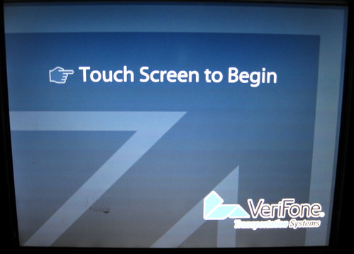
Ah yes. The trusted Off state. When this is up, I can look out the window without distraction. No sound, no movement. When I touch anywhere on the screen, everything turns back on immediately. When I touch the Off button again, it’s all Off immediately. Thank you.
Creative Mobile Technologies (CMT)
Well, I’ve shown you the best first. I probably should have shown you the worst first and then built up to the best, but well, I didn’t.
Default Screen
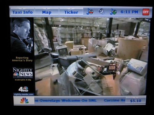
By default you see the TV almost fullscreen with the rotating skyscraper on the left.
There are three tabs for information: Taxi Info, Map and Ticker. There’s also a volume control and a tiny Off button that’s pretty tough to hit.
Taxi Info

When you click on Taxi Info, the allocated area for the TV broadcast shrinks down, the ad moves below it, and the content you’ve selected appears on the left side. Notice how the selected tab now says “Back.” It’s a clunky implementation, but it’s the right idea. The VeriFone system doesn’t provide Back buttons anywhere in the interface. Of course here, Back replaces the name of the tab and without a header above the content, the user can easily lose their way.
All of the content within Taxi Info is displayed and the user can dig deeper down into each section. See “Airport Trips” below.
Airport Trips
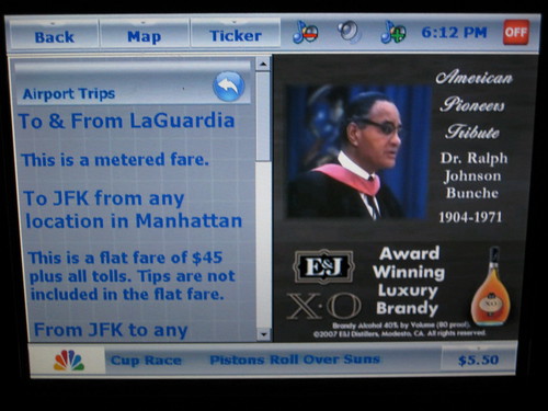
Here, the blue arrow icon brings the user back to the Taxi Info main page, while the Back tab brings them back to the initial default screen (TV fullscreen). The traditional scrollbar is pretty much impossible to use, either by tapping the up or down arrows or by dragging the bar. I had to tap the down arrow about 50 times before it moved even an inch, and it took about 10 seconds to reload.
Map
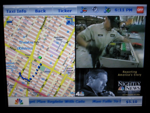
The dotted blue line shows my trajectory since I entered the cab. I don’t know what the green dot is since that wasn’t my destination. The map is well-marked, but a bit chaotic.
The minus sign in the top-left corner of the map zooms out, and the arrow in the top-right corner expands the map to fullscreen. Both are ridiculous hard to see.
Full Screen Map
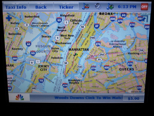
The plus sign in the top-left corner of the map zooms in.
Ticker
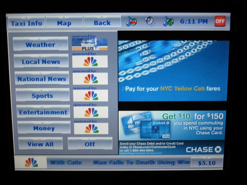
This screen is the strangest of all. Selecting any of these information types doesn’t repopulate the left-side of the screen with content; instead it changes the content being thread through the horizontal ticker at the bottom of the screen. The sponsor graphics are not only meaningless to a user but also take up much needed real estate. The Off button turn the ticker off altogether.
Fare Details
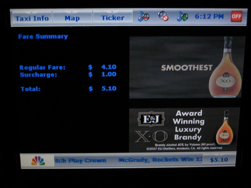
The current fare in the bottom-right corner of the screen is a nice touch which the VeriFone version doesn’t have. When clicked it displays the exact information that’s displayed on the meter up by the driver: fare and any surcharges. Still, it’s nice to have the total number right there in view without having to extend your neck to see over the partition (and the cabbie always knows what you’re doing).
Off Screen

While this is a much better design for my liking (even less intrusive than VeriFone’s style), the functionality is so sensitive it’s barely usable. When you tap the red Off button on the screen, this Off screen appears immediately and there is absolutely no delay, so if your finger lingers even for a split second, the system believes that you’ve “touched here to resume” and the whole thing turns back on. I had to tap Off about three times before it stuck.
Digital Dispatch (DDS)
Here’s the third and last system that I’ve seen in the back seat of NYC taxicabs. However, it is so horribly designed and unusable that I don’t have a whole lot to say about it.
Default Screen

None of the buttons along the top worked. The only button that caused a state change was the Full Screen button on the map, which is pictured below. The system seems to have much of the same functionality (volume, brightness, zoomable map) and similar content (taxi info, news, fare display, etc), but since absolutely none of it worked, I’m not able to review it here. Though frankly, the fact that the screen isn’t operational pretty much says it all. The Off button — tiny and in the bottom-left corner — didn’t even work, so I sulked through the whole cab ride and was probably so pissed off that I didn’t tip as well as I should have.
Full Screen Map
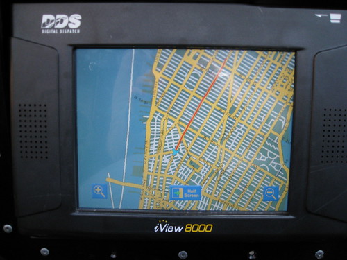
The streets are hardly marked. The zoom functionality didn’t work. The red line indicates the path from my pick-up location, but the blue arrow pointing to my current location is barely there.
So there you have it. I think it’s fairly plain to see that VeriFone has designed the best system here, and I suspect that the other systems will be replaced within the year. But there is still a lot of room for improvement. With a TV broadcast that repeats itself every three minutes and news that’s several days old, I don’t feel that there’s any reason compelling enough for me to keep the screen turned on. Now if I could watch previews of soon-to-be released movies, check out upcoming concert dates or make a reservation at a favorite local restaurant — that would be something worth putting right in front of me. Otherwise, please let me take my ridiculously overpriced taxi ride in peace.
Read more about Taxi TV in a December 2007 issue of the New York Times.


