In the past, web browser page content like text and streaming video or audio always worked, spare for occasional rendering issues.
It didn’t matter if we viewed web content on a Mac or PC, using a preferred browser like Internet Explorer (Windows), Safari (Mac), Firefox, Chrome, or Opera.
Text content followed HTML4 layout specifications, while video and audio streaming was played back using the Adobe Flash player, which was preinstalled on the browsers.
Mobile devices like smart phones and tablets changed all that. Initially, viewing mobile web content, whether static text or streaming video, worked just fine. No one had to give UX a second thought as Adobe supported a mobile version of the Adobe Flash player for all mobile web browsers’ platforms.
Then, starting three-plus years ago, viewing identical web content on any computing platform became the expected norm. We expected that content viewing on our desktop computer would render just as well on our smart phone or tablet. Computing platform users observed that viewing content on any device frequently created unacceptable UX.
Those in the computing trade or closely affiliated stated: “No problem, we are moving from content rendering software using Adobe Flash and HTML4 to HTML5 with a new <video> HTML tag to replace Adobe Flash.”
The software industry assured computing users, “We’ll have a short transition period while websites cease using Adobe Flash while simultaneously moving from HTML4 to HTML5 content layout inside of the web browsers. Soon your inconsistent UX will go away.”
Others continued to scratch their heads wondering why the promised consistent content viewing on any computing device was not always there. After all, ubiquitous platform content viewing was promised three years ago. The promised delivery of good UX on any computer platform is still not there and will not be for another year, if not longer.
Plan on web browser standard differences being your annoying rendering issue for a few more years
This issue has led to a considerable amount of frustration, as users do not always know why they can’t see sites in the same way they can on their desktop and laptop computers and mobile devices.
Smartphone penetration is already a reality. “Two separate surveys confirmed that smartphone penetration has not only passed half of all mobile subscribers, but has gone well beyond 50% of all adult Americans for the first time,” Forbes reported back in June. “The Pew Research Center places the figure at 56%, up from just 35% two years ago while noting the number of adults with no cell phone at all has fallen by half in that time, to just 9%.”
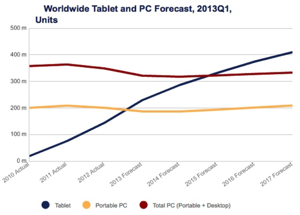
The emerging mobile platform—replacing PCs with tablets and smartphones—is driving the need for more care when it comes to rendering all forms of HTML content across all browsers on all platforms. There’s more to the story, though. Actually, the software development community unwittingly and unnecessarily foisted this inconsistent content viewing problem on users starting back in April of 2010.
How and Why it Happened
Lets look back to January 2010, when cross-platform viewing of rich—not just plain text—web browser and email HTML tagged content was not an issue. The web browser HTML layout control tags—a.k.a. HTML4—rendered cross-platform text and graphic images just fine. Sure, there were cross-platform rendering and view problems to overcome, with a little extra work for video, audio, and web animation we used Adobe Flash, which was (fortunately) ubiquitously deployed in all web browsers on almost all computing platforms, both PC workstation and mobile devices. Flash videos rendered the same way anywhere without much in the way of video and audio differences.
It was a time when Adobe Flash won for online rendering of video, not because it was the most ideal method, but because a developer could publish a video using the Flash video codec and expect it to be viewable most anywhere. Write once and view anywhere was the norm. Then, suddenly, in April 2010, all hell broke loose when our cross-platform rich content rending was unequivalently forced to take a new platform road for displaying rich content on mobile devices.
The big bomb: Apple, principally Steve Jobs, announced that their mobile device operating system, iOS, would no longer support the running of Adobe Flash on the iOS devices—iPod, iPhone, and the soon to be released iPad. Apple’s reasons for no longer supporting Flash on the iOS operating system were covered in Steve Jobs now famous online post: Thoughts on Flash.
Apple’s Flash replacement was proposed as:
- Non-existing HTML5 web standard on the Apple Mac OS X and iOS mobile devices Safari web browser
- Video display via the <video> HTML5 tag element using the H.264 (also known as MPEG-4) codec
Adobe continued to support Flash on Google’s Android smartphones that were, and still are, available from several vendors. Then, in November, Adobe’s support for Flash was pulled on all mobile platforms. Almost overnight the entire software development community started to abandon the use of HTML4 web layout with Flash as the rich content display for user viewing. In its place came web browser content display using: HTML5, JavaScript, and CSS3, and video display using the HTML5 <video> tag element rendering the H.264 video codec.
The dying off of Flash did not leave clear and concise alternatives. This is exactly when and where the UX hell was created that is still with us today. We were moving down a new road, with multiple forks in front of us:
- Use of HTML5 web layout instead HTML4, where the HTML5 standard was basically an idea, far from being a standard specification for consistent multivendor use
- Not all web browser providers were planning to support H.264 as the rich content video (and audio) codec
- Not all web browser providers were ready to move from HTML4 to HTML5
Some readers who have made it this far are probably saying: “The solution is easy, just stop using content encoded in Adobe Flash.” But the issue is much more complicated than not using Flash encoded content. These are the forks awaiting us along the new road content developers and publishers are forced to take.
Fork: Nonexistent HTML5 Web Specification
The first fork appeared back in April of 2012: the lack of an HTML5 specification to develop website content against. But wait a minute, isn’t the web browser the ubiquitous standard for rendering content across all platforms? That is what we are told, but web browsers are far from being consistent and reliable at rendering content.
The published W3C HTML5 specification is neither complete nor finalized. Working with an ever-shifting HTML5 specification is part of a whole phenomenon, which creates a mix of available web browsers with different content rendering functionality. Your text and video content may or may or may not render to the user properly, depending on the web browser and its respective version being used.
The W3C HTML5 spec release train finalizes the HTML5 spec in 2014. Plan on web browser standard differences being your annoying rendering issue for a few more years.
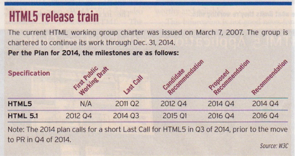
Graphic courtesy of SD Times
Fork: Adobe Flash to HTML5 <video> Element
This video (and audio) fork in the road is more involved that you might realize.
Missing is an HTML5 <video> tag codec standard. The idea is that you feed streaming video to an HTML5 <video> tag and it will render properly for the user. This is yet to be determined within the HTML5 specification as to which video codec or codecs to support.
Presently each browser provider has a different idea regarding which video codec to support. You can see what I mean by viewing the UX Magazine article, The State of HTML5 Video. In the Media Formats chart, observe that different browsers support varied video codecs. Confusing to say the least.
What this means is that your video is viewable in one browser but potentially not viewable in another. To me, it is unconscionable that the software industry is even allowing this to happen.
One solution is to use adaptive codec publishing (create multiple codec formats) and send a different video codec file depending on the web browser being viewed. Another alternative for video publishing on your website is YouTube. You can optionally embed your YouTube videos on your website. There are tradeoffs with this approach beyond the scope of this article.
So where does the HTML5 <video> codec battle go from here? When will these video codec standards be established? There are no answers yet and we will not have them for another year at least.
Fork: Web Platform Streaming Video on All Computing Platforms
Web publishing just for Windows and Mac OS X workstations is declining and being offset by the explosion of disparate mobile devices. Associated with this is the rapid emergence of BYOD (Bring You Own Device) to work. These are typically tablet devices and sometimes capable smart phones.
We’ve lived through three-plus years when all web browser providers where each browser supports a different set of video codecs. What this means is a given video will render fine in one browser and not even start up on another web browser. This problem is exacerbated when viewing videos between desktop and mobile devices.
An employee may view video web content on their home desktop. Then take their tablet or smartphone to work only to learn the video is not viewable at work. The same scenario can happen in reverse too, from work desktop to mobile BYOD video viewing. The non-technical computing platform user, of course, does not have a clue as to why this is happening and for that matter “why does this not work?”
The cause of this platform inconstant video rendering problem is most obvious and straightforward. For the W3C HTML5, yet to be released specification, <video> HTML tag there is not a list of supported and unsupported video codecs.
Indeed this is a very bad situation: various web browser providers—principally Apple, Microsoft, and Google—are all vying for their favorite video (and audio) codec to be supported. Today, browser providers are like a bunch of Wild West cowboys. “We have a larger video content installed base than browser provider X, therefore our HTML5 <video> HTML tag should be the W3C supported standard.
As I mentioned, this non-ubiquitous platform-to-platform video rendering problem will be with is for another year or more. First, the final HTML5 specification will not be released until the last quarter of 2014. Second, there will be three-plus years of old published web content in the wild, which will require republishing to the final HTML5 specification.
Content updating will not happen immediately. Video rendering consistency will not happen until the specification W3C HTML5 <video> HTML tag supported list of codecs is finalized and published. There are software development paths around this issue using specially crafted HTML5 <video> tags or the use of what is called video adaptive bitrate encoding, but that’s another story for a subsequent article.
Conclusion
Inconstant web content rendering, especially from the desktop to the BYOD smart phones and tablets has been with us now for three years. Expect another year plus of these issues and realize that, despite all your UX design and management, sometimes your content will not render as you desire—especially on BYOD devices—and that this issue is beyond your control for a while longer.
Image of cluttered signpost courtesy Shutterstock.