Video games and book readers have shown that it is possible to create interfaces that promote engaging, immersive experiences even on the tiny screens of mobile devices. Many mobile games make the gameplay experience more immersive by removing all navigation and chrome. Typically, a single, specialized drop-down menu provides convenient access to navigation controls that are not directly involved in gameplay.
In this article, I will explore the topic of using a specialized drop-down menu as one of the ways of creating immersive experience in mobile e-commerce search UIs, and I’ll introduce a novel design pattern, the status bar drop-down menu. In contrast to existing mobile search interfaces that devote 24-33% of the screen to navigation, the status bar drop-down menu allows 100% of the screen real estate to be dedicated to search results, while also providing convenient and intuitive access to navigation and filter functions.
This is just one among many ideas and design patterns for creating immersive mobile e-commerce search UIs. I’ve written much more on this subject in my upcoming book, Proceed to Checkout: Designing Successful eCommerce Search, due out from Wiley in spring of 2011.
Today’s Mobile E-Commerce Search Interfaces
Most of today’s mobile e-commerce search interfaces are built on the Web’s random-access navigation model, and devote 24-33% of the screen real estate to navigation and chrome. Although this model is usable, there remains considerable room for improvement. In particular, mobile search interfaces can be made more effective by:
- moving results higher
- displaying more results
- maintaining flow
Navigation is optimized for random access
Most of today’s mobile e-commerce apps seem to be variations of the Amazon iPhone app, which mirrors the web interface random-access navigation model, which makes the major areas of the site (home, shopping cart, etc.) available for one-click navigation from every page using tabs or links.
Searching, the display of search results, and the browsing of searched item detail pages constitute 80-90% of a typical e-commerce app’s traffic. That means a typical app lives and dies by what people find (or fail to find) in the search results.
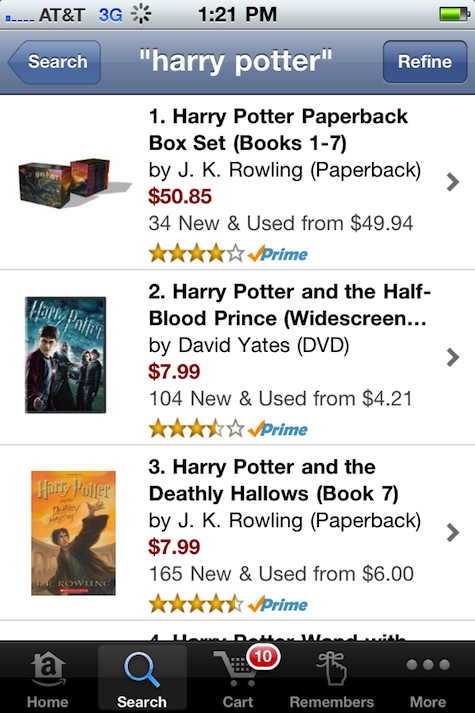
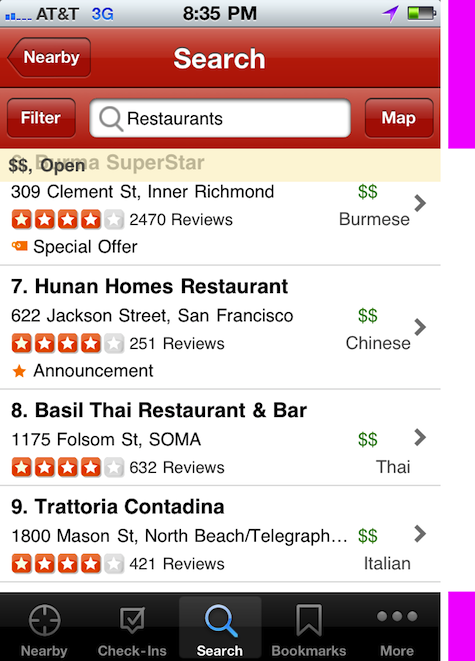
However, looking at the search screen of the Amazon iPhone app, you would hardly guess that this is the case. The search screen interface carries a full complement of “chrome:” a device bar, an app bar, and a tab bar taking 24% of the screen real estate. For some mainstream apps, it’s common to devote as much as 33% of search screen real estate to app chrome, as in Yelp iPhone app.
Although the random-access interface model is time-tested and fairly intuitive for customers who are new to mobile e-commerce, there remains considerable room for improvement.
Increase engagement by moving results higher
People read from top to bottom, so it seems logical the first thing people see at the top of a search UI should be the search results rather than the app’s chrome. When this is the case, users are likelier to engage with the page to a greater extent. Although the real-world numbers supporting this hypothesis are generally not released by companies for strategic reasons, there is a lot of strong anecdotal evidence that people on the Web look at more results if the search results content is positioned higher on the page. Although it’s not yet proven, it is conceivable that removing some of the chrome and moving search results up higher on the mobile screen would have similar effect of increasing engagement.
Make search interfaces more useful by displaying more results
Displaying more search results improves the experience in two ways. First, it promotes more effective engagement with search results (you can read more about this in my UX Matters article on the subject). Second, it improves the overall relevance of the search results page. Showing more individual search results on the page above the fold increases the chance that the person will find what he is looking for with less scrolling. By removing some of the chrome that’s not required for the task at hand will allow the app to display more results.
Increase satisfaction by maintaining flow
Perhaps the greatest opportunity to improve search interfaces would be to change the entire approach to mobile e-commerce search interfaces to make search an immersive activity that is the core of the entire shopping process. Rather than using the random-access web page as a basis for experience, we can start by optimizing search for maintaining the sense of flow.
When the app maintains the sense of flow, people are likely to use it longer, enjoy it more, and presumably, buy more products and recommend the app to friends. What UI design approaches create opportunities for immersive experiences? In the next section of this article, I’ll start by looking at existing mobile apps that are designed to maintain flow: games and book readers.
Immersion and Flow in Games and Book Readers
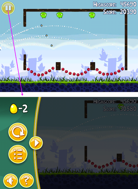
Despite the inherent constraints of mobile UX (small screen, fat fingers, etc.) some mobile apps, such as Angry Birds and Amazon Kindle, manage to create truly immersive experiences that satisfy people’s need to escape their overcrowded surroundings.
As of this writing, Angry Birds has been both the top grossing and the number one most downloaded paid game in the Apple App Store. It has over 68,397 user ratings, nearly all of them 5-stars, that it earned by providing a clever, immersive gameplay experience.
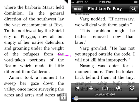
Amazon’s Kindle for iPhone book reader is another best-in-class mobile app that is specifically designed to create immersive experiences.
At first glance, Angry Birds and Kindle are quite different; one is a colorful multi-touch game, and the other is a minimalistic book reader. However, if we look beyond the obvious differences dictated by function, we see that both apps use some of the same immersive interface design approaches:
- Maximize the amount of screen real estate given to immersive content. In Angry Birds and the Kindle app, there are no app bars, tab bars, nor even the space typically devoted to the iPhone device status. This keeps the customer focused on the content and immerse in the activity.
- Minimize navigation. The only navigation in Angry Birds is the “Pause” button. It’s a semi-transparent button located in left top corner, out of the way. In the Kindle app, the only navigation is the semi-transparent overlay menu that appears when the user taps the middle of the screen. When the user is focused on the content or immersed in the activity, any buttons and navigation tools that do not directly relate to the activity not only take up precious real estate, but are also a source constant distraction. People are forced to consciously avoid the areas of the screen devoted to controls areas such as tabs and buttons, lest they be activated by accident. Any effort thus spent avoiding accidentally activating unwanted navigation detracts from the immersiveness of the activity.
- Maintain flow. In both apps, accessing the menu pauses the immersive activity, but does not yank the person into a different page. Instead, in both cases there is conscious effort to maintain the illusion of flow and continuity by making the action screen recede behind the transparent overlay. In addition, all of the parts of the screens and menus are completely custom, created specifically to enhance the immersive experience.
- Remove branding. There are no branding elements in the menus or action screens. Once the user enters the immersive activity, all focus is on the content.
Creating Immersive Mobile E-Commerce Search Using Drop-Down Menus
Wells Fargo recently redesigned their mobile website by stowing all of the navigation away into a single, large menu button, radically departing from the usual random-access navigation model commonly found on the Web. The same pattern can be extended to display search results using the Status Bar Drop-Down Menu pattern. By using the Status Bar Drop-Down Menu, it is possible to remove chrome entirely, utilizing 100% of screen space for showing search results content and making the search interface more immersive.
Mobile web navigation via single drop-down menu
Wells Fargo improved their mobile website based on customer research findings. The new mobile website (designed by Wells Fargo Internet Services Group’s Dirk Gonzales, George Corzine, and Diana Macias), uses a novel approach to presenting site navigation. Instead of taking up screen space with the usual assortment of links or tabs for random-access navigation, the Wells Fargo mobile website sports a single drop-down menu that aggregates all of the mobile website’s navigation in one convenient drop-down panel.
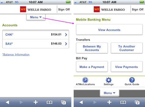
Much like in the Angry Birds app, the menu unrolls downward like a Roman shade and covers up the page content without yanking the customer out of the process flow. This design represents a conscious departure from the traditional random-access information architecture, which would have surfaced an assortment of navigation devices on every page. Instead, Wells Fargo redesigned the page for a smaller mobile screen and fat fingers, optimizing the available real estate to focus on the task at hand.
Reclaiming screen space with the status bar drop-down menu
While definitely a huge step in the direction of creating a more immersive UI, Wells Fargo mobile website is somewhat limited. It is a mobile website for a large financial institution, so it has to display the Wells Fargo logo and masthead, as well as the browser chrome and the iPhone device status bar on the top of the browser. So how can we adopt this single drop-down menu idea to create a more immersive mobile e-commerce search?
One approach might be to use the semi-transparent status bar design pattern shown below.
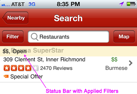
I described the effectiveness of the semi-transparent status bar in Design Patterns for Mobile Faceted Search: Part 2 on UXmatters. Status bars are very effective because they don’t use up screen space; users can still see the search results behind them. At the same time, status bars are very effective at showing the keyword query and applied filters. They need not be very thick—just tall enough to display a single line of text, while remaining very noticeable because they remain stationary while the rest of the page scrolls under them.
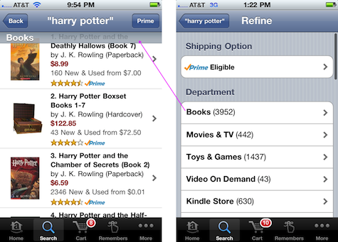
In the original Amazon iPhone app design (shown below), note that the search results screen shows the status bar that displays the “Books” department selected using the filter page on the right.
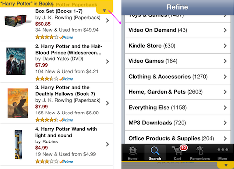
Extending the status bar slightly to show a shape of a drop-down menu button, and moving all of the navigation and filters to the drop-down menu, creates a powerful new design pattern for immersive search: status bar drop-down menu. By using the status bar drop-down menu, Amazon iPhone app could reclaim 24% of the screen space previously used for app chrome. Thus 100% of the screen real estate could be used to show search results content, while still displaying the applied keywords and filters in the semi-transparent status bar. The resulting interface is shown below. I happen to prefer the yellow transparent status bar color for contrast, but you can use any color other than white (which is the color of background of search results).
Some of the features of this novel pattern include:
- Unnecessary chrome is removed. No space is given to navigation and branding, so 100% of the real estate is utilized for search results. If the signal is weak or the battery is critical, a warning can be shown on the semi-transparent status bar, removing the need to display the device status bar.
- Action screen is optimized for immersive experience. Just as is the case for games and book readers, on the search results screen the user’s attention is exclusively on search results, but she has the ability to access other functions via the menu.
- Menu is optimized for filtering. If the menu is accessed while in search results, the menu also contains faceted search filters (as shown above). In this case, the status bar morphs into the actual filter values and keywords, creating a very effective transition that fits the user’s mental model.
- Menu provides task-based access. The menu contains the standard Apple Human Interface Guidelines recommended tab bar. These tabs should be familiar to most mobile users. The difference in this pattern is that the tabs are out of the way until the customer needs them, helping to create a more immersive experience. In addition to the tabs, the rest of the menu could be contextual, presenting appropriate options and additional content on the shopping cart, home screen, and any other areas of the app.
- Overlay menu maintains flow. Like the Angry Birds and Wells Fargo website, the menu overlay rolls down like a Roman shade on top of the search results, maintaining the user’s perception of staying on the same page and being engaged in the current flow.
Conclusion
Search is an activity that is at the center of the mobile e-commerce experience. However, today’s mobile e-commerce search interfaces are still being created using the Web’s random-access model. The status bar drop-down menu design pattern I propose in this article is uniquely suited for utilizing 100% of the screen’s real estate for search results, and is one way of creating more immersive mobile search experiences.
While it’s not right for every e-commerce application, this design pattern can be a powerful tool in a mobile designer’s toolkit. It is one of several key mobile search design patterns I discuss in detail in my upcoming book, Proceed to Checkout: Designing Successful eCommerce Search due out from Wiley in the spring of 2011, currently available for pre-order. I look forward to continuing the discussion of mobile design patterns in the comments on this article.