Although every website is global from the moment it goes live, few are designed with the world in mind. That is, they don’t take into account the many modifications that must be made to accommodate different languages, scripts, and geographic and cultural requirements.
This article presents a number of best practices to ensure that a web design is truly global by design.
The Importance of a Global Template
Over the past decade, companies have been embracing global design templates to present a consistent user experience across regional and country websites. The value of this approach becomes pronounced as companies find themselves managing more and more local websites.
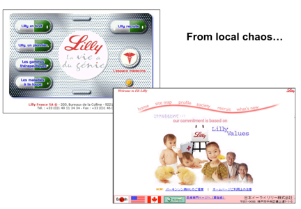
Consider Eli Lilly. Years ago, its local offices managed uniquely designed sites. While there is nothing inherently wrong with every country having its own unique design, the collective costs of designing and maintaining all these designs is significant. Local resources are better spent on creating local content.
A global design template frees up local offices to do just that while also improving the user experience for those who may travel between country websites. For example, if a web user lands on the .com site and then travels to a specific country’s website, a consistent design is less disruptive; the user does not have to relearn the navigation.
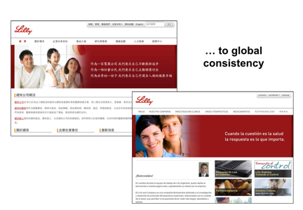
Today, Eli Lilly uses an excellent global template that supports global consistency while allowing room for local content and promotions.
When Designing for the World, Less is More
Creating a global template that works globally requires input from all local offices. Many global web design mistakes originate from the idea that a design that is popular with one country or region will necessarily be popular in other places. As a result, companies sometimes try to force the exact same design across all countries and regions without listening to people in the local offices. Sometimes a company gets lucky and the design they created for the home market travels well. But more often than not problems arise.
For example, if a website uses photographs of people, these photographs don’t always travel well. The ethnicity of models, their poses, and their clothing can lead to unintended negative consequences in different countries. Also, some local websites may not have the same diversity of products or degree of customer support as the global home page. These limitations have to be planned for when designing the global template.
And then there is product assortment. During the month of June, a fashion website may promote swimsuits in the U.S. but winter clothing in Australia. A global template should be flexible enough to support totally different products or services in different markets, such that the elements can simply be swapped in and out as needed.
The global template should be thought of as an underlying infrastructure for the web design. Culture-specific images should be avoided and navigation should be limited to the most global elements: “about us,” “products,” “services,” etc. This template can then be rolled up into regional or divisional templates. But by beginning with an austere structure, each instance will support the same look-and-feel.
Keep It Loose: Design for Text Expansion and Contraction
When text is translated into another language, the text rarely stays exactly the same size. A few minutes spent on Google Translate will quickly illustrate how a text string expands or contracts in different languages. Consider just how the text string “Welcome home” changes in length when translated from English into four languages using Google Translate:
| English: | Welcome home |
| German: | Willkommen zu Hause |
| Chinese (Simplified): | 欢迎回家 |
| Russian: | Добро пожаловать домой |
| French: | Bienvenue à la maison |
The inaccuracy of these translations shows the importance of using professional translators, who can also help minimize the impact of expansion and contraction by striving to convey the right meaning within specific character-lengths. But even with professional translation, it’s impossible to avoid a degree of expansion or contraction.
The general rule is to plan for text expansion of up to 30% to 40% when going from English to German, which is one of the more extreme examples of text expansion. Going from English to Spanish or French will probably only result in a 10% to 20% expansion. To safely design for any target language, a goal of 35% expansion is a good guideline.
Text expansion can wreak havoc with the menu; translating a single word from one language into another, while maintaining a strict character length, can be extremely challenging. For example, “Search” in English translates to “Rechercher” in French, which is nearly twice as long. Allow space for an additional 40% or more of room for expansion in the menu.
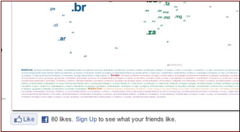
Text expansion issues can crop up in surprising places. Consider the Facebook “Like” widget, which has been installed across more than half a million websites. This widget, shown below, adapts to the language of the user’s web browser. So if the user’s web browser is set to English the text string displays in English:
But if the user’s web browser is set to Japanese, the text string changes to Japanese. And as shown here, the text expands from one line to three:
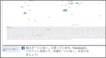
If not enough room is allocated for the expansion of this widget, text may be clipped.
Keep It Legible: Design for Different Fonts (and Scripts)
Supporting different languages requires understanding different fonts and how they display in different sizes. One can’t assume that a given font size is equally legible across all fonts, particularly when working with Asian scripts.
For example, consider the German and Chinese web pages from Accor Hotels. As shown here, Accor specifies the Chinese font at 12 points while the German font is specified at 10 points.
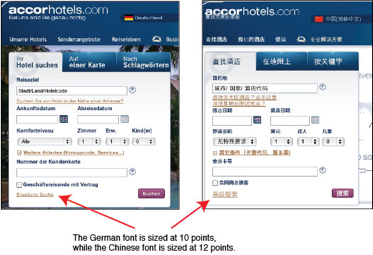
As a general rule, Chinese fonts need to be displayed at a point or two larger than Latin-based fonts. Language-specific style sheets can easily support this type of localization. But be sure also to devote adequate testing resources.
Keep It Text-Based: Designing for Machine Translation
More and more people use machine translation engines such as Google Translate when they visit websites in languages they don’t speak. While the quality still leaves much room for improvement, it has gotten good enough to provide the gist of the content.
Google has embedded its translation functionality into its Chrome browser so web pages may be automatically translated. This feature fails to work, however, if the text is embedded within visuals or Flash-based modules.
Shown below are two web pages translated by Google Chrome. In the case of Facebook, every word of text is translated except for the logo itself. With Apple, more than half of the text is embedded within visuals, so only a fraction of the text is translated.
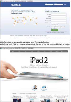
There is an opportunity cost to embedded text within visuals. Even companies that translate their sites into 10 or more languages can benefit from Google Translate, as it supports more than 40 languages.
Keep It Modular: Design for Movement
Shown here is the same Facebook login page supporting multiple languages. Notice how the design accommodates the range of fonts and how modular the design is.
You also may notice that because Arabic text reads from right to left, layouts are also flipped to be viewed from right to left.
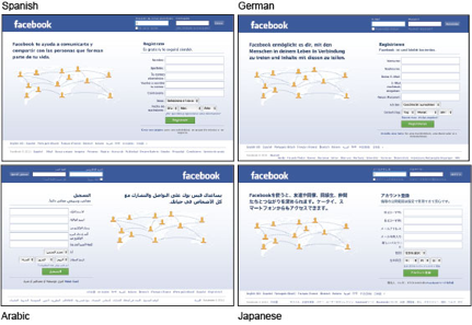
But because the Facebook layout is modular, flipping the layout was a relatively trivial undertaking. It’s easy to imagine how the blocks of text and form elements could be easily realigned via style sheets specific to Arabic.
While planning for an Arabic-language site may be well off the radar for many companies, it’s important to plan now for just such a scenario. Doing so ensures that the global template developed today remains world-ready tomorrow.