Questions nearly always abound about what Human Factors Engineering (HFE) or User Experience (UX) departments do within an organization. The combination of art and science within these teams baffles the traditional engineers working in disciplines that have predictable algorithms that solidified decades ago. Having a frame of reference that provides simple analogies to pop culture builds an understanding of the basics without overwhelming.
With that, let us navigate the deep waters of Johnny Depp for five more user experience lessons from one of Hollywood’s elite.
Lesson #1: It’s Not About the Ship You Rode In On

“That’s what a ship is, you know. It’s not just a keel and a hull and a deck and sails, that’s what a ship needs but what a ship is… what the Black Pearl really is… is freedom.”
In the 2003 action flick The Pirates of the Caribbean: The Curse of the Black Pearl (and its soon-to-be four sequels), Johnny Depp plays arguably his most memorable character, Captain Jack Sparrow, a pirate who flirts with ghosts, treasure, and Davy Jones’ Locker. As hinted at in the quote above, a consistent theme across all of the movies is Jack’s focus on recapturing control of his ship: the Black Pearl. His mental model of a utopian user experience is mostly driven by this sole piece of hardware.
Most real world projects start in this fashion: a specific piece of hardware and/or an operating system is selected ahead of defining the user experience, which is then bent around constraints therein. “This will be an iPhone app,” or “We want this to run on XYZ processor on a QNX platform.” The false belief is that somehow this provides the framework for the UX and will define some core functionality. In reality, the better UX modeling tools will allow the designer to define the user experience and subsequently auto-generate code for nearly any operating system or bit of hardware. The final screen flow, information architecture, and system presentation should not be constrained by the availability of predefined widgets or frame buffers.
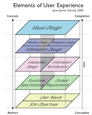
To clarify, let’s look at the infamous chart from The Elements of User Experience (Jesse James Garrett, 2002) where designers of a system are supposed to start at the bottom and work their way up (see right). Not surprisingly, the bottom layer does not say, “Define the hardware” or “Source the operating system”—the foundation instead is “[Identify] User Needs.” Yet, a large automotive company (who shall remain nameless) recently preset its budget and subsequent processor, memory, OS, etc. for its cross-carline cockpit system and then defined the UX, only to discover the former pieces were inadequate and unsatisfying.
Does that mean the hardware should be ignored? Certainly not. The designer should produce the working model, put it on reference hardware (a close estimation of the production hardware being considered), and confirm the user needs and visual-design pass muster. But it by no means suggests that “the Black Pearl” should be prescribed instead of simply identifying and meeting the user goal—in Captain Jack’s instance: “freedom.”
Lesson #2: Good UXers Plan Ahead to Assimilate External Content
“Then you blend, and blend, and blend. Blending is the secret.”
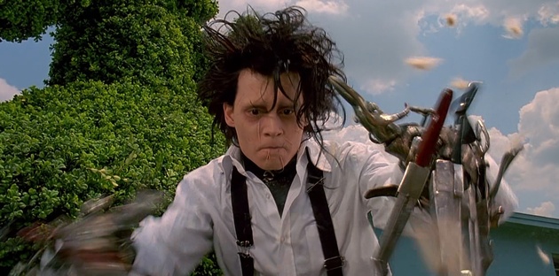
In one of his earlier roles, Depp played a quasi-Frankenstein monster whose inventor passes away before finishing him: Edward Scissorhands. Edward has—you guessed it—scissors for hands and eventually finds a home in a nearby town rather than the lonely mansion in which he’d been squirreled away. His successful resolution of the plot’s conflict comes from both blending in and not blending in; he remains a unique creation, but assimilates by showing natural talents for hairstyling and fantastic lawn art. In the end, the most important change isn’t to Edward, but rather the environment that welcomes (and then shuns) him. A feature within UX modeling tools that approximates this behavior is appropriately entitled “clipping.” This feature allows the designer to bring a unique graphical asset into a model and present the original image with some of it chopped off or faded for accomodation into the existing UX.
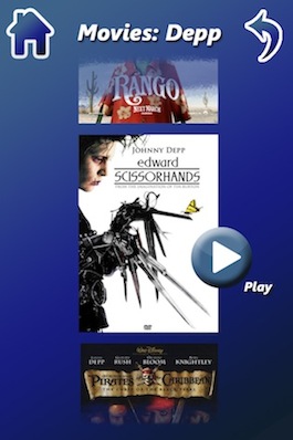
Why is this important, you may ask? Sometimes the user’s goal includes having dynamic content within a structured framework. For instance, let’s imagine an iPhone 4 application that allows you to select movies by actor (see right). The system engineer only wants to send one version of the poster image for data conservation, but the designer wants that image dynamically inserted into an existing framework that allows them to be “clipped” at the top and bottom edges while retaining the whole image. This allows the animation to swipe up and down without changing the core graphical assets—something that could even be auto-generated into an iPhone 5 or Android app with some small modifications within the modeling tool. And when the next sequel comes out, it’s just one more graphical asset inserted into the framework.
This is only one example of planning ahead for external, dynamic content. The skilled user interface engineer will appropriately plan ahead for inclusion of these unique assets within the context of a structured UI. Hence, Edward Scissorhands et al. might be clipped to allow perfect assimilation.
Lesson #3: Flexibility on Size Helps Win the Battle
“Now, here, you see, it takes all the running you can do, to keep in the same place. If you want to get somewhere else, you must run at least twice as fast as that!”
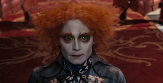
The 2010 hit Alice in Wonderland was based upon the classic 1885 novel Alice’s Adventures in Wonderland by Lewis Carroll. In the novel and subsequent movie versions, Alice shrinks and grows to various sizes based upon a magical beverage labelled “DRINK ME” and some enchanted cake marked “EAT ME.” The shrinking and growing does not affect who she is, but it does enable different use cases (like reaching a key on the table or fitting through the door). When she eventually gets to the perfect size, she enters Wonderland, interacts with Depp’s Mad Hatter, and rebels against the evil Red Queen.
Vector images allow this same type of growth or shrinkage without affecting the core asset, and have become much more common for UX development. Vectors are mathematically defined geometric shapes—such as lines, objects, and fills—which are created in vector development tools like Adobe Illustrator using nodes with lines or curves connecting them. Vector images are smaller in size than traditional rasters—which define and store every pixel separately—and may be converted to rasters more easily if so desired than vice versa. But there is no question their greatest trait is the retention of sharpness regardless of the resolution: changing size is no problem.
Along those lines (no pun intended), the reason vector images have become more popular is that designers must simultaneously consider the embedded HMI, the mobile GUI, and the online HCI, and between them there’s the desire by both corporation and user to have a consistent look. This means icons, images, etc. must change size depending upon the medium, and the historical use of rasters that must be redrawn equates to “running twice as fast” to get somewhere else.
Use and reuse, efficiency, consistency … all are great things … but if you don’t believe me, go ask Alice (when she’s ten feet tall) if changing the size of vector objects is as easy as eating cake. Otherwise, you’ll have Depp’s Mad Hatter commenting, “Why is it you’re always too small or too tall?”
Lesson #4: Design for What Your Customer Wants … Not for What You Want
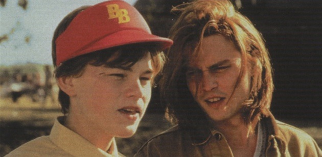
Gilbert: You know what? You’re such a big boy.
Arnie: Yeah!
Gilbert: You’re such a big boy.
Arnie: I’m a big boy!
Gilbert: You know what? I bet you could do this all by yourself if you really wanted to. Could you do this by yourself?
Arnie: I’m a big boy!
Gilbert: Yeah, you’re a big boy. Now take this …
In one of the few films where he plays a rather regular person, Depp is the Gilbert Grape of What’s Eating Gilbert Grape, the caring older sibling to a mentally challenged brother, Arnie (played by a young Leonardo DiCaprio). In a critical scene, Gilbert, after coaching him that he can do it by himself, leaves Arnie alone in the bathtub by himself in order to spend time with a young lady watching the sunset. Gilbert returns home late and wakes up the following morning to find Arnie still in the bath, shivering in the now-frigid tub and afraid of ever entering water again. Gilbert’s goal and the user’s need were orthogonal, but Gilbert defaulted to HIS needs, and the results were undesirable.
As most UX engineers know, egocentricity is rampant in the design community. As noted in The Inmates Are Running the Asylum: Why High-Tech Products Drive Us Crazy and How to Restore the Sanity, author Alan Cooper writes of how an employee of a failed start-up company “… innocently touches on the root cause of the product’s lack of success when she says [the company’s president], ‘launched his engineering team to design the device of their dreams.’ There [was] no irony in her statement.” And in Leisa Reichelt’s five reasons why “most UX is shite,” is the engineer’s belief that HIS opinion counts. “I would LOVE to believe that all designers are able to put the end users’ needs ahead of their own personal ego, or their end-of-year bonus, but, let’s be realists. If you’re my boss and I know what’s going to please you, your opinion is going to be influential. Chances are strong this is not going to lead to your product having better user experience.”
Gilbert’s mistake is a common one, and the disastrous ending is all too common as well: keep the end user in mind, or you shall fail. Period.
Lesson #5: Tremendous Flexibility Can Lead to User Satisfaction
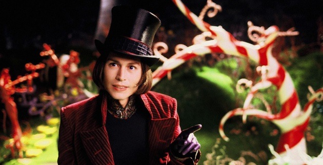
“But lucky for us, we have the Great Glass Elevator to speed things along.”
One of the most memorable scenes in Tim Burton’s Charlie and the Chocolate Factory took place in the Wonkavator, a great glass elevator that can “… go sideways, and slantways, and longways, and backways … and squareways, and front ways, and any other ways that you can think of [to] take you to any room in the whole factory just by pressing one [button].” Tremendous flexibility. You press any button and “Zing, you’re there!” Charlie smiled ear to ear.
There are great examples in the real world of this type of flexibility working well and poorly. A great comparison in one user interface modality is speech technology. Google Voice allows the customer complete natural language that, in essence, permits the same redirection as the Wonkavator. Speech Technology Magazine gave Google Voice the highest ranking in 2012 thanks to “… high accuracy rate, company innovation, and customer satisfaction…” in the midst of that flexibility. Users said where they wanted to go and “zing”, they arrived.
In other automotive applications—which, granted, have larger hurdles such as a road noise and a distant microphone—the user must know to return to the top level of the invisible menu and then some natural language is permitted. Understandably, the hidden inflexibility creates dissatisfied users. In fact, for the first time in the 26-year history of the JD Powers study, owners reported more problems related to audio, entertainment, and navigation systems than in any other vehicle area, which “… is driven in part by a rapid increase in the fitment of new technology, such as voice recognition …” If the “go anywhere” technology has great accuracy, flexibility creates almost as much user satisfaction as a lifetime of chocolate … OK, OK, let’s not overdo it.
So what if you heed these UX suggestions weaved subtly into Depp’s works? For the answer, let’s look to Captain Jack Sparrow again, as when it comes to the double edged nature of great design, he said it best: “Well, I’m actually feeling rather good about this. I think we’ve all arrived at a very special place, eh? Spiritually. Ecumenically. Grammatically. This is a day that you’ll always remember as the date that …” [Depp jumps off a cliff].
Johnny Depp image courtesy Featureflash/Shutterstock