Google Catalogs is a new iPad app that presents shoppers with a consistent user interface to a wide variety of retail catalogs. Shoppers can quickly flip through exquisite catalog imagery, view coordinated product layouts and individual products, save favorites and, of course, purchase products.
Google Catalogs is a new iPad app that presents shoppers with a consistent user interface to a wide variety of retail catalogs. Shoppers can quickly flip through exquisite catalog imagery, view coordinated product layouts and individual products, save favorites and, of course, purchase products.
Catalog Shopping User Experience
In e-commerce user research sessions, I regularly encounter users who prefer to navigate visually rather than semantically. Quite a few of them, particularly in earlier years, said they find product list and detail pages thin and unsatisfying in comparison with the sumptuous visual collections of coordinated products in mail-order catalogs. Google has decisively bridged the UX gap for this user segment with the Catalogs app. It presents an engaging, visually rich catalog experience with products grouped by style rather than taxonomy, and does this across many types of stores, wrapping it in a single unified shopping experience.
To take the app for a quick UX test drive, I asked a Millennial female test participant to step through several shopping scenarios while I observed and took notes about the user experience. I’ll describe this first look in terms of the three main content types found in the app: Catalogs, Favorites, and Collages.
Catalogs Section
Product catalogs are the heart of the Google Catalogs app. The catalog images appear crisp and vibrant on the iPad, which is the only device it currently runs on although an Android version is reportedly in the works. Some of the larger retailers whose catalogs are included in the app are: Anthropologie, Bare Escentuals, Bare Necessities, Bergdorf Goodman, Bloomingdale’s, Crate & Barrel, Eddie Bauer, Fossil, L.L. Bean, Lands’ End, Macy’s, Nordstrom, Neiman Marcus, Patagonia, Pottery Barn, Saks Fifth Avenue, Sephora, Urban Outfitters, and Williams-Sonoma. The most complex problem solved by Google Catalogs is not a UX problem at all, but a business one: how to get these top-tier retailers to commit to a single app and a single interaction design.
Catalog shopping uses primarily visual, as opposed to semantic, navigation cues. The app does have a textual search feature, but the results page consists of images. In visual navigation systems, clear, simple hierarchical structures and a relatively small number of entity types are essential for reducing ambiguity. Google Catalogs manages this by limiting the entities to catalogs, page spreads, products, favorites, and collages.
Catalog interaction design
Catalogs are grouped into product categories: Women’s Fashion & Apparel, Jewelry, Beauty, Home, Men’s Fashion & Apparel, Kids & Baby, and Gifts. Clicking into a category, you see catalogs for different retailers in alphabetical order by month. The sequence of the catalogs will probably have a substantial impact on click-through rates, with upper-left being the prime position.

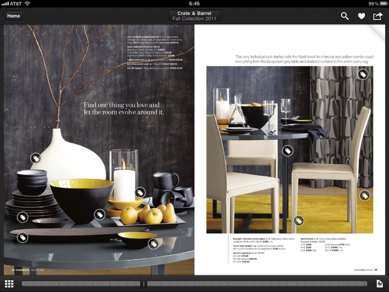
Clicking a specific catalog, such as Crate & Barrel’s, brings up its cover page. You can then turn the pages individually with a swipe, or you can use the mini-thumbnail slider at the bottom of the page to quickly scroll through. Each catalog page consists of:
- A coordinated collection of products in the context of a room or lifestyle scene
- Hotspots in the shape of shopping tags
- Controls for: saving the page to Favorites; sharing via Gmail; toggling between thumbnail or full-page views; and display Favorites only
My test shopper, who had never used the Catalogs app before, was able to find her way through the various product categories and catalogs and into product pages in a matter of seconds. Unfortunately, the app was somewhat unstable, crashing at least 5 times in our one-hour test session. All shopping progress was lost after each crash. This was a major experience dampener, and made my test shopper wonder out loud about the security of conducting transactions with an app that had so many problems staying alive.
Product page design
Retailers were apparently given some flexibility on product pages. Some product pages have only a small picture and a sentence or two of text. Others have multiple images of the featured product and a paragraph of text. My test shopper found the pages with additional product colors and styles helpful, because they offered her more variety to choose from.
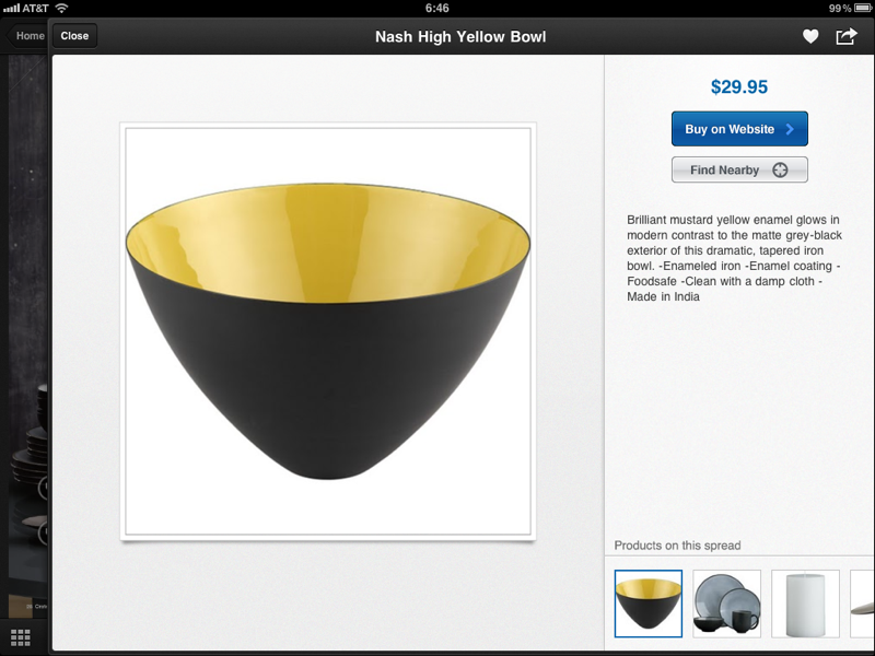
Product pages present both the selected product and the other coordinated products from the catalog page in a small carousel. This is a much more elegant and intuitive interaction than was possible with the original paper catalogs.
Any product page or catalog page in the app can be saved to Favorites, or can be shared via a Gmail account. Users have to sign in to their Google account to use either of these features.
Buy on website
Every product page has a “Buy on Website” button. Clicking it takes you to a non-authenticated version of a standard e-commerce product detail page, viewed in a separate window within the Catalogs app. You have the option of opening the product page in Safari.
After adding an item to the cart, and opting to continue shopping, neither my test shopper nor I could figure out how to go back to the cart. Each catalog has its own cart, but after adding a product to the cart, closing the modal window, and continuing shopping in the same catalog, there was no icon that we could find that would allow us to return to the cart or go to checkout. This is a serious design flaw.
Find nearby
Some product pages have the option of finding the product in a nearby store. This feature is an important extension for Google, but in our test it didn’t seem quite ready for release. Sometimes it crashed the app. Other times searches ended with a blank map of North America, and we weren’t sure what to do with it. Google should have a more engaging design solution for null results.
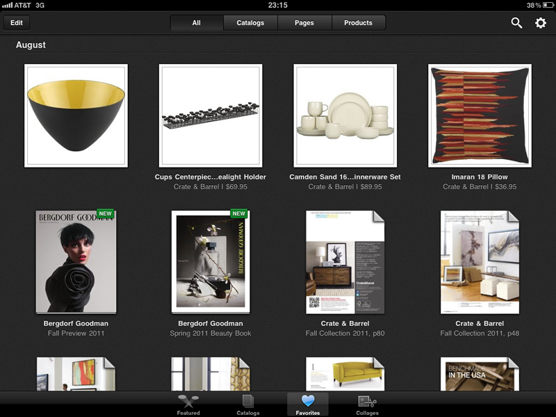
Favorites Section
Any content type the user is viewing can be added to Favorites. If you click the Favorites section in the global panel at the bottom of the app, it will take you to all your Favorites. Clicking a Favorite takes you to the corresponding content item in context. Given the number of taps and swipes it takes to get to a product you want, Favorites is an essential feature for speed and convenience.
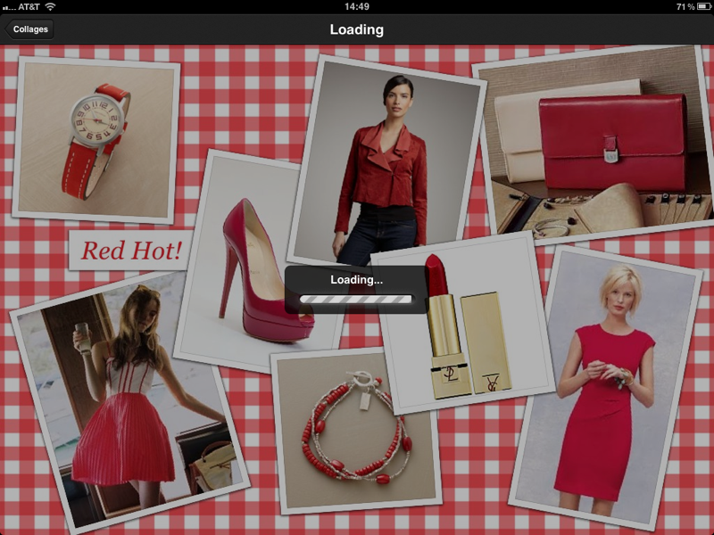
Collages Section
Collages are like scrapbook pages. You select a visual theme and then add catalog pages or products from any catalog in the app. Collages, like other content types, can be shared via Gmail.
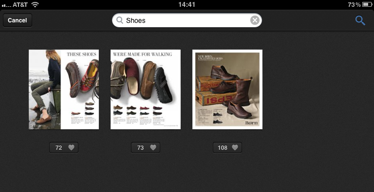
Search
Of course, being a Google app, there is a robust search function. My test shopper tried a number of searches and was very happy with the precision and the accuracy of the results. For example, when she entered the search term “shoes,” the results only showed catalog pages with shoes for sale in them, i.e. no false positives.
Social Commerce Noticeably Absent
Google Catalogs is surprisingly void of any of the social commerce features that are popping up all over the Web. Shoppers can share products and collages via email, but using the app is fundamentally a solo experience. There are no “+1s” or “Likes” or comments or reviews. I’m guessing that this glaring omission is intentional to get the app launched and in circulation, with follow-up releases planned to bridge the social commerce gap. Or maybe it’s an intentional effort to keep the catalog experience distinct from standard e-commerce patterns.
Key Takeaways
Google Catalogs breaks new ground in e-commerce by bringing multiple retailers into a consistent, visually driven user experience. Some of the key takeaways from our review of the app were:
- Visual navigation requires rich imagery and a simple but explicit hierarchy of entities.
- To bring many visually distinct entities into a single app, set strict template guidelines for interaction consistency, with flexibility for variations at the endpoints.
- When organizing a visual menu of a few dozen choices on a tablet, you need a solid basis for determining the order the entities appear in.
- Technical failures (like crashes) lead to UX failures, which lead to transaction failures.
- Make sure hotspots can be easily identified regardless of the colors in the image behind them.
- Provide an engaging experience even when there is a null set response.
- Since shopping on a tablet requires lots of taps and swipes, a Favorites feature is essential for easy repeat access to products.
In our first look evaluation above, we highlighted quite a few positives, and a few negatives. On the positive side:
- The images are gorgeous
- The path to purchase is straightforward
- Catalogs and Favorites are easy to figure out the first time around, and work as you would expect them to
- Collages are intuitive, but I’m not sure how useful they are
- Search works very well
On the negative side:
- A clearly labeled Shopping Cart icon is needed
- The app crashes far too often, which is frustrating and a barrier to trusting the app for transactions
- Absence of social commerce features
In summary, Google Catalogs is an extremely well designed app for its intended audience and activities. It will be interesting to see if they solve the problem of crashes and the absence of social shopping in the next release.