I’m a devotee of TED talks. I was once assigned to watch several TED talks to deconstruct what made each a good or a bad presentation. TED topics are wide-ranging, though they generally relate to the categories that make up the “TED” acronym: Technology, Entertainment, and Design. I tend to stick to the design topics, but during my research I came across a video of Martin Seligman talking about positive psychology.
Happiness is a topic I’ve been interested in for a while. According to Darrin McMahon, author of Happiness: A History, happiness is a relatively new construct in the history of humanness. It’s only been in the last 250 years or so in the West that we’ve been safe and healthy enough to think about how we feel emotionally.
After watching Seligman and skimming through McMahon, it occurred to me that the experience design field is undergoing a similar evolution. When I started out at the same time the field was starting out in the early 1980s, teams did usability testing on products to learn where the users would encounter problems, and where they would get lost or frustrated. It was a kind of human factors quality check, and it was often done two seconds before launch. No changes could be made, but these teams could at least incorporate what they found out into training, which almost everyone needed to use technology back then.
Fast forward to somewhere between 1997 and 2005, and the usability testing dynamic shifted. Teams started performing usability testing earlier and earlier in the product development process to inform their designs. Usability professionals were still concerned with identifying issues post facta to eliminate existing problems and frustrations, but they also learned about user behaviors and habits and used this to influence design decisions earlier in the product development cycle. This was a very important step in the evolution of user research. It happened because teams started testing early designs and prototypes and using what they learned to refine designs well before they launched.
Only recently has technology improved, proliferated, and become cheap enough that design is less and less about solving problems, testing less and less about eliminating frustration. It’s all becoming more and more about making a good experience for users. Sure, we’re still eliminating frustration, but it’s happening earlier in the design process. Finally, design is at the table with engineering and business. Now we talk about experience design rather than just usability. Now it’s not good enough to just be usable. The design has to fit into peoples’ lives. It actually has to make people happy, and anticipate their needs.
It seems we’re all aspiring to an ideal of designing for delight, but most of us are landing somewhere short of delight, but at least better than frustrated. Users can use our designs, but they’re not excited about it. (Okay, you can’t be excited about everything.) We want users to trust our designs, but there’s still too much overhead for users to easily reach their goals.
Creating remarkable Design
After watching Seligman’s talk about positive psychology, I was curious to learn more about the subject from other TED talks and other sources. I watched Don Norman talk about ways that design makes you happy, and Stuart Brown explaining the importance of play in cognition and creativity. Stefan Sagmeister drew parallels between the emotions people feel as they experience good design with the types of happiness and contentment people feel as they meditate.
Admittedly, design nirvana may be a bit much to ask for. But after watching these talks, reading a few articles (see the links at the end of this one), and hearing people like Aarron Walters, Stephen Anderson, and Giles Colborne, it all seemed to boil down to three levels of happiness that could be designed in to experiences. They are interconnected, but I think they come down to these:
- Mindfulness
- Flow
- Meaning
If you have these woven into a design, it will be pretty remarkable.
It may seem impossible to create a lovable, remarkable experience instead of just getting by with an experience that doesn’t suck. There are so many pressures on design teams. Delivering on time. Delivering clean code. Delivering something that is easy to sell. The constraints on a given design by business requirements and technology often make it extremely difficult to deliver a great experience. Departments won’t talk to one another. The system architecture won’t scale. As Jared Spool has said, “Too often, we choose a design because it’s doable, not because it’s the best we could do.”
But there are companies making their customers happy—lots of them, actually. In this article, I’m going to talk about some of my favorites: Tripit, Netflix, and Zipcar. But there are others, like Mint, Virgin America, Marriott, Pandora, Kiva, and, of course, Apple. Their customers are so happy that they engage with a design, product, or service willingly, sometimes even with longing.
Three Levels of Happiness in UX Design
I’ve used Seligman’s terms, but my descriptions incorporate concepts and vocabulary from all the research I did as I apply them to experience design.
Mindfulness in design is about a pleasing awareness. In relationships, it can mean infatuation. It’s knowing that this is good, that this makes me happy. It’s satisfying. You feel it in your body. As Norman suggests, it’s visceral. You trust that things are moving the direction you want them to go. As the user of the design, there’s the feeling you’re being paid attention to, that the designer is anticipating your needs and being considerate of your wants. As the designer, you demonstrate that you have the user in mind and you understand her goals.
Flow is from work done by Mihaly Csikszentmihalyi. In his book, Flow, Csikszentmihalyi describes a state that people enter when they are fully focused in which they experience immersion in a task or activity to the point where they lost track of time. There’s no time between tool time and goal time. Brown talks about transformation; I think that applies here, too. Sagmeister uses words like contentment and joy. As the user, you sense no friction between you and the design on the way to reaching your goal. You may even spend more time than you planned because you’re having fun, or being productive, or both. As the designer, you incorporate psychological cues, language, social cues, and reinforcement to subtly motivate users to keep working or playing longer than they might without those design cues.
Meaning comes from a feeling of fellowship, contributing, and making the world a better place. It’s about harmony and, as Norman says, reflectiveness—because good things happen to you, you want to do good for others. As a user, you reach your goal quickly, easily, and happily, but you realize you’re involved in something bigger than yourself, that your involvement is making a positive difference in others’ lives. As a designer, help users know where they fit in and what their effect is by thinking through exactly what you want the emotional and behavioral effects to be of using your design. You demonstrate intention (in the yogic sense) through clarity, simplicity, funneling, modeling outcomes.
Before showing you happy design examples I found in websites, let’s take a look at a not-so-happy example.
A Counterexample
Here, the traveler is checking in for a United Airlines flight online. The page she’s just come from has asked all the necessary questions about carrying hazardous materials, checking bags, and so on. Wanting to move on to getting the best possible seat, she encounters this:

Note the defaults. There are interesting interactions built into the UI that go well beyond frustrating to downright annoying. First, the upsell is interrupting the path to the goal of checking in for a flight. It’s very unlikely the traveler wants buy a couple of thousand “award” miles right now, and making it an “option” Is deceptive. Second, the “Add option” is a huge call-to-action. It’s a button, and buttons are magnetic to users, especially when partnered with other elements that are less prominent (like a link to “Skip and continue”). So what happens when our traveler clicks the “Add option” button without thinking? She’s sent to a shopping cart, further away from the goal of checking in to a flight. This is not the optimum moment for selling something.
What this feels like is an act of desperation on United’s part: we can’t make you like us but we can make you spend money, even if we have to trick you into doing it. That is not a happy experience.
Fortunately, fewer organizations are following this example, and more try to incorporate happiness into their experiences. For demonstration purposes, I’m going to focus on three of my favorites: TripIt, Netflix, and Zipcar.
Mindfulness: TripIt
This first level of design builds in as much positive emotion as possible, helping people have the skills to engage in that positive experience. That is, having positive experiences and being aware enough that you’re savoring them. A beautiful afternoon. A perfect summer peach. Looking into the eyes of someone you love. The website equivalent would be a site that “knows” what you want to do next by “observing” what you’ve done so far. Or “remembering” what you’ve done before and using that observation to improve the experience by speeding it up, or reminding you what you did before, or prompting you to do something that will make things better for you.
For example, ProFlowers knows I’ve sent flowers to my mother for her birthday. Rather than making me set up reminders, they automatically send me a nice note about 10 days before the day I’d asked for the flowers to be delivered before. I’m pleased they remembered. I’m happy to be reminded of a gift that I enjoyed giving and my mother liked getting. And I think it’s cool that ProFlowers is on my side. The reminder feels like a friend saying, “Hey, Don’t forget to get your mom something for her birthday,” rather than like a company trying to get me to buy more product. It feels like they’re being considerate and thoughtful. They’re mindful of my priorities (and incidentally, how they fit into their business goals). I see that email and I say, “Nice!”
TripIt.com shows consideration and thoughtfulness—there’s a pleasing awareness of the user throughout the UI not only of who the user is, but that the person has relationships other than the one with TripIt. It tries to anticipate the user’s needs.
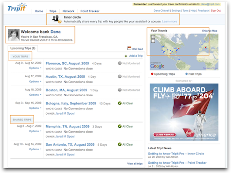
Here, the page shows some standard stuff. When the user logs in there’s a picture and a welcome. There are other nice features, like a map of upcoming and past trips, a listing of people the user has shared itineraries with, and an option to share all trips with “key people.” The past trips are good because the user may have fond memories of those trips, or there may be something useful about having that record (like for expense reports).
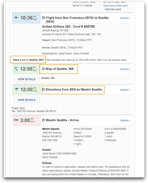
Drilling into an itinerary, TripIt anticipates needs like the best travel agent would, with a link to rent a car (a very subtle cross-sell, at just the moment when the user might be thinking about that) along with other useful trip information so the user can find her way around her travel destination. The timing of the cross-sell is extremely important. Offering help in ancillary services could be a disaster if it’s presented in the wrong place in the flow (as in the united.com example above), but here it’s subtle but noticeable, and is well positioned.
It’s really easy to get used to this kind of attention. Users begin to expect this level of happiness pretty quickly. Soon, the relationship is taken for granted by the user.
Flow: Netflix
An obvious example of flow is what happens when people enjoy great video games. (My personal favorite game app for enduring long lines in airport security is Ragdoll Blaster 2 from Backflip Studios.) It’s true that a good game is immersive and absorbing. There are also examples from e-commerce and information-rich sites. Netflix incorporates careful, deliberately designed cues and “treats” that make the endlessness of rating movies fun rather than a chore.
How many times have you been to your Netflix queue only to look up a half hour later realizing that you’ve just spent 30 minutes rating movies? Here we have contentment, understanding, immersion, and trust. Time stands still in a good way.
Using Netflix, I’ve seen users become completely absorbed. It starts by clicking a star in an email. It’s a simple call-to-action.

The star ratings take the user to the Netflix website, where it offers other movies it thinks the user will like, asking users to rate the films already seen.
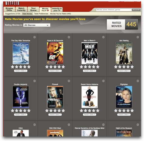
It’s a natural extension of the same task. Even people who say that they don’t rate things on other sites have said in that they just get completely sucked in. They rate a few movies, and look up to find that 30 or 40 minutes have flown by. But it’s not like spending time on other sites (like Facebook)—this is useful to the user, not just the system. The more you rate, the better the suggestions are that the site makes.
Netflix even talks about love. They’re not called suggestions; they’re called “Movies You’ll Love.” The site, or the human persona behind it, does seem to adore users, and users adore it as it continues to offer them things that they are likely to like. As users add movies to queues, Netflix offers yet more. Every page of movies is like a group of gifts—a preview of the gift that arrives in the mailbox with a disc in it. What’s not to like about that? Give me more and keep it coming.
Meaning: Zipcar
When I start talking about how people get meaning from the Web, people often assume that I’m talking about social media. But there are lots of ways the Web offers belonging, reflectiveness, contributing, making a difference, commitment—being involved in something bigger than you.
People I’ve talked to about their experiences with the service are radiant when they describe their interactions with the company, glowing with purpose and pleasure at the same time.
Zipcar encompasses mindfulness and flow as well as meaning. Reserving a car is pleasant, even cute. It knows where I live, anticipates needs, and uses a personal tone.
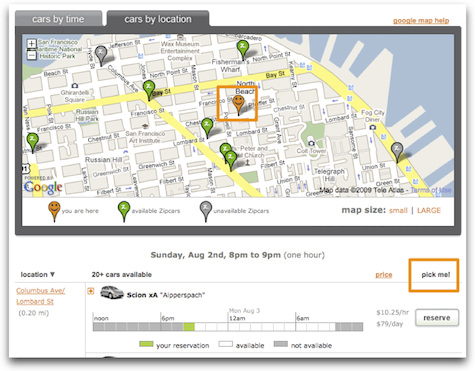
The flow of Zipcar comes from how quickly and easily it is incorporated into members’ lives. The people in charge of the experience seem to have taken into account everything important, from how easy it is to reserve to how easy it is to extend a reservation, all the while keeping a fun, whimsical tone.
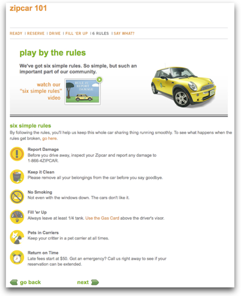
But it goes well beyond just ease of use. The idea of Zipcar is simple: rent a car by the hour. This works great for people who live in expensive, dense, urban areas where owning a car isn’t necessary. Zipcar’s commercial premise is inexpensive convenience. But everything about using the service says “sharing.” The rules are simple, and all about being considerate of the other people who use “your” car.
Many Zipsters at a cocktail mixer sponsored by Zipcar (to which no one drove, by the way) said they joined just for the convenience of the service and that they loved the eco-friendly, sustainable aspects of being a member. They felt they were doing good. This goes beyond just social networking online. People who had never known one another before met face-to-face because they were excited about their experiences Zipcar. They found themselves becoming involved with the company and one another, signing up for community-based activities sponsored by Zipcar. This was the germ of a real community forming within real neighborhoods, mediated through a service that is self-served on the Web. Customers see themselves as members, but instead think about making a difference in the world. Magic.
Want your users to fall in love with your designs? Fall in love with your users. The companies I’ve showcased here are just a few that have done that, and it shows. That’s how users become excited about designs—being desired is very seductive.
Related Links
- TED Talks: The psychology of happiness – Martin Seligman
- TED Talks: Play is more than fun – Stuart Brown
- TED Talks: Happy design – Stefan Sagmeister
- TED Talks: 3 ways good design makes you happy – Don Norman
- Emotional Design: Why We Love (or Hate) Everyday Things, by Donald Norman
- Happiness: A History, by Darrin M. McMahon
- Flow: The Psychology of Optimal Experience by Mihaly Csikszentmihalyi
- Seductive Interactions (Slideshare) by Stephen P. Anderson
- Designing for Delight (Slideshare) by Giles Colborne
- Learning to Love Humans – Emotional Interface Design by Aarron Walter (see Luke Wroblewski’s notes from Aarron’s talk at An Event Apart)


