Harmonizing UX design and agile development is possible, but it takes some work. When it’s not going well, the common indicators are:
- design inconsistencies in the application
- Miscommunication, frustration, and blame between developers and designers
- Front-end code that is buggy and difficult to maintain
Peel back the layers of the onion and you’ll uncover more fundamental problems that have led to the previous ones:
- design team lacks a shared vision of the design language
- designers are communicating individual features, but not how they think and talk about the UI and interaction patterns that make up your design language
All of these process issues can be addressed by incorporating a test-driven, semantic, live style guide into your process to establish and evolve your design language. Style guides have been around forever, but live, semantic ones are different in several ways that help cope with agile+UX woes:
Live: Old-school style guides were PDF documents. They had to be maintained, which is to say, they were always out of date. And they were inevitably aspirational, including design elements that didn’t actually exist. Live style guides, by contrast, are HTML-based, are part of your application, and are generated on the fly by your production code. In this way, they’re never out-of-date and always reflect the application’s actual design language.
Semantic: Most style guides don’t do a good job of explaining “why.” As I’ll explain below, semantic style guides establish basic patterns (e.g., colors, typography, line style, etc.), name each pattern, provide usage guidelines, and then use these patterns to build up higher-order patterns (e.g., containers, widgets, page styles).
Test-Driven: Because live style guides are a reflection of the actual (developed) styles, they serve as a test suite for your application’s design language. If the design looks right in the style guide, you can be confident it looks right in each page that utilizes these styles. A live style guide enables your designers and developers to apply test-driven development (TDD) to styling: get a new pattern right in the style guide first, and then apply it to new features.
Creating an Initial Style Guide
Chances are you’ve already got part or all of an app built. As an example, let’s suppose we operate a leading genealogy website so we can work through how to develop an initial style guide for this preexisting application.
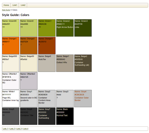
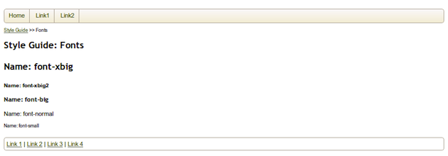
Step one is to catalog your existing, basic UI and interaction patterns. In our application, the basic types of patterns are colors, fonts, and boxes. For each domain, walk through your site and find all the patterns (e.g., colors) you use. Each time you notice a unique pattern (e.g., another color), name it, and add it to your style guide.
Name your patterns semantically, rather than structurally. The best names suggest intended usage. Names like “emphasis-font’, “call-to-action-color” and “widget-box” are all preferable to “large-no-serifs-font”, “blue-color” and “drop-shadow-rounded-box.” In most applications, though, your basic patterns may not have a single use. For example, you might use the same green as a link color, a button color, and a background color for certain divs. In that case, it’s okay to name the color “color-green” since that’s the most specific you can get about its intended function.
Here are the colors, fonts, and boxes used in our genealogy application:
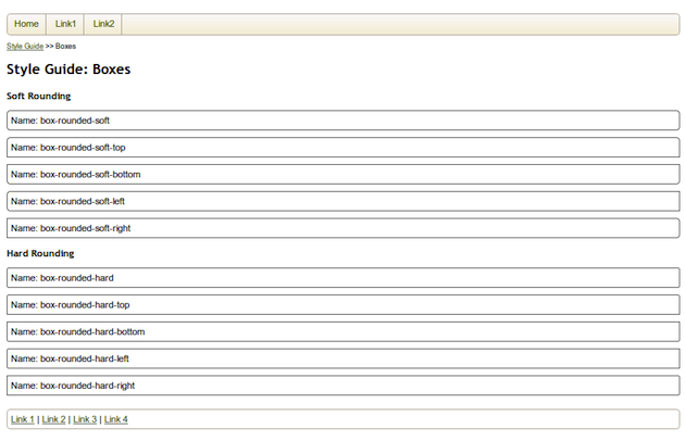
Note that in other applications, your visual language may call for other types of basic patterns. Line style is a natural one that I’ve ignored in this example. Most lines in our examples use solid, one-pixel-wide lines, so I haven’t bothered cataloging the few exceptions to that rule.
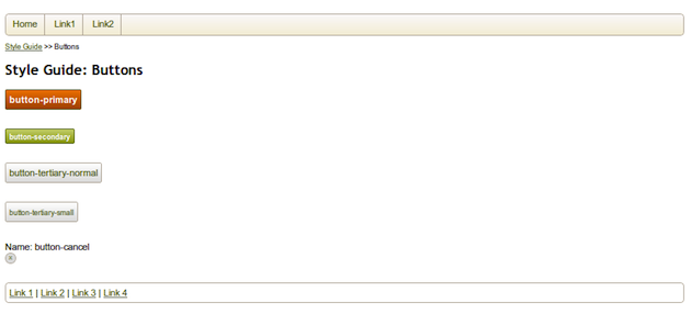
Next, compose basic patterns to create higher-order patterns. In the visual language of our genealogy site, the next “order” of patterns comprises buttons (a box, with color gradients and certain fonts) and containers (combinations of various shapes, some with shadows of a certain color, rounded or not, etc.).
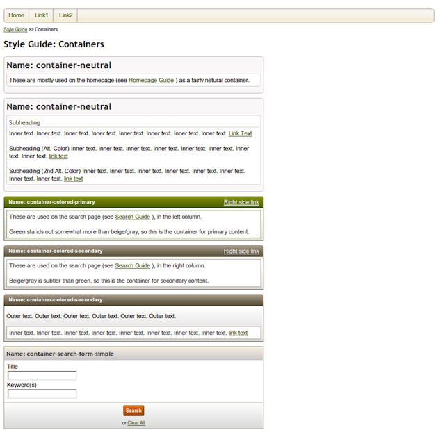
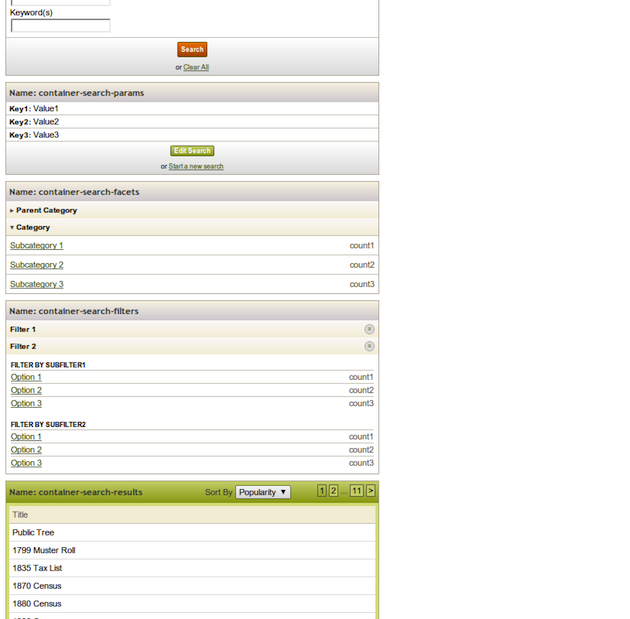
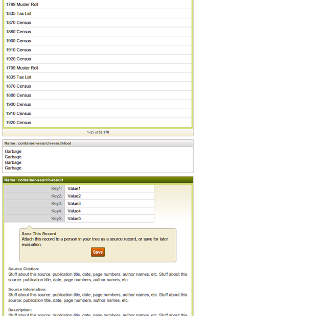
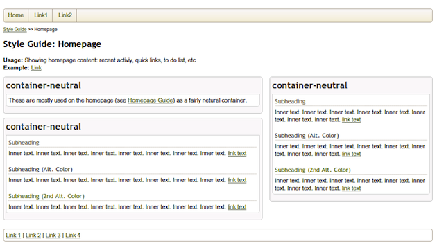
Finally, we can build on these patterns to construct entire widgets and page-level patterns. For our genealogy site, here are the homepage, the catalog page, and the search result page:
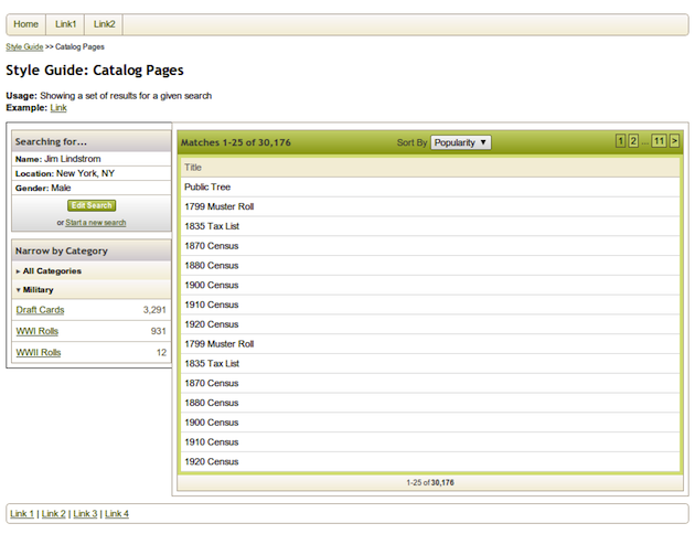
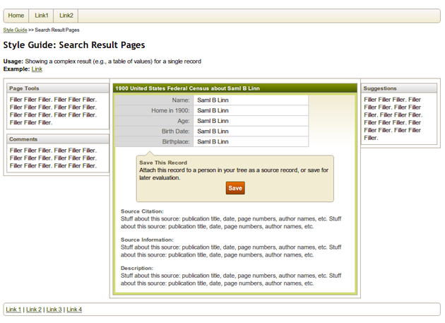
You can find the full style guide here.
Reviewing the Initial Style Guide
Immediately after creating your style guide, take the time to review it with your team. This is an important step in coming to a shared understanding of your design language. It is also a time to begin to identify refactoring opportunities. It is important to include all of your product managers, designers, and developers so they all can contribute and build toward a shared understanding.
When reviewing your style guide, be alert for:
- Unnecessary variation. Refer back to the style guide for this genealogy application. Do we really need 16 shades of beige/gray, or more than ten types of containers? Take this opportunity to reduce unnecessary complexity by eliminating unnecessary and infrequently used styles.
- Missing patterns. Team members may be surprised that other patterns didn’t get included in the guide. If so, it indicates that your design team lacks a shared vision. Take the time to decide as a team whether such patterns should be made official or be eliminated.
- Poorly named patterns. Remember that styles should be named for function rather than for structure. If you see widgets with exact colors or positions (e.g., “left-aligned container”, “red-section”, etc.), this may be a symptom of disagreement or lack of understanding about the intended use of a style. Worse, it may indicate that your application uses a style in random, inconsistent ways.
- Complex mega-patterns. If you are striving for visual parsimony and a consistent user experience, watch out for big, monolithic patterns. You needn’t necessarily avoid the pattern in question, but try to decompose it into lower-level patterns. That way, other complex patterns can reuse the same intermediate-level patterns, thereby increasing parsimony and consistency.
Applying Your Design Language
Without a style guide, high-fidelity mockups are the best way to communicate a new feature to developers. Unfortunately, though, pixel-perfect mockups almost always result in duplicative and wrongly abstracted code. Why? First, fidelity alone (without good annotations) does not communicate the abstractions you intend. Without knowing how the designers conceive of the design language, developers may make different modeling choices and make the code difficult to maintain. Second, higher fidelity can unintentionally signal novelty. Developers may think that you mocked up something in higher fidelity because it is a new UI component, and thus fail to reuse existing code. This slows down development and results in bloated, less maintainable code.
With a solid style guide in place, less is more, which is to say the new best way to communicate features is by mocking up only as much fidelity as needed. In many cases you should be able to hand-draw a new feature and then (using a different color pen, if you want to be nice) annotate the drawing with the names of the styles that apply to it. For example: “Here’s a napkin-sketch of a design for new kind of search result. It should use the ‘search-result-container,’ but with the title in ‘emphasis-color’ and with two ‘footer rows’ instead of the usual one.” The lack of fidelity properly signals that developers should look to reuse existing code. Furthermore, your annotations explicitly reference the style guide patterns, which will help developers make the right modeling decisions.
This makes intuitive sense. If you are simply applying your existing design language to new features, there is no reason you should have to draw the new feature in all its pixel-perfect glory.
Evolving Your Design Language
Clearly, not all your features will reuse existing styles, so you’ll need to evolve your design language over time.
One key question is whether and when to add new design to your style guide. I recommend erring toward keeping your style guide comprehensive and up-to-date so it remains relevant. One exception is if you aren’t sure how a design will play out and you want to do some experimentation before reflecting changes in the style guide.
When you do decide to add a pattern to the style guide, consider separating that user story into two parts. First add the new pattern to the style guide, then develop the new functionality and apply that style to it. Splitting stories in this way helps ensure that the pattern is well encapsulated and abstracted, so that it can be applied to other instances easily in the future.
This mode of development also fits well with test-driven development (TDD). Agile developers have been practicing TDD in the back-end and in the functional aspects of the front-end for years now. The idea is simple: write a test first, verify that it fails; write some code, and stop coding when the test passes.
When you develop new design patterns in the style guide first, the style guide acts as a test suite, and adding a new pattern is like writing a test. Once your developers get the test (new pattern) set up, they can go develop the story with a clearer idea of what they’re aiming for, and as soon as the feature matches the style guide, test passed, story complete.
Parting Thoughts
My company, Case Commons, and our design and development partners IDEO and Pivotal Labs have benefited from incorporating these techniques, but we continue to experiment with how to use our style guide even more effectively. We love to talk about design process and we would welcome your thoughts or experiences.