Reading on an iPad, or a tablet, just isn’t the same as reading a book. And for me, it’s not better. Even though I was, of course, excited about the prospect of an infinitely accessible library in a carry-on form, the fact is that when I try to read on the iPad, I’m doing so reluctantly, and I get through far fewer pages in a sitting than I’m used to.
In theory, I have thousands of paragraphs in that aluminum-and-glass enclosure that I’d love to get to, but in practice, it feels like a chore. Sure, I’m in the minority here, but I know I’m not the only one: Researchers from Sven Birkerts (The Gutenberg Elegies) to Margaret Mackey (Literacies Across Media) have explored whether and how the growth of digital reading has changed our reading behaviors. In my case, it has—for the worse. But why?
Black Marks on a White Page: The Physical
We have intense emotional reactions to books as physical objects. We turn books over in libraries and stores; we smell them and suddenly it’s Proust with a cookie (being anosmic, I cannot address this directly); we schlep boxes and boxes of books each time we move; we browse them on shelves; any single one may instantly remind you of a particular time or relationship. And this physicality, along with the haptic nature of page-turning, has real effects on the cognitive act of reading.
Research has shown that the physicality of books is linked to comprehension and memory. A 2005 study by Thierry Morineau et al. found that readers link, at deep levels of the brain, the physically and functionally “unitary object” of a book with the text content; much as repeating something out loud helps us memorize it, this sensory-motor experience reinforces focus and comprehension. In e-books, though, the connection between the text and material is at a remove that removes this reinforcement.
That haptic problem may not be avoidable with today’s technology. We can, however, look at a few more immediate issues that I, and others, have with reading on an iPad. We can look at why they’re issues, and what can be done to improve the experience.
Putting a Gloss on Things
The glossy, reflective screen of the iPad can be seriously distracting—sometimes it’s a physical strain, sometimes it’s a mental strain, but both degrade the reading experience. As a graphics professional friend of mine pointed out, you have to adapt to the iPad in ways you don’t have to adapt to a book. He then demonstrated the not-quite-graceful pose he had to hold when he last was on a plane to keep screen glare to an acceptable level. Maybe it’s an unintended consequence of my screen-cleaning OCD, but this happens a lot, and makes sitting with an iPad often less comfortable than sitting with a nice, matte-paper book.
The second problem with Apple’s glossy screens is that I often find my eyes refocusing to bring the reflection in the screen into focus (I’m not vain, I’m just always there). This is a physical strain, but more importantly it takes me from reading the words on the screen to “reading” the image that’s suddenly unavoidable. Once this happens I have to take action to refocus my eyes and my attention, just to get back to what would have been uninterrupted on paper.
This is forcing the user to task switch. Task switching, an active concept in psychology since the 1920s, is when we have to change our attention from one thing to another. It’s important to realize that each time you ask a user to task switch, there is some switch cost; the best-known contemporary research shows how talking on the phone impairs driving performance. These costs may be large or trivial, but I think we can all agree that any cost can totally ruin it when the user’s goal is to concentrate on or “get lost” in, say, Twilight fanfic.
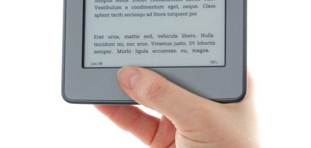
I can’t speak to how this plays on other types of displays, such as E Ink. Does losing the gloss eliminate this problem? I’d love to hear from users.
Thick as a Brick
Marketing copy is sure to tell you how thin and light the latest and greatest tablet is. I’ll argue that the latter is good and should go further, but that the former attribute actually works against the latter.
How do we hold the things we are reading? Whether we’re sitting, standing, or lying in bed, we’re applying force with one or two hands. Generally, we put the majority of the burden on the muscles and tendons on the back of the hand in what’s been called the “iPad pinch grip”. Online forums have threads like “Beware of iPad Hand” and the Daily Mail surveyed a few slightly hysterical users. Is this better or worse than with books?
A third-generation iPad weighs right around 660g and is just under 10mm thick. Hari Kunzru’s The Impressionist, a 480+ page hardback, weighs noticeably less and is about 45mm thick. The physical stresses on your hands when sitting (or lying, or standing) and holding the two in standard reading positions are different, because of simple physics.
I’m no biomechanist, so please correct me if I’ve got this wrong, but high school physics shows that the combination of thinner and heavier requires more “pinch” force to hold an object in a reading position. This in turn puts more strain on the ulnar nerve, the commonly strained dorsal tendons, and other areas that we already sacrifice to Repetitive Strain Injury demons. Alternately, a thicker book gives us more leverage in the “pinch,” and a magazine is lighter. Print simply hurts less to hold. Perhaps when we get to the point when our tablets are made from a single, lightweight sheet, all will be cool.
Nook and Kindle readers, how do you feel about this?
The Light in Your Eyes
Another critical usability difference is that paper isn’t a light source, while most tablets and e-readers (and certainly the iPad) are. Even with your book-reading app of choice (mine is Blue Fire, after Amazon bought and stifled Stanza) in Night Mode and the system’s brightness turned down—here I have to interject that the iOS Auto-Brightness feature has never really seemed to work for me—your tablet is a powerful light source firing photons into your skull from mere inches away. This makes it problematic for reading in bed.
When the arrays of light receptors in our eyes detect that ambient light is low, as it is after sundown, our brain secretes sleep-triggering melatonin. If we bombard our eyes with artificial light, we affect this process and potentially disrupt our sleep cycles. This is especially true with light in the blue range of the spectrum—and computers and tablets emit a good deal of that (though you could counter this if you want to sport stylish, orange-tinted glasses).
This is not a settled matter, scientifically. The Los Angeles Times quotes Frisca Yan-Go, the director of the UCLA Sleep Disorders Center, as saying that light-emitting gadgets such as the iPad keep your brain, and you, away from sleep. But other researchers have suggested it’s more a personal preference or habit. Studies have yet to definitively confirm or deny either case, but the trend leans toward considering light-at-night a potential problem.
Yan-Go also points out that iPads are relatively heavy compared to books. I know I’ve interrupted a good drifting-off when my iPad dropped from my hands directly onto my kneecap. Ouch! This is where Nicholson Baker‘s preference for the iPhone as an in-bed reader could be good safety advice.
I won’t go as far as Baker in picking the iPhone over a book in bed, but I have noticed the iPhone screen, perhaps due to its small size, doesn’t seem as bright or glossy. Is this less of an issue in a smaller form factor (fewer photons), or is it related to the book only reflecting ambient light?
How We Do: The Behavioral
When you change the nature of a thing, you also change the way we see, behave, and interact with that thing. Part of the strength of an e-reader is that it is not a book, so we are comfortable doing non-book things with it. But we have to account for how its non-bookness changes our actions, and how that can work against the goal of concentrated reading.
All tablets and e-readers are multifunction devices. This is true even of dedicated e-book readers; they still have access to multiple titles or other media available at a few taps. On the iPad, even when it’s not connected to a network, I could not be reading in favor of writing, sketching, or playing a game. And when there is online connectivity, I have the constant urge to see if anything’s changed on the internet.
When you’re reading a book, you’re reading that book (unless you’re doing the “book and switch“). The switch cost is high and we know it. This helps us stay on task and be happy about it. In contrast, an immeasurable amount of R&D has gone into ensuring that switching titles on an e-reader or apps on a tablet has as low a cost as possible. This is a good thing, though it comes with the tradeoff of distraction (we can read a lot into the market for desktop apps that “lock” you into one app, or block you from the internet).
The result is that we have a seriously altered set of behavioral cues and pressures when reading on a tablet or e-reader.
Something Is Happening Here, But You Don’t Know What It Is
Whether you fall into “Brain Age” optimism or “Is Google Making Us Stupid” pessimism on brain plasticity, it seems to be settled science that what we do regularly shapes our habits, expectations, and abilities. This is how we learn to be proficient at sports, reading, or living online. As Anne Mangen of the National Centre for Reading Education and Research at the University of Stavanger writes, we are constantly training ourselves to avoid concentration. “Skills inherent in screen-reading are quite different from print reading: for instance, the required ability in certain kinds of screen reading such as hypertexts, to navigate in a network without any defined and unambiguous beginning and end.” (Even if you’re not into the neuroscience, it’s good UX to know that users fall into and value the familiar.)
And especially problematic for concentration or “flow” is that the rewards system in our brains is set up to encourage this—to hook us on fresh stimuli. Each time we find a new email in our inbox, or a funny tweet, or our status “liked” on Facebook, the brain squirts out a dollop of happy chemicals. As Christopher Chabris writes in The New York Times, “What the Internet does is stimulate our reward systems over and over with tiny bursts of information (tweets, status updates, e-mails) that act like primary rewards but can be delivered in more varied and less predictable sequences. These are experiences … [that] happen to be even better suited than the primary reinforcers to activating the reward system.” Mangen agrees: “What we do when we (often quite apathetically) switch from channel to channel, is auto-stimulate our own attentional response.”
This is what we’re up against when we hold our iPads and swear that this time, really, we’ll get through The Magic Mountain or Finnegans Wake. The cards are stacked against us biologically, and that stack gets higher the more proficient we are with our devices.
As users, we can fight against these biological and learned behavioral cues, but it’s hard and, ironically, we’re working against these wonderful, modern devices. I, for one, am weak. What could we as hardware, system, and app designers do to help reduce distraction? How atomic must the settings be to free us from the very affordances that make these e-readers so special? I’m sorry, I lost my train of thought there—had to go check my email. Nope, nothing. Let’s move on.
I Go to Work
Another form of learned behavior related to reading on an e-reader is the fact we’re staring at a screen, whether it’s E Ink, LCD, OLED, or some other technology. We do so many things and spend so much of our life in that position—how does that affect your expectations and behavior when you’re just trying to read, dammit?
In their 90th “Wait, What?” podcast, Savage Critics and semi-pro comics readers Jeff Lester and Graeme McMillan discussed reading comics on iPads, with McMillan stunning Lester by admitting he doesn’t like it. To placate Lester, McMillan has to clarify that his problem is that he spends so much time at his computer to work his dozen or so writing gigs that if he tries to read on his iPad, facing an electronic screen puts him in “work mode,” whether he wants that or not.
Conversely, I’m used to using an iPad for 1) communicating, whether via email or social media, 2) doing things like typing or sketching, and 3) playing silly games. So my mind gets conditioned to see iPads as two-thirds distraction devices, and this places extra mental tasks on me not to engage those, but to get through a book instead.
How can we improve as users? I suppose we could, as mentioned before, set strict limits and re-train ourselves. In my case, turning off all networking and delete all non-productive apps; in McMillan’s case, working a bit less and playing a bit more. A more difficult question would be, how can we, as designers, help the users? Here we’ll need to do serious user research and build specialized options for, say, my persona and McMillan’s persona.
Reconcile
This is not to say there aren’t some use cases where even I find the iPad a brilliant solution for reading. As with all usability evaluations, there can be situations where the use case can overwhelm other, perhaps conflicting, situations.
Last summer I worked abroad, and traveled occasionally for it. Though as I mentioned before, iPads are heavier than most books, they’re lighter and easier to pack than multiple books. I usually want to read more than one book throughout an international flight, so an iPad works well there (though the glare issue can be worse on a plane, the lack of network access plus the peer pressure not to spend hours on Tiny Wings helps overcome my stated concerns). In addition, I had network access at work, but no set mailing address, so having an iPad allowed me to keep up with magazine subscriptions such as the New Yorker.
And comics look great on an iPad—the aspect ratio is perfect, the colors are vibrant, and swiping to turn pages just seems a better fit for comics than for books.
So I’m not saying it’s a lost case, by any means. My experience outlined here is with the iPad. Some of my concerns may be unique to that device, and I’d love to hear from readers on other platforms. Some of my concerns may be mooted as thin-and-light technology advances, some may be addressed by screen setting options, some we can take upon ourselves in customizing and/or limiting our tablet, but will books ever be totally replaced in our hearts and minds?
Some of us will continue to find unique user experience value in our dead-tree friends until you pry them from our cold, dead hands.